Tag: PBC Case Studies
Did This Intervention Reduce Blood Culture Contamination Rates?
Here is a chart from a team in San Antonio, where I teach a class on Lean for quality and patient safety twice a year. This team was basically using the “A3” improvement methodology to look at a problem that really impacted patients. My understanding is that a contaminated blood culture bottle leads to false positive results that indicate that a patient has a bloodstream infection when they really don't.
“ER wait times down, but only slightly” or ER wait times...
This article was sent by a friend and blog reader from Winnipeg the other day:
"ER wait times down, but only slightly"
Oh good, the waiting times are down. But what does "only slightly" mean? Have ER wait times gone down in a meaningful way? Or are they just comparing two data points? Is this "down" a matter a signal or is it just noise in the system?
These are the types of questions that can be answered by methods in my new book Measures of Success: React Less, Lead Better, Improve More.
Context and a “Process Behavior Chart” Instead of Two Data Points:...
I started my career in manufacturing, so that's just one reason I'm interested in the topics of offshoring (sending manufacturing work overseas) and what's now called "reshoring," or bringing jobs and factories back to the U.S.
Somebody at A.T. Kearney sent me a link to their recent report on reshoring, with the headline:
Reshoring in Reverse Again
US manufacturers are not exactly coming back in droves. In fact, the 2018 Reshoring Index shows that imports from traditional offshoring countries are at a record high.
When you learn to look at data and workplace metrics through the "Process Behavior Chart" methodology, you learn to be skeptical of text descriptions like "a record high." Does "a record high" mean that the data point is statistically meaningful? Not always.
A “Pulse Check” – Bonus Material From “Measures of Success”
Today's post is some material that I wrote for my book Measures of Success but cut due to length. I've modified the material a bit to hopefully be fine as a standalone post.
There's a somewhat humorous, if not scary, story from a book (This is Going to Hurt) written by a former "junior doctor" in the British National Health Services (NHS) -- the equivalent of a "resident" in the American medical education system.
Is the Reported Drop in Major League Baseball Attendance a “Signal”...
Here is my latest article that I published on LinkedIn:
Is the Reported Drop in Major League Baseball Attendance a "Signal" or "Noise" in the Data?
Should This Japanese Hospital React to a Dip in Kaizen Submissions?
Last week, I wrote Part 1 of this piece about TQM and "Small Kaizen" at a Japanese Hospital pharmacy.
The hospital was happy that employees were participating in their "Small Kaizen" process, but there was a month in which they saw the number of submitted Kaizens drop, from about 138 to 58 or so.
As I write about in Measures of Success, two data points usually don't make a trend.
Are Minor League Baseball Games Getting Slower or Faster?
Are minor league games taking longer? Well, yes and no, depending on the league.
My next book, Measures of Success, is about the use of this Process Behavior Chart methodology in the workplace, as applied to our performance measures.
This post explores some data, how asking for more data can be more helpful, and how to use charts to evaluate a metric over time.
Ratings for “The Oscars” Were Lower in 2018? Should We Ask...
As I blogged about yesterday, things went well at the Oscars... or, at least, no errors were made in the announcements. But that thing that didn't go well was the TV ratings.
Two Data Points Are Not a Trend
The headlines I saw had a lot of two-data-point comparisons. Headlines sometimes gave the percentage decrease in viewers or how many million fewer viewers there were. Many talked about "record low" but if you're tracking a metric "record low" or "all-time high" doesn't mean there's a "special cause." That "record low" could still be noise in the system.
Every Metric Has Variation – What Can We Learn from NCAA...
Last week, I saw a headline about a drop in NCAA college football attendance.
I wasn't satisfied with the two data point comparisons or other written descriptions of the metrics. I wanted to see data. SHOW ME THE DATA, JERRY! (with apologies to "Jerry Maguire"). I wanted to see a chart. So, I found the data on to NCAA website and created "process behavior charts" that tell you much more about the data than text numbers ever could.
Two Data Points Don’t Make a Trend, So Read Beyond the...
When looking at data, whether it's the number of homicides in San Antonio or some of our workplace metrics, it's tempting to overreact to a "headline" that says a measure went down in 2017 compared to 2016. But do two data points really help us understand what the real trend is? This blog post explores an approach we can use to make better decisions about our data.
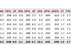
Is Andre Drummond a Better Free Throw Shooter This Season?
Today's blog post -- it's not just about sports, it's about managing and measuring improvement...
Deciphering the World Series Home Run Surge: A Data-Backed Analysis of...
If you watched this year's World Series, you saw a lot of home runs. There were many dramatic home runs in late innings or...


