I'm all for visualizing data and performance measures in the form of a chart. Charts are far better visuals than “bowlers” or “bowling charts,” as I've written about and spoken on before:
For time-series data, like metrics and KPIs, I strongly prefer “line charts” or “run charts” to “column charts” (sometimes referred to as “bar charts”).
I'm also not a fan of overlaying this year's performance on top of last year's. If we're going to look at 24 months of data, it's more effective to see that as a single time series.
Here's an example of the type of chart I've seen a lot — with last year's data in columns and this year's data as a line:
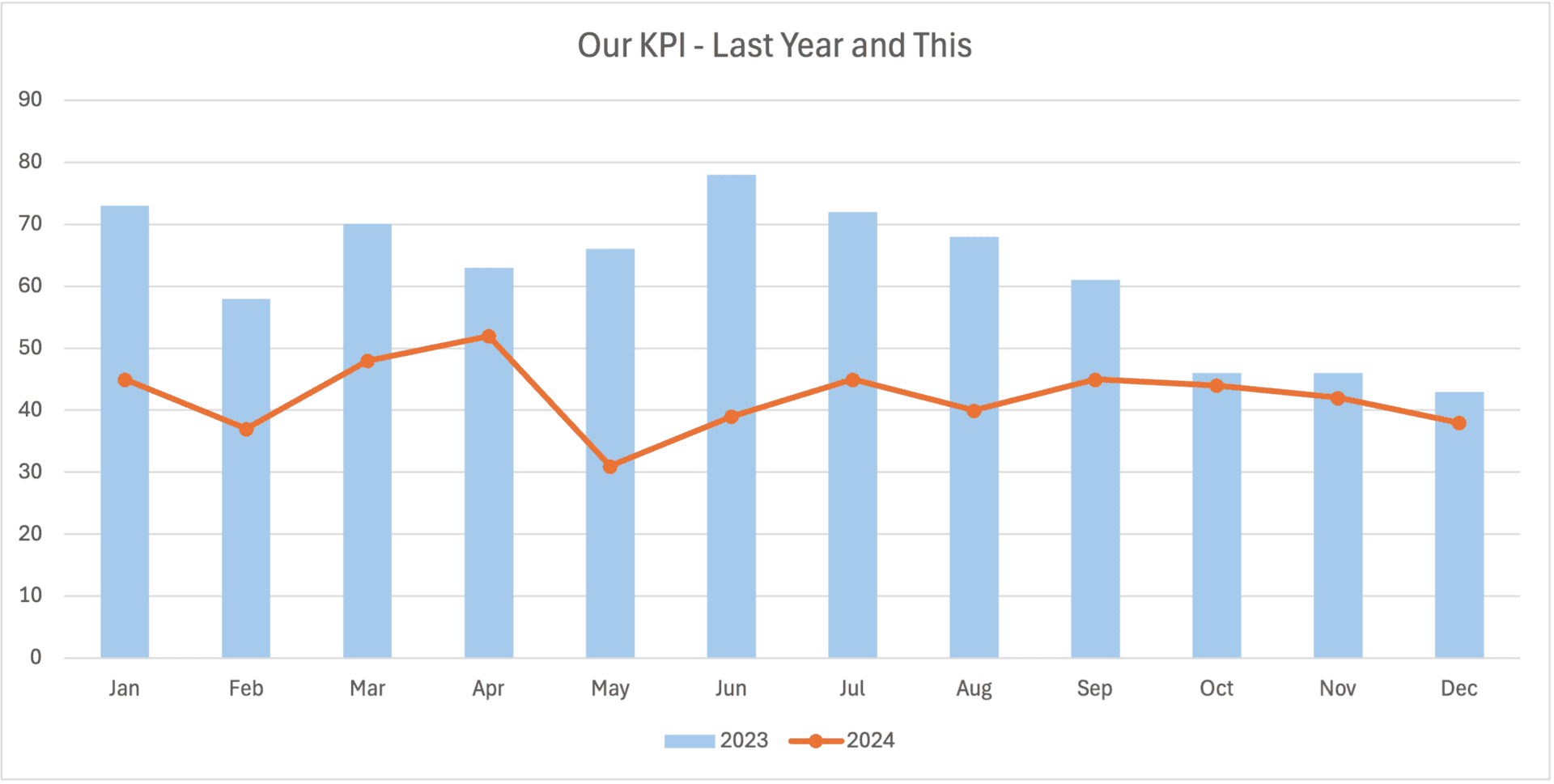
To be fair to this visualization, one thing that jumps out is that every 2024 data point is LOWER than the corresponding 2023 month.
But what's the statistically valid trend? When did performance improve? What would we expect for future performance?
A “process behavior chart” (another name for “control chart”) would be the best visualization. But let's start with a run chart for comparison:
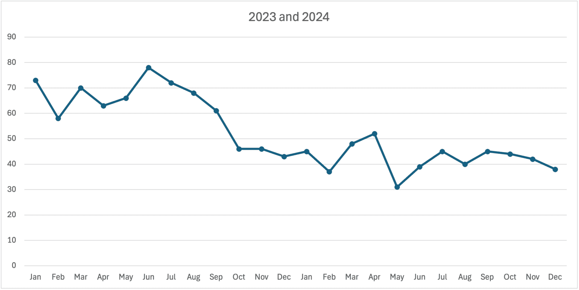
The run chart makes is much clearer that something happened in October 2023 that caused performance to shift downward. It looks like a one-time event, where the metric had been fluctuating around an average of about 65. And now it's been fluctuating around an average of about 43.
Now let's look at the Process Behavior Chart view, where the initial average, along with the lower and upper limits, were calculated using the first nine months of data:
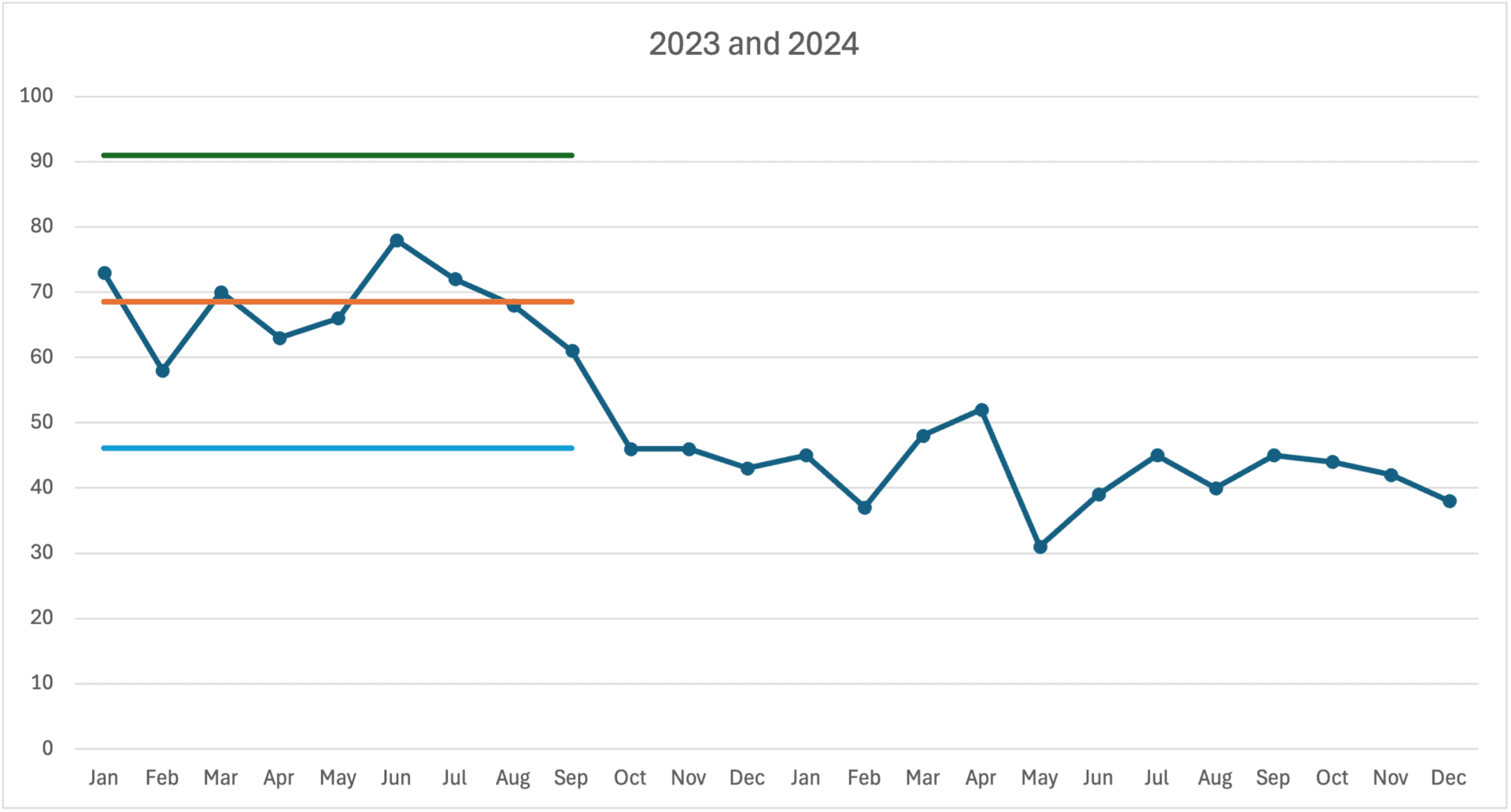
The October data point is just below the calculated lower limit… evidence of a “signal” — that tells us that something changed with the process. I call that a “Rule 1” signal — and then we see more of those.
We also see, then, a “Rule 2” signal, with eight (or more) consecutive data points that are below the baseline average. This is a meaningful and sustained shift in performance.
Hopefully, we know WHY that happened.
A Process Behavior Chart tells us that the system changed — but we need to understand our system enough to figure out what changed. Was there an intentional system change or improvement project? Or was performance changed by some outside factor?
We can then calculate a new average and limits using the last 15 data points, which looks like this in my spreadsheet:
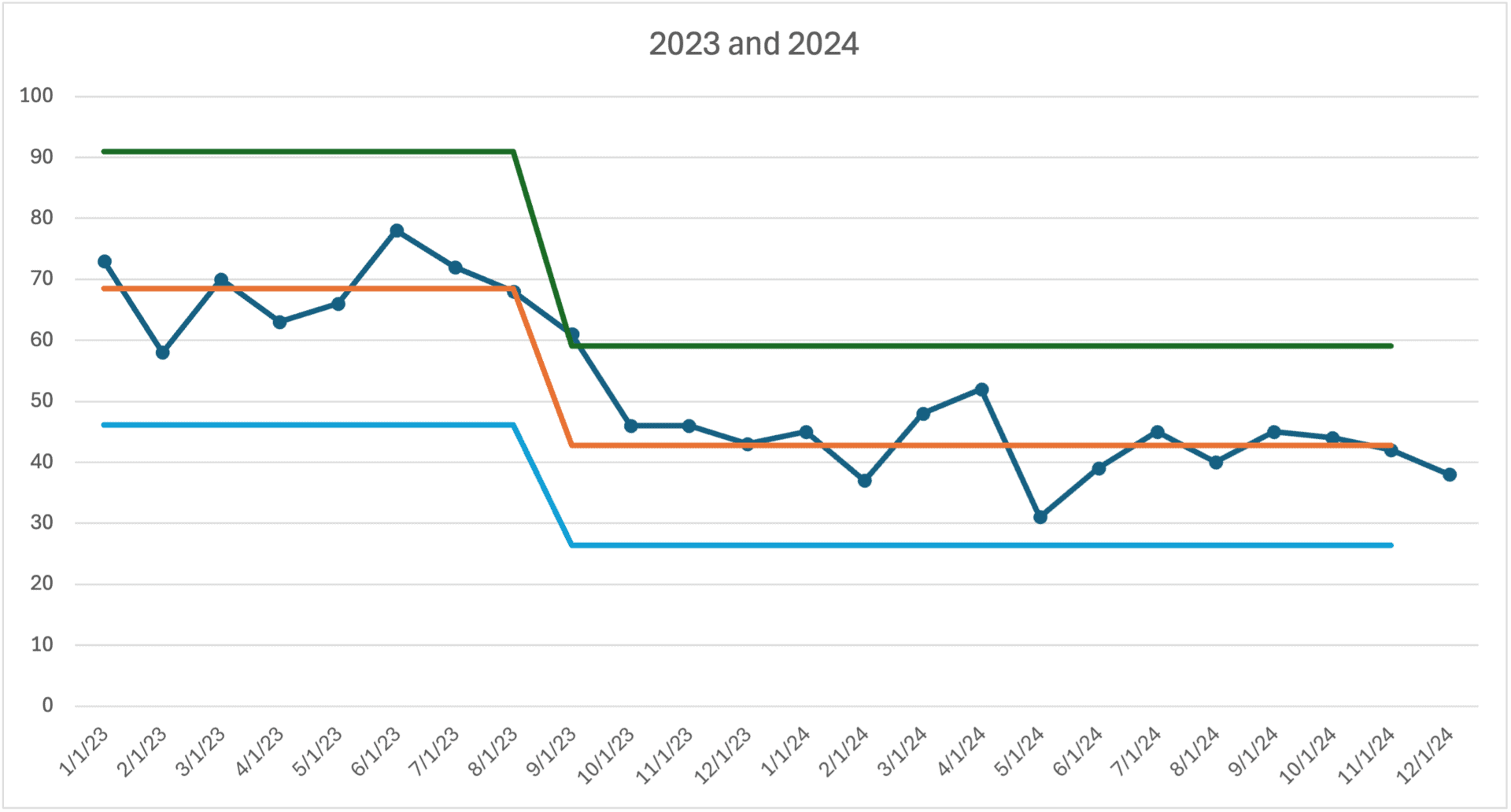
We might be happy that this number has shifted down from an average of 68.5 to a new average of 42.7. But there's no evidence of continued decline. A linear trend line would be mathematically correct but practically misleading:
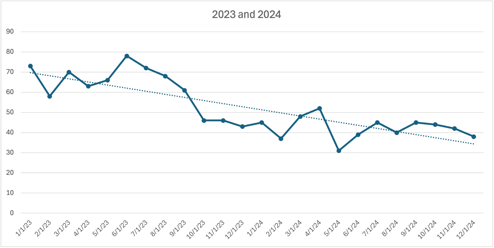
The linear trendline implies (incorrectly) that performance will continue to improve, hitting zero given enough time. But I think the one-time shift downward is probably a more accurate description of what happened.
Here is the same Process Behavior Chart as generated by the free XMRit.com tool that shows the shifted average and limits. You can click this link to play around with the chart.
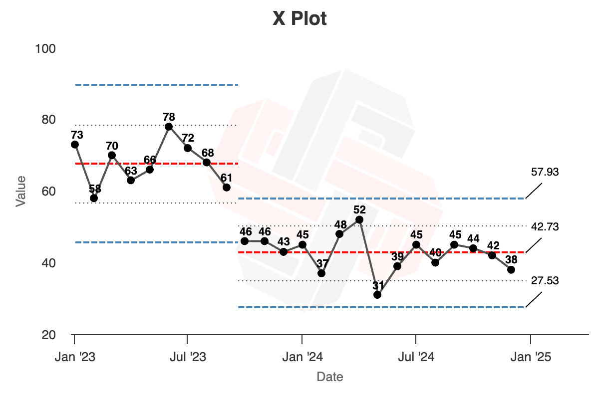
We can use the PBC to predict future performance. It's going to keep fluctuating around the average of 42.7, with data points between the limits of 27.5 and 57.9… UNLESS the system changes again.
How do we know the system has changed? By seeing a statistical signal following these three rules:
- Any data point outside the limits
- 8 or more consecutive data points on the same side of the average
- 3 of 3 or (3 of 4) consecutive data points that are closer to the limit than they are to the average
To learn more, check out my book Measures of Success: React Less, Lead Better, Improve More (get a free sample chapter). I can also come do a workshop and provide coaching for your team…
What do you think about these different approaches to visualizing metrics? What does your organization use? How do you see the potential benefits of Process Behavior Charts?
What do you think? Please scroll down (or click) to post a comment. Or please share the post with your thoughts on LinkedIn – and follow me or connect with me there.
Did you like this post? Make sure you don't miss a post or podcast — Subscribe to get notified about posts via email daily or weekly.
Check out my latest book, The Mistakes That Make Us: Cultivating a Culture of Learning and Innovation:


