Are Your Charts Leading You to the Wrong Conclusions?
Data is everywhere in today's organizations, but are we using it in the most effective way? Many businesses rely on traditional bar charts and color-coded dashboards to monitor their performance. But what if these visuals are giving us a false sense of security–or worse, distracting us from real opportunities for improvement?
During a recent visit to an organization, I encountered charts that looked helpful at first glance but were, in fact, misleading. While they had good intentions, their approach made it difficult to see what was really happening with their processes. Let's dive into why these common metrics fall short and explore a better way to visualize data for true continuous improvement.
That organization had a mix of business metrics posted, all in this sort of format–column charts:
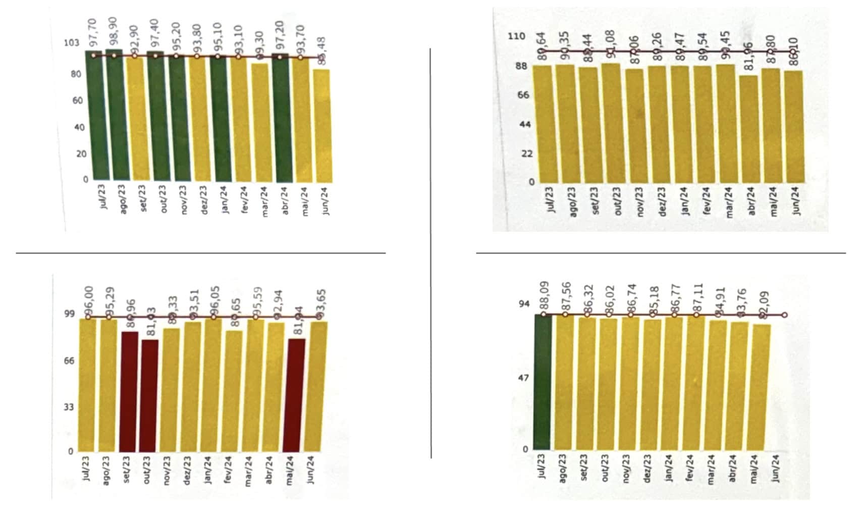
I do appreciate that they were looking at 12 data points. That's better than unhelpful two-data-point comparisons. And I like that they show a rolling 12 months period (instead of starting a new calendar year with a blank chart, which is also pretty unhelpful and unnecessary).
They're relying on color coding (red, yellow, or green) to illustrate how the process is performance against goals. That's one way to look at a process over time, but the goals and thresholds for those goals are quite literally arbitrary.
As I teach in my Measures of Success workshops (and the book), we need to answer three key questions about each of our Key Performance Indicators:
- Are we achieving our target or goal?
- Are we improving?
- How do we improve?
Color coding only answers the first question. It's hard to answer the other two with the column charts, if not impossible.
What else do I dislike about those charts?
For one, I think line charts (a.k.a run charts) are better for time series data than bar charts (a.k.a column charts). I remember an expert in data visualization saying that column charts are bad because your eye is drawn to the middle of the column, where the real data point is the top of the column. So it can be visually misleading.
Secondly, with the y-axis scale going from zero to 100, the differences in month-to-month performance are compressed (or squooshed together).
Those issues are all addressed with Process Behavior Charts, as shown below.
Using Process Behavior Charts
Here's the first chart compared to a PBC that I created with my free Excel template:
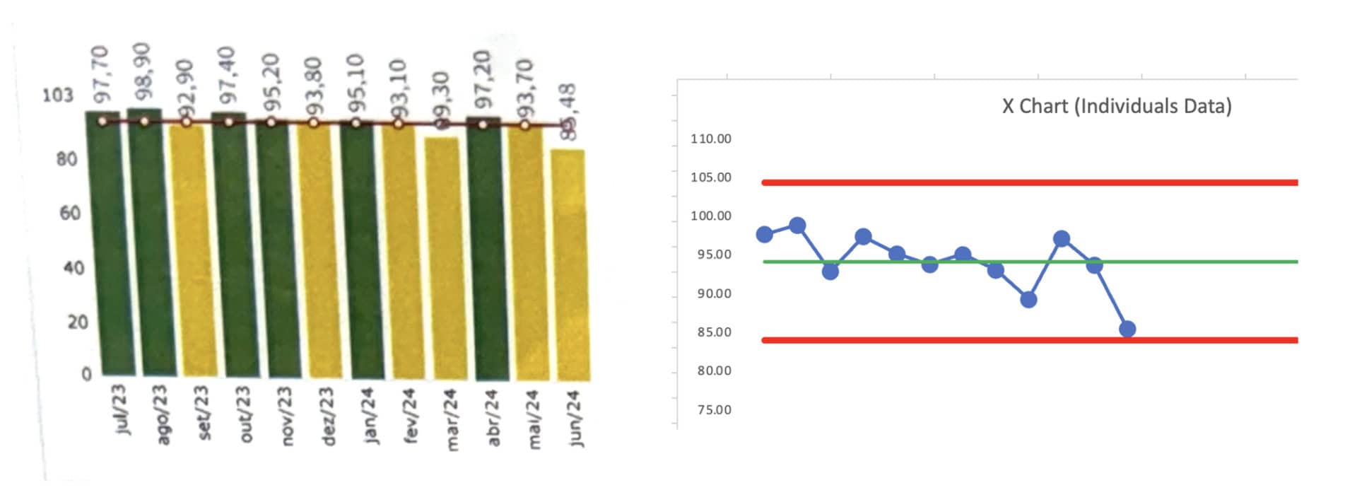
We could answer the first question about how performance compares to the goals if we overlaid color coding.
The PBC helps answer the second and third questions.
Are we improving? No. Performance is fluctuating around an average that seems stable over these 12 months. And the difference between “green” and “yellow” performance is not statistically meaningful. We shouldn't demand a root cause analysis for the yellow data points.
How do we improve? That last data point is near the calculated Lower Limit (see my blog post about how the math works). We don't see any “signals” in the chart based on the three key rules:
- Any data point outside the limits
- 8 or more consecutive data points on the same side of the average
- 3 of 3 or (3 of 4) consecutive data points that are closer to the limit than they are to the average
How do we improve? Not by asking for an explanation for any of those data points. There no statistically-meaningful “trend” (and I wouldn't use a linear trend line calculation).
We improve by asking how we can improve the system that generates those metrics — how can we do so systemically? That means understanding the system (and studying the way the work is done), to look for opportunities to improve.
Here's a second PBC with its column chart:
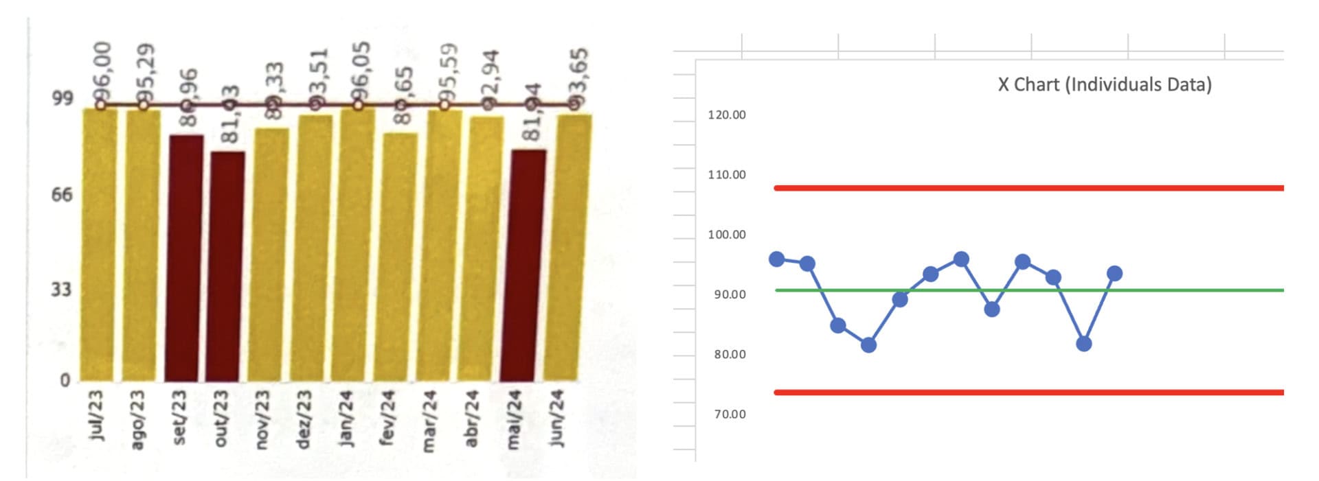
This chart shows, again, that performance is fluctuating around a stable average. We see no signals, only noise. The difference between yellow and red is not statistically meaningful for this metric.
It would be a mistake (a waste of time) to use a single red data point to trigger an A3 or such. Even a rule of thumb like “do a root cause analysis if you have two reds in a row” is not a statistically-valid rule or approach.
Here is the third chart:
We see a clear signal in the last data point, as it's below the calculated Lower Limit. THAT is a data point worth reacting to. Why did performance get worse? Do we understand the cause? If so, how do we eliminate the cause and put performance back to where it had been, if not better?
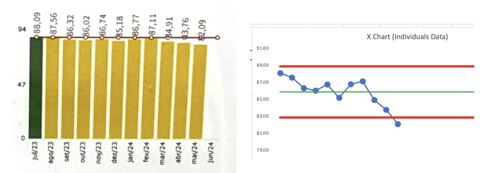
The column chart suffers from the difference between data points being tightly compressed. The column chart doesn't clearly show the last data point as being an outlier. The PBC makes this clear — the visual depiction combined with the math that decides the lower limit is about 83.
The time to react is not the difference between the first data point (green) and the second (yellow). The difference between green and yellow is arbitrary. The difference with that last yellow data point is statistically meaningful. Again, that's a signal and a time to react, investigate, and improve.
And the fourth:
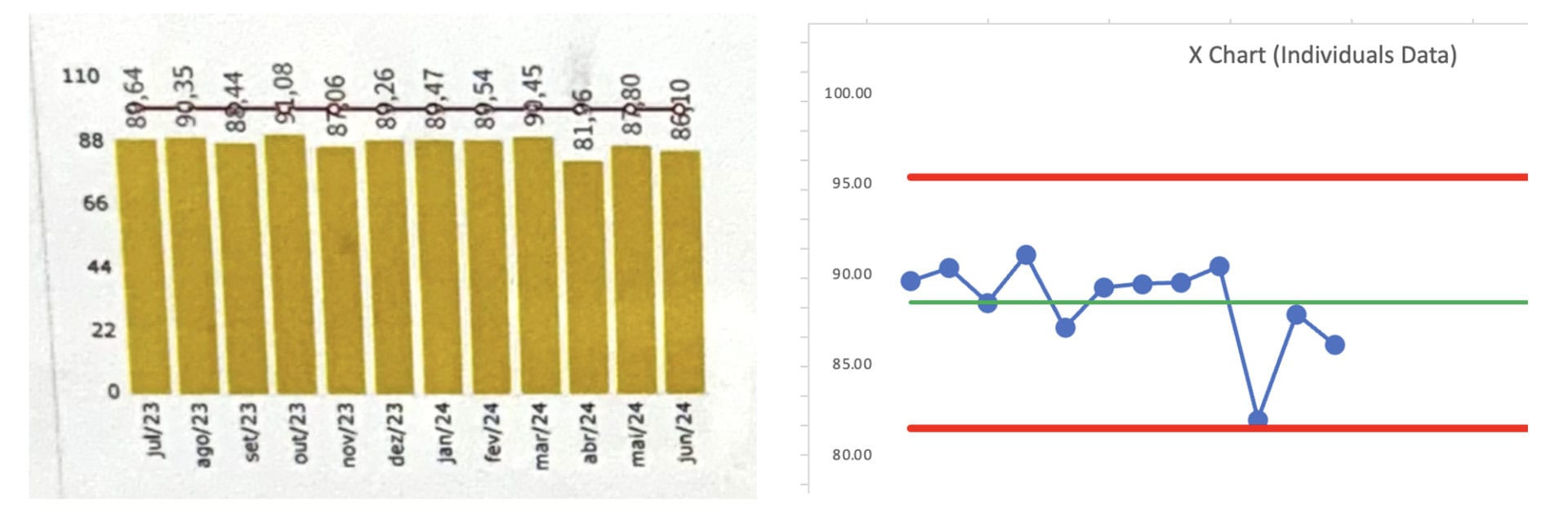
This column chart shows that all of the data points are yellow. The PBC shows that the third from the last data point is “almost” a signal. It might be worth investigating. Investigating that one data point would be better than trying to explain every up and down in the data.
Conclusion
If we want to truly drive improvement, we must move beyond simplistic color coding and arbitrary thresholds for goals. The process behavior charts (PBCs) provide the visual clarity and statistical rigor that column charts lack, allowing us to focus on meaningful signals rather than chasing random noise.
By embracing PBCs, we can better understand whether we're improving and, more importantly, how to improve. It's not about reacting to every data point, but rather improving the system that generates those metrics. In the end, meaningful improvement comes from studying the system, not just reacting to arbitrary colors.
Download a free preview of my book, Measures of Success.
What do you think? Please scroll down (or click) to post a comment. Or please share the post with your thoughts on LinkedIn – and follow me or connect with me there.
Did you like this post? Make sure you don't miss a post or podcast — Subscribe to get notified about posts via email daily or weekly.
Check out my latest book, The Mistakes That Make Us: Cultivating a Culture of Learning and Innovation:


