


Two-Year Comparisons in Major League Baseball Stats: A Strikeout, not a Homer
It's just over halfway through the 2024 Major League Baseball season. Tuesday is the annual All-Star Game featuring National League stars (such as my two favorite players, Shohei Ohtani and Elly De La Cruz) facing off against the American League stars.
Baseball is a wonderfully statistics-focused game. The overlap between the sport and numbers has fascinated me since I was a kid. I used to read the annual “Bill James Baseball Abstract” book cover to cover each year. Before the internet, I prized my printed copy of the Baseball Encyclopedia, which contained every historical player's stats going back to the 19th century.
I've blogged a lot about baseball stats here, usually in the context of explaining why “Process Behavior Charts” (looking at 20+ data points) are superior to the simplistic analysis of two data points — comparing a current season to the year before.
There are news reports and I've heard announcers say things like:
- “It sure is tough to hit a double these days, they're way down.”
- “Runs and hits are down this year… what's up with that trend?”
- “Stolen bases are way up.”
A comparison of two data points can be true — but also a bit meaningless.
News stories include:
The culprits behind baseball's run-scoring decline
“As Major League Baseball fans know, run scoring is down significantly this season.”
Let's look at the numbers (via Baseball-Reference.com).
Runs per game (per team) in 2023 (full season) = 4.62
Runs per game (per team) in 2024 (partial season) = 4.39
Yes, that's a decrease of 0.23 runs per game. That's a 5% decrease. Before trying to talk about WHY that happened, we need more context.
Runs per game (per team) in 2022 (full season) = 4.28
So runs per game were UP (0.34 runs) in 2023. 2024 scoring is higher than 2022. Why don't we see headlines about that?
We could play the two-data-point comparison game all day long. And three data points do not make a trend.
What's a better way of looking at the data? Create a Process Behavior Chart (learn how here or in my book Measures of Success).
Long story short, a PBC shows the data as a “run chart.” We then add lines that are calculated — the average, the lower limit, and the upper limit. Again, the limits are calculated based on a baseline set of data (LOL, a baseball pun) and the limits are wider if the data set has higher variation going from point to point.
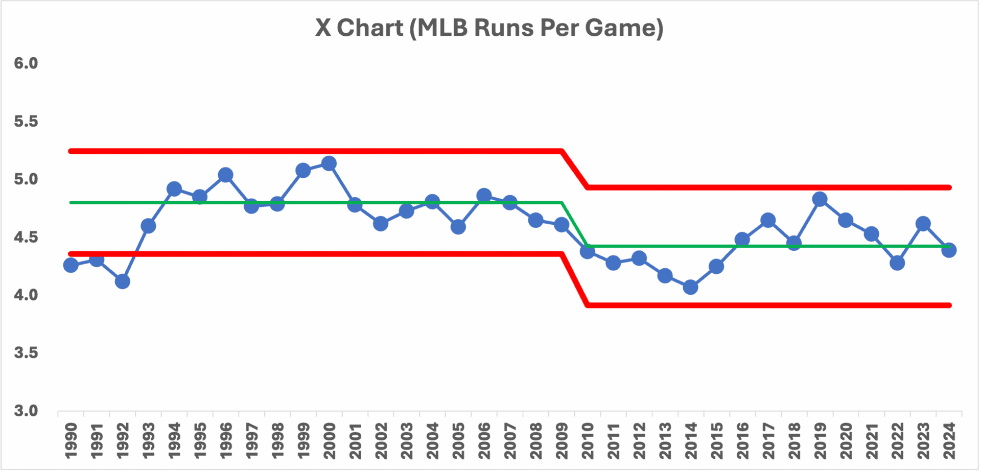
Let's look at PBC that goes back to 1990 (an admittedly arbitrary date):
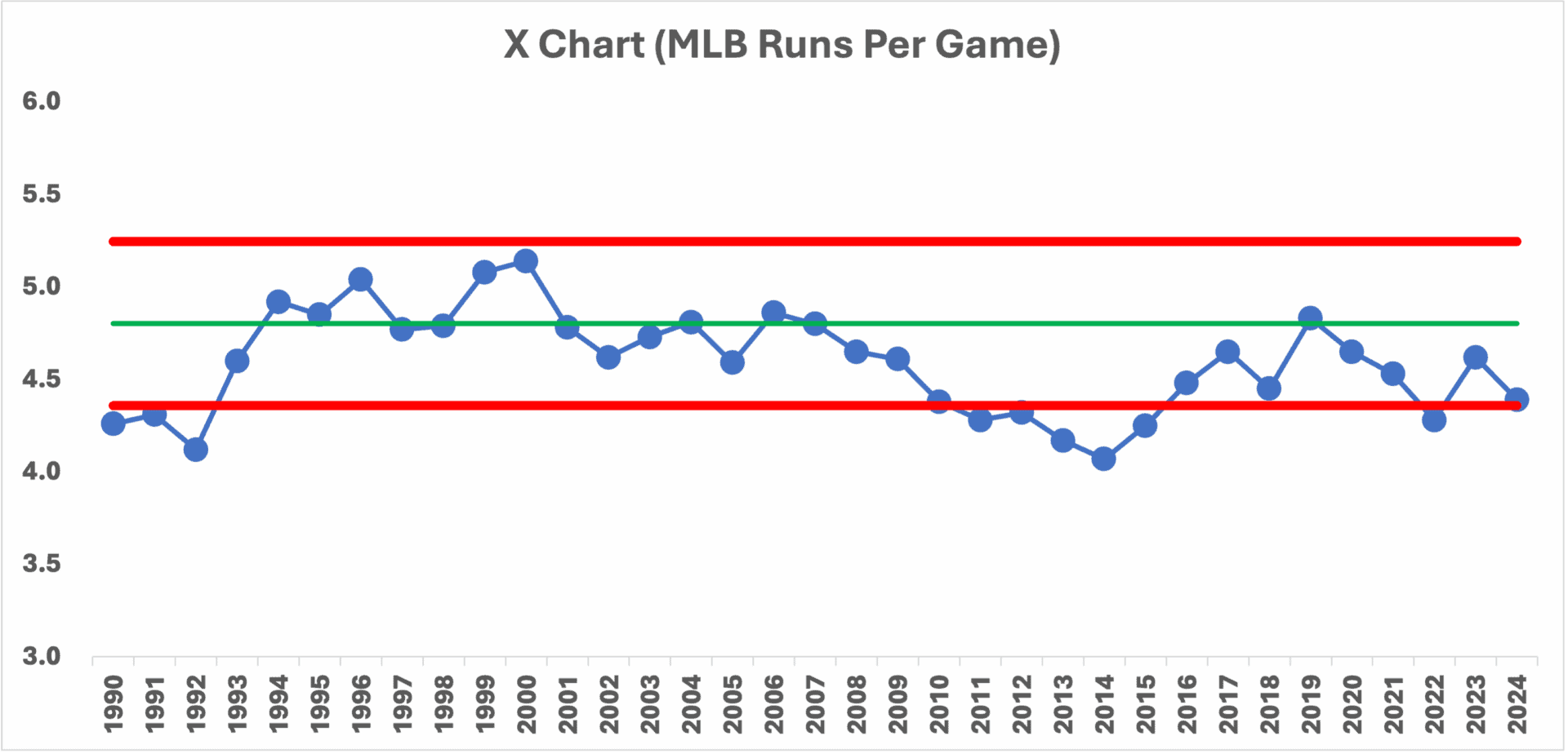
That chart tells us so much more!
Runs in 2024 are not at a historical low, even in this time frame. Scoring was lower from 1990-1992. Then, a big shift upward, although there's not technically a “special cause” data point (a.k.a., a “signal”). There no data point above the upper limit and we don't see eight consecutive data points above the average.
But, it's so close… and the special cause of that era was… STEROIDS.
After the steroid era, things shifted back down and steadily declined until 2015, when the average seems to have bumped up a bit.
Since 2008 is the start of 8+ data points below the baseline average, I recalculated the average and limits from that point on. What happened in 2008? I'm not sure.
I asked ChatGPT to create “alt text” for the chart, and what it said, in part, was pretty good:
“The chart shows variations in the average number of runs per game over the years, with noticeable fluctuations. The average number of runs per game has remained relatively stable with some peaks and troughs, particularly around the mid-1990s and the late 2010s.”
That's not how I'd describe it, but the ChatGPT sense of it is better than analyzing just two or three data points.
I'd say, “The chart shows variations in the average number of runs per game over the years, with noticeable fluctuations and a few shifts over that time period. The last four years' scoring numbers are all basically “the same” from a statistical standpoint. There's no “special cause” to explain for any of the last 15 seasons or so.
Let's Look at Other Core Measures
Are hits and runs down this season? Yes, but what's the context? Here are the charts:
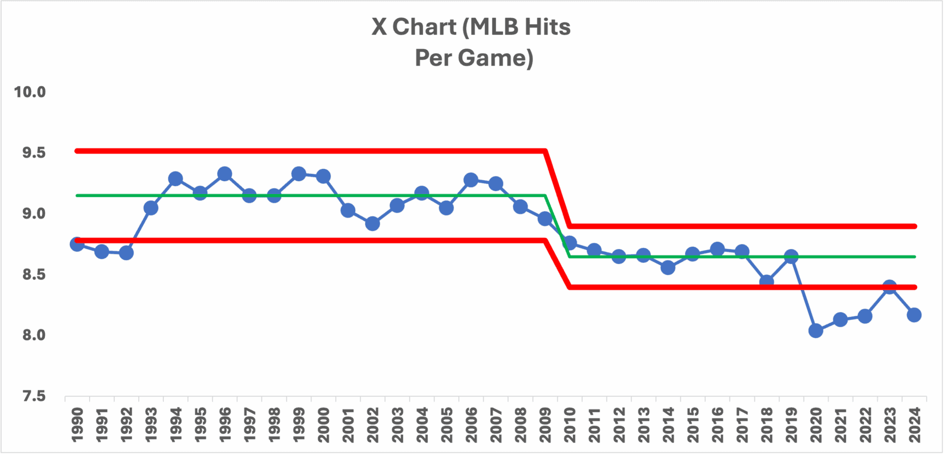
There are some similarities to the runs per game chart. We see the 1990s shift upward and a new lower baseline average being established around 2008.
But the difference is that we now have data points below the lower limit. That's a “signal” for the past five seasons. Runs are not down in a statistically meaningful way, but hits are.
What about doubles? I purposefully didn't try adding in the “shifts” in the average and limits this time. The chart still tells us so much….
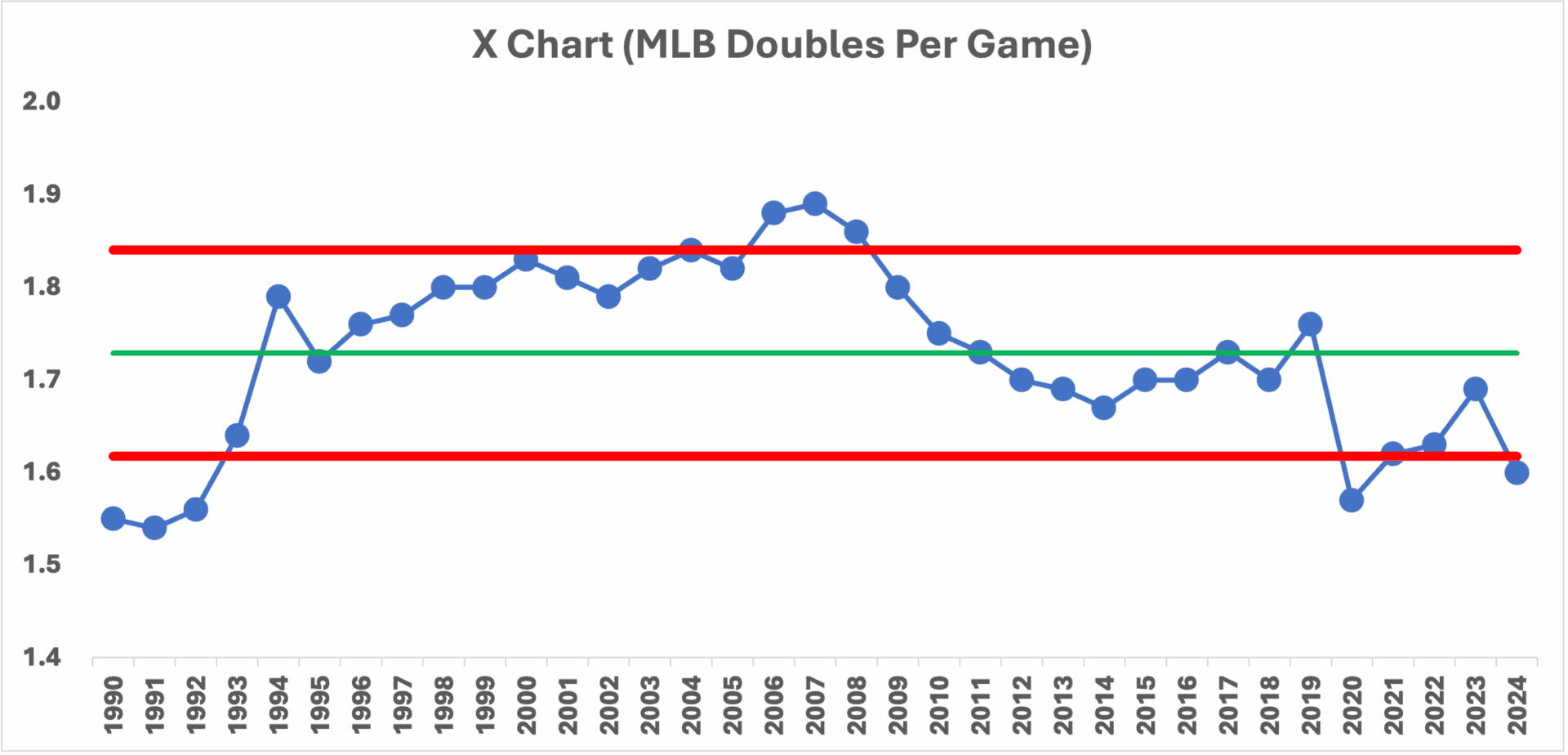
These charts put the statistical analysis into much better context?
We can ask why doubles are down. Some say more teams have decided it's better to have their outfielders play deeper (closer to the warning track) in an effort to prevent doubles. The tradeoff is that you will probably allow more singles. But doubles are more likely to lead to a run than a single. Is that our “special cause” combined with slightly lower offensive output to begin with?
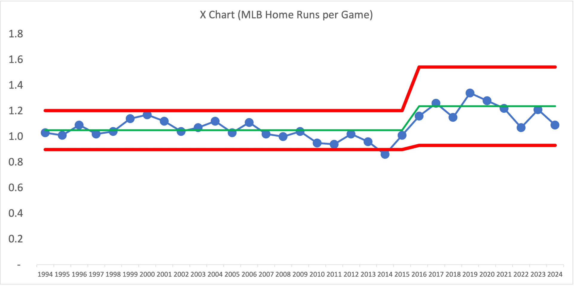
Oh, and I updated my home runs per game chart for the first time since 2020. See a previous post about a 2019 home run “surge”:
The updated chart is below. Are we in a “post-surge” state now? We seem to be fluctuating around a new average.
One Stat That's Indeed Increasing
Stolen bases are up. Way up. That started last year. But let's look at the PBC:
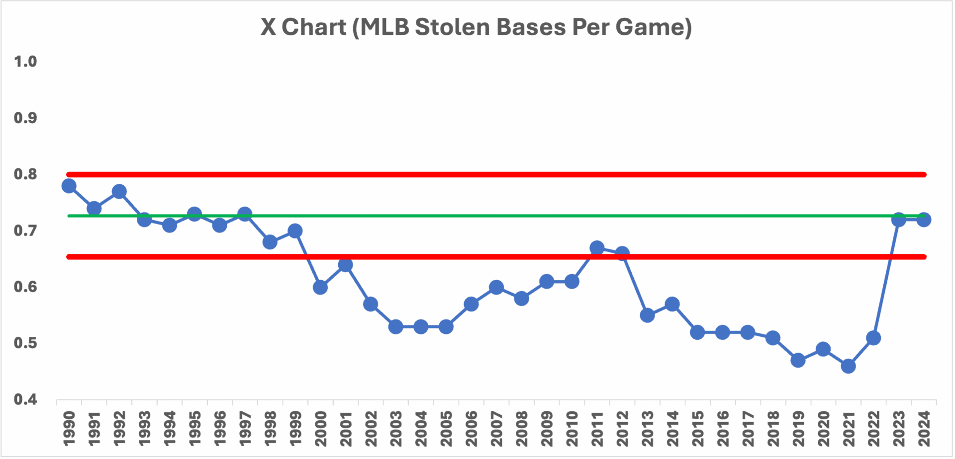
There were a lot of news stories last year about stolen bases being up. There are a few “special causes” that seem to make sense:
- With the pitch clock era, pitchers aren't allowed to attempt as many pick-off throws to keep runners closer
- The bases are now physically larger, as of 2023 — going from 15 inches to 18 inches. That means the distance from first to second base is shorter by 4.5 inches (explained here)
This seems like an example of clear “cause and effect.”
Why was there such a decrease in steals over time before 2023? Teams decided (thanks to analytics) that the risk of giving up an out (when the runner is caught stealing) doesn't always outweigh the benefit of gaining a base (read more).
Bottom of the 9th (Conclusion)
In conclusion, while it's tempting to draw quick conclusions from comparing two data points in baseball statistics, it's clear that a more robust analysis, like using Process Behavior Charts, provides a richer and more accurate understanding of trends over time. The fluctuations in runs, hits, and doubles per game each tell their own story when viewed in the context of relatively long-term data.
The decrease in runs per game this season might seem alarming in isolation, but when compared with data from previous years, it becomes part of a larger, more nuanced narrative. Similarly, the rise in stolen bases, influenced by recent rule changes, highlights how specific system changes can impact statistical trends in a meaningful way.
By employing Process Behavior Charts, we can better understand the inherent variability and stability within baseball statistics (or any business metric). This method helps us avoid overreacting to short-term changes and instead focus on genuine trends and potential causes. Whether it's the shift in defensive strategies affecting doubles or the strategic calculations behind stolen bases, the insights gained from long-term data analysis provide a deeper appreciation for the complexities of the game.
As baseball continues to evolve, so too must our methods of analysis. Embracing comprehensive statistical tools allows fans, analysts, and players alike to make more informed observations and decisions. So, next time you hear an announcer making a bold claim based on a single season's data, remember the value of context and the importance of looking at the bigger picture.
Thank you for joining me on this deep dive into baseball statistics. Here's to a great second half of the season and the ongoing thrill of America's pastime. Play ball!
Please scroll down (or click) to post a comment. Connect with me on LinkedIn.
Let’s build a culture of continuous improvement and psychological safety—together. If you're a leader aiming for lasting change (not just more projects), I help organizations:
- Engage people at all levels in sustainable improvement
- Shift from fear of mistakes to learning from them
- Apply Lean thinking in practical, people-centered ways
Interested in coaching or a keynote talk? Let’s talk.
Join me for a Lean Healthcare Accelerator Trip to Japan! Learn More


Sure, home runs are up. I’m sure so is the distance they travel. And therein lies the problem. What most analysis fail to mention is the proverbial elephant in the room. Over the past twenty years, strikeouts have doubled (due to the “all or nothing” mentality that prevails in todays game), batting averages has plummeted from .271 to the mid to low .240’s, and OBP has dropped 10%. Baseball has a problem. They fail to consistently harvest the best talent available. Period. Sounds funny, right? But it actually has a basis in fact. And “Winning the Day – Saving Baseball” proves it in numerous incontestable ways. Give it a read, and see for yourself……
Comments are closed.