


Two data points are not a trend. Two-data-point comparisons can be mathematically correct but practically meaningless.
This is true in workplaces and news articles like this one.
Multiple two-data-point comparisons (comparing last month to the previous month AND comparing it to the year before) don't paint the full picture the way a simple run chart would.
If a hospital's margin is “23% higher” than the year before, is that a difference between 1% and 1.23% or the difference between 10% and 12.3%?
Give me more data points. Better yet, create a chart that shows trends (or the lack thereof) over time. Otherwise, we're just celebrating (or bemoaning) every little up and now.
23% sounds like a big change. But that doesn't mean it's statistically meaningful. Was it down 27% the previous month? Possibly. Some metrics simply fluctuate around a stable average.
On NPR recently, the hourly news update covered economic indicators, including the truth and data points that say:
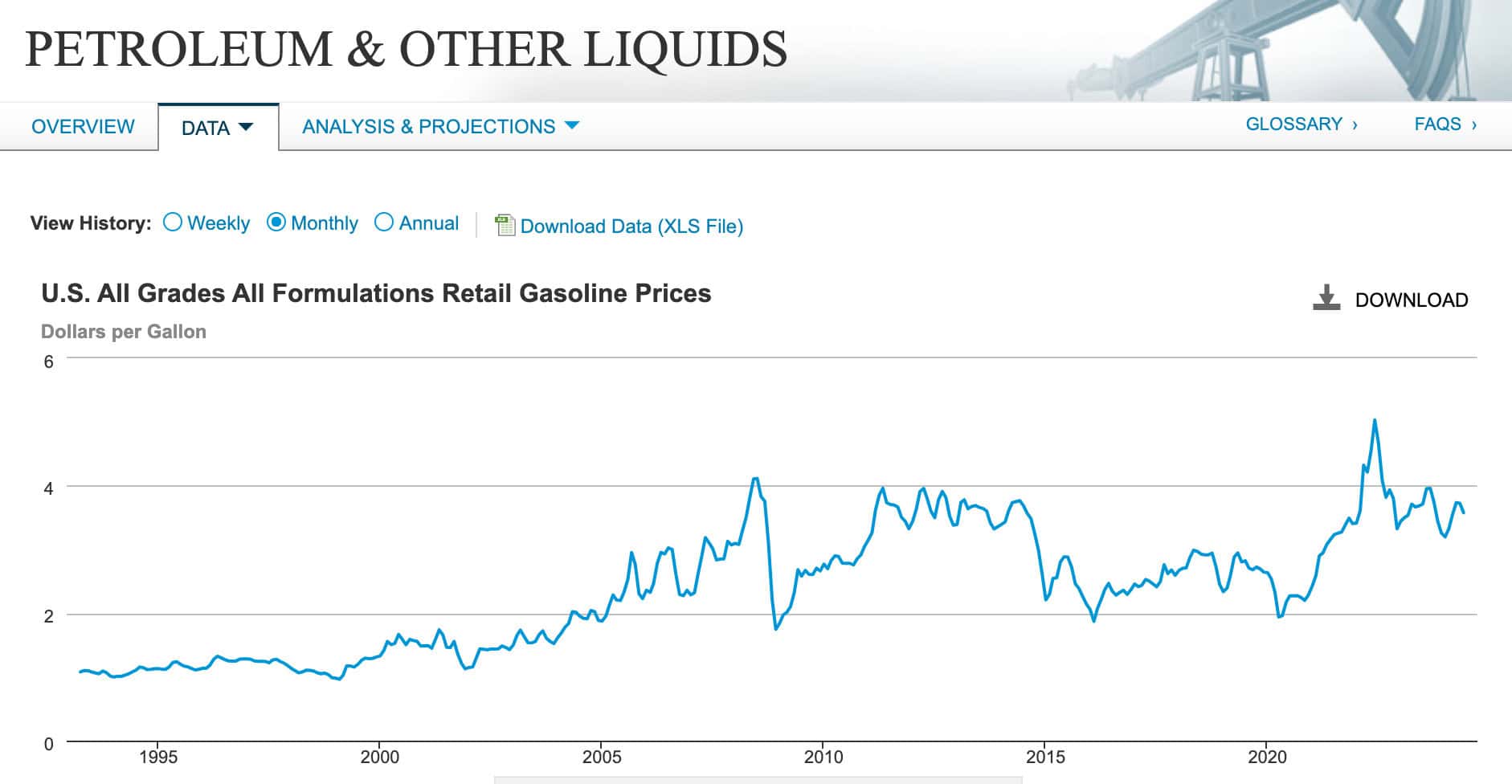
- Gas prices are UP 5 cents from a week ago
- Gas prices are DOWN 10 cents from a month ago
So, gas prices are both going UP and DOWN. It depends on which data point you use as a starting comparison — and what point you might be trying to prove. What are those two facts “indicators” of?? What's the longer term trend??
Reacting to this “noise” and trying to explain it is a waste of time. That's why the cover of my book, Measures of Success has rollercoaster imagery on the front cover. That's why the subtitle is “React Less, Lead Better, Improve More.”
It probably should have been “Using Process Behavior Charts to React Less, Lead Better, and Improve More.”

The Power of Run Charts
Run charts plot data points over time, providing a clearer picture of trends. By visualizing data, we can see patterns, fluctuations, and outliers more effectively than with tables of numbers. For example, if a hospital tracks its monthly margins on a run chart, it can identify whether the margins are consistently improving, declining, or fluctuating within a stable range.
Run charts also help distinguish between routine variations and significant changes (although Process Behavior Charts, with their calculated upper and lower limits are better at this). This distinction is crucial for making informed decisions. Instead of reacting to every change, we can focus on signals that indicate real shifts in the process.
The EPA provides an interactive run chart that you can play with:
Be careful, though, since run charts can be misinterpreted as much as they are helpful, as I illustrated and discussed in this blog post:
Process Behavior Charts: A Step Further
Process behavior charts (PBCs), another name for a control chart (the “XmR Chart”), go a step further by providing upper and lower natural process limits, and a calculated average. These limits help us understand the expected range of variation in our data. If a data point falls outside these limits, it indicates a significant change that warrants investigation.
See more about how to create these charts (and how to use them).
For instance, if a hospital's monthly margin suddenly drops below the lower limit, it signals a potential issue that needs attention. Conversely, if the data points consistently fall within the limits, the process is considered stable — we still might need or want to improve it, but asking, “What's wrong with last month's number?” is not the way to do so.
We need to ask about systemic drivers for the long-term consistent underperformance and then think about systemic improvements or breakthrough initiatives that can boost the average. That's different than telling people to care more or to try harder in the current system.
By using run charts and PBCs, we can avoid the trap of overreacting to routine variations. These tools provide a more accurate picture of performance, helping us make better decisions and focus our improvement efforts where they are truly needed.
Conclusion
In summary, two-data-point comparisons are often insufficient for understanding data trends. To make informed decisions, we need more context and a comprehensive view of our data. Run charts and Process Behavior Charts offer powerful tools for visualizing data over time, distinguishing between routine variations and significant changes, and avoiding overreaction. By adopting these methods, we can better understand our processes, make more informed decisions, and drive sustainable improvements in our organizations.
Join the Discussion
I posted a shorter version of this on LinkedIn the other day and it sparked a lot of great discussion:
Related Posts:
See all posts on Process Behavior Charts and a few of my favorites:
What do you think? Please scroll down (or click) to post a comment. Or please share the post with your thoughts on LinkedIn – and follow me or connect with me there.
Did you like this post? Make sure you don't miss a post or podcast — Subscribe to get notified about posts via email daily or weekly.
Check out my latest book, The Mistakes That Make Us: Cultivating a Culture of Learning and Innovation:


