My new book, The Mistakes That Make Us: Cultivating a Culture of Learning and Innovation, is still only in a draft state before final proofreading (actually, the proofreading is taking place now).
UPDATE — the paperback and hardcover books are NOW available through Amazon!
Trying to get some proof copies printed by Amazon sure does open up the possibility of mistakenly hitting “Publish Your Paperback Book” instead of “Save as Draft.”
See the screenshot below:

I'm not sure if there's an “Are you sure?” step, such as a pop-up, that appears if somebody hits Publish by mistake. Confirmation pop-ups like that, by the way, aren't the best form of mistake-proofing either, as we sometimes mindlessly click through them.
Based on a Google search, which shows the panicked questions of people who mistakenly hit that button, I'm guessing there is not good mistake proofng there.
Hear Mark read this post — subscribe to Lean Blog Audio
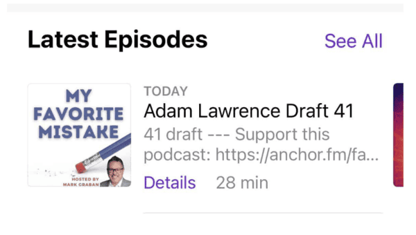
I've made that mistake before with a podcast episode, hitting publish instead of draft (as I wrote about here). I was able to unpublish it without too many problems. The worst thing is that the episode appeared in some people's podcast apps before the audio disappeared, when I again saved it back to draft, which probably threw an error message if they tried to hit play in their app.

Having to unpublish a book would cause more problems with Amazon, I bet.
EDIT: Based on some Google searching, it seems like this happens a lot and it's easy to unpublish immediately if nobody has purchased it. This depends on you noticing right away that you hit the wrong button by mistake. I'm guessing that Amazon sends an email to you announcing that your book has been published.
This seems like a form of “mistake-proofing” where the system has been designed so the user can easily detect and undo a mistake. We can call that a mitigation strategy.
Better yet is preventing mistakes.
Telling people, including me, to “be careful” is not a fully effective strategy…
Maybe Amazon could move those two buttons to be a little further apart. The bright yellow “Publish” button is still likely to draw your eye and your mouse to it, even if you intend to click “Draft.”
It's called human error. Some ask, “Well, what can we do since people are imperfect?”
We must recognize that humans are imperfect and then design systems that prevent error (protecting us from ourselves instead of just throwing up our hands in frustration). Instead of being resigned to human error… work to prevent it through better systems and better design.
When I posted about this on LinkedIn, I got an insightful comment from Sid Atkinson:
“Developers and testers typically experience these workflows so often that they forget that many of us will only ever perform some of these tasks once. The number of non-intuitive workflows or things that utterly lack clarity fills oceans.
I think this will be one of the biggest steps forward we'll make in these experiences will come from the interfaceless app – i.e. LLMs/ChatGPT will allow us to talk to something to accomplish our goals, with more human-esque validation happening prior to an activity being completed.”
Keep this in mind if you're the designer of software or other interfaces. Instead of saying, “Well, the human user shouldn't do that,” make it harder for them to do the wrong thing (and make it easier for them to do the right thing).
What do you think? Please scroll down (or click) to post a comment. Or please share the post with your thoughts on LinkedIn – and follow me or connect with me there.
Did you like this post? Make sure you don't miss a post or podcast — Subscribe to get notified about posts via email daily or weekly.
Check out my latest book, The Mistakes That Make Us: Cultivating a Culture of Learning and Innovation:


