I recently saw this article in the Washington Post:
This MLB season, the ball is making everyone batty
Major League Baseball has been trying to reduce variation in the production of the balls that are used in games, as I've written about before. Before getting to the related chart that was in the article, and my discussion of it, let us look at the underlying issue or concern.
Here is a post from 2018:
They've been trying to reduce variation even if all baseballs were “in spec.” Their cause-and-effect hypothesis was that increased variation — namely the center of the ball being off center — means the ball spins more and flies further, leading to more home runs.
From the recent WaPo article:
“MLB confirmed it had made changes to the baseball ahead of the 2021 season, then admitted it had used two different balls because of production issues caused by the pandemic.
Those issues are resolved now, according to an MLB official who spoke on the condition of anonymity. That official explained that MLB reworked the baseball before the 2021 season so that it would have a lower and more consistent coefficient of restitution, or COR.”
Again, the balls were “in spec” but the variation wasn't centered around the center of the spec:
“…while the baseballs the league used in 2019 and 2020 had a COR that was within the range specified in the rule book, they were averaging a number in the high end.”
There are some process improvement ideas from those who handle the baseballs most — the pitchers.
“Multiple pitchers suggested a more standardized process of rubbing the balls with mud before use, and MLB has seemingly begun trying to embrace that suggestion: Instead of having to complete the process a few days ahead of time, the baseballs now must be mudded the day of the game.”
They're also doing experiments (small tests of change) to get feedback from minor league pitchers:
Similarly, a pre-tacked ball is being tested in the Texas League, the second recent attempt at a prototype to help meet pitchers halfway. If that ball is well reviewed and big leaguers decide they like it, too, it could arrive as soon as 2023 — but pre-tacked balls introduce new variables, too.
All they can do is test these different changes out in practice. Do they have too many countermeasures in play at the same time? Does that muddy their ability to understand which countermeasures had a positive effect?
One measure that's worth looking at is a league-wide aggregate stat called “OPS” — On-Base Percentage plus Slugging.
The article talks about that statistic (or metric) using words… a very inefficient way to explain what's going on:
“Through the season's first month, major league hitters had a combined… .629 on-base-plus-slugging percentage, the lowest since 1981.”
The lowest since 1981 is a fact, but is it helpful to know this?
Words also might say “there has been a huge drop in 2022 compared to 2021.” What is meant by words like “huge” or “precipitous”?
What if we say “it has fallen from last year's .701 and it's even lower than 2019's .747 OPS.”
Like any statistic, there's going to be variation. How much is normal?
As we see with all sorts of measures, showing a simple line chart (aka run chart) and more data points gives us so much more context instead of just looking at a few data points.
Thankfully, the article has such a chart (and if you're on the article page, mousing over the chart shows you the numbers for a particular year, if you're interested.
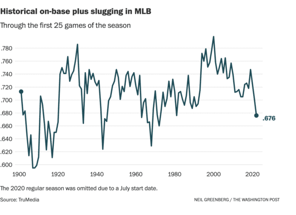
How many words would it take to describe this chart?
OPS has been pretty consistently falling since in all time high of .798 in the 2000 season. By that, I mean it's fluctuating around a downward trend — it's up some years and down others. Has the rate of decline increased or is there just more variation around that downward trend for various reasons?
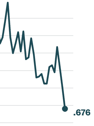
Often, the speculation about the reasons for such changes would be inserted here.
More words would be needed to describe the chart. There was a huge increase from 1993 to 1994, which was right after the work stoppage the killed the 1993 World Series and it also coincides with the “steroid era” in MLB. So maybe OPS was dropping due to PEDs being tested for and players getting suspended for this, leading to less use.
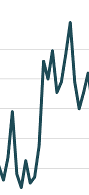
Again, I'm combining the description of the data with the supposed cause-and-effect. Talking about suspected causes of the change does require words, but the chart can show us when shifts of trends seem to start and end.
The OPS number had been fluctuating around a pretty stable average from 1970 to 1993, with some years being higher than others. It's probably not worth trying to explain what looks like “common cause variation” in that timeframe. Again, sometimes the number is going to be higher than other seasons.
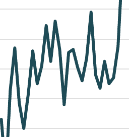
But, the OPS number had been falling sharply during the 1960s after a previous period of pretty routine fluctuation.
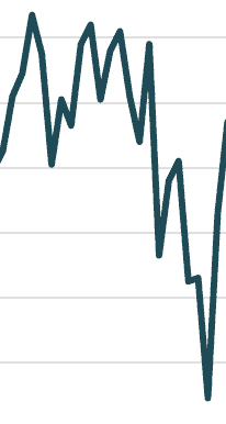
Why did it drop? Was it due to more expansion teams being added? There are new expansion teams in the 1990s and OPS went up… so is that a reasonable cause-and-effect over time? Or were circumstances different each time?
Going back to 1901 and looking through the 1940s, there are pretty wild swings up and down.
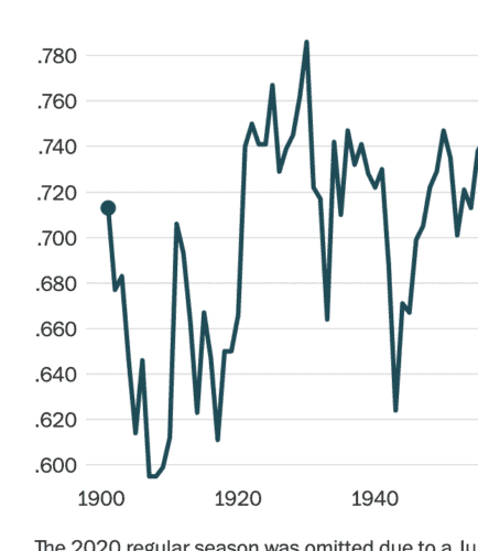
The so-called “dead-ball era” was from 1900 to 1919 and OPs fell by more than 100 points. Then, it jumped back up for a few years. Then it fell to a low in 1917. Then, Babe Ruth started hitting a ton of home runs and other players followed — was it due to changes in the ball or an increased willingness to “swing for the fences?
OPS then fluctuated again for a while, before dropping sharply from 1930 to 1933 – a different “Great Depression”? Then it jumped up and fluctuated from 1934 to 1942, before having a huge decrease in 1943. Was this caused to World War II and some great players going off to serve in the war?
Then the number jumped back up.
Whew, it's exhausting to try to use words to describe that chart. If I were including year-to-year detail, it might really take 1000 words.
The line chart (or run chart) tells so much in a much more efficient use of space.
A list of numbers would take up a ton of room and it's really hard for humans to process a list of numbers. It's much easier to see trends in a chart. Stats via BaseballReference.com.
I also shared the chart and shorter commentary on LinkedIn last week if you'd like to take part in the discussion there:
What do you think? Please scroll down (or click) to post a comment. Or please share the post with your thoughts on LinkedIn – and follow me or connect with me there.
Did you like this post? Make sure you don't miss a post or podcast — Subscribe to get notified about posts via email daily or weekly.
Check out my latest book, The Mistakes That Make Us: Cultivating a Culture of Learning and Innovation:


