Shout out and hat tip to Dan Markovitz for his excellent blog post:
“WHEN LEADERS TORTURE THEIR EMPLOYEES“
He makes a strong case that displaying three months of customer satisfaction this way might lead to a lot of wasted effort and frustration. Below is just part of the photos that he shared — and please read his blog post and see the full picture. I'll add comments below.

Three data points don't show “the full picture” of performance, of course.
As Don Wheeler says:
“Data have no meaning without context.”
Three data points don't give us much context. That's the trend (if any) over time? How do those numbers compare to similar Starbucks locations? That said, we do have to be careful when comparing sites…
With three data points, all a manager can do is react to each data point. In November, they might ask, “Why is the score lower than October?” They might exhort workers to do better at getting to know the customers. Spending more time with each customer might, then, slow down service — and “speed of service” is another thing customers are surveyed on.
The manager might get more frustrated when seeing the December score. “Why is that even lower now?? I thought I told you to get to know the customers! Make more of an effort!!!”
The January number might then be 35%… and the manager might claim they've turned the corner and things are getting better. The manager might take credit and tell the District Manager that there's a clear improvement trend.
Or is there?
My recommendation to Starbucks, as Dan also said, would be to put numbers like this (if you're going to look at them) into a “Process Behavior Chart” (as I recommend in my book Measures of Success). I agree with Dan's recommendation that weekly numbers might be better — as long as we're not just reacting more frequently to each weekly number.
Process Behavior Charts help us separate signal from noise in our metrics. We shouldn't ask people to explain noise.
Dan's headline is an attention getter… but I bet he'd agree that managers (and Starbucks executives) aren't trying to torture the employees. They just don't know a better way to manage… but a better way exists.
I'll give Starbucks credit for not posting an arbitrary target for each store. I'm also happy they aren't color coding the numbers against the target and they aren't posting emojis with each number.
That said, I agree with Dan that a Process Behavior Chart (one for each metric, actually) would help.
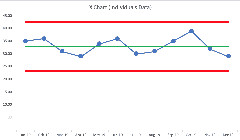
I'm going to make up some numbers for the purpose of creating a Process Behavior Chart:

It's quite possible that the number is just fluctuating around an average over time. There are no “signals” to be found in 12 months of data. It's all “noise.”
Asking, “Why was the number bad in December?” won't lead to any helpful information. If the PBC looks like the one above, there's NO special cause (or “root cause”) for any single data point. There are no trends in performance.
Asking, “Why was the number better in October?” won't give us a meaningful answer — there's nothing to learn from October.
Explaining each month's number, in the scenario above, is literally a waste of time.
The PBC does suggest that the performance in future months will fall anywhere between about 24 and 44 — unless the system is changed.
Now, if management wants performance to be higher, they should be asking:
“What can we do to improve the system?”
This is different than asking employees to care more or to try harder.
By reacting to every up and down, that's what I call “the metrics rollercoaster” in Measures of Success.
“People often feel like they're on a proverbial performance roller coaster. There are a lot of ups and downs. There's anticipation, excitement, and sometimes yelling — whether from excitement or fear. The emotional roller coaster of metrics and the way leaders react (or overreact) to them can be exhausting. This book is meant to help you get off the performance roller coaster, both stabilizing and systematically improving your results instead of ending up right back where you started.”
– Mark Graban, Measures of Success: React Less, Lead Better, Improve More
If you take hot coffee on the metrics rollercoaster… you're likely going to get burned.
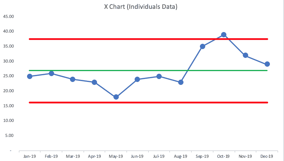
Now, it's possible that the PBC would look like this:

In that case, the “voice of the process” is saying something very different.
We see clear signals that show us the system changed during the year. The first eight data points are below the average. Then, it appears the system changed in September, as we now see that October's data point is above the calculated upper limit — more evidence of a signal… showing us the system has changed in a meaningful way. The data is NOT randomly fluctuating around a single average over this timeframe.
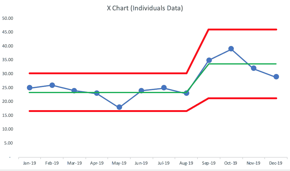
If the system change is being sustained, the metric might now be fluctuating around a higher average than it had been before:

We can now predict that future performance will probably fall between 21 and 46. The average is higher, but there's also more variation. This is important and helpful to know.
Either way, we need more than three data points. We would do better by visualizing the data in a chart (even a simple “run chart”) and we need to learn to not react to noise.
React Less. Lead Better. Improve More.
Here is the LinkedIn discussion that was triggered by my initial sharing of Dan's post:
Please scroll down (or click) to post a comment. Connect with me on LinkedIn.
Let’s build a culture of continuous improvement and psychological safety—together. If you're a leader aiming for lasting change (not just more projects), I help organizations:
- Engage people at all levels in sustainable improvement
- Shift from fear of mistakes to learning from them
- Apply Lean thinking in practical, people-centered ways
Interested in coaching or a keynote talk? Let’s talk.
Join me for a Lean Healthcare Accelerator Trip to Japan! Learn More


Thank you Mark for explaining the right use of metrics by Process Behiour Charts in this blogpost. It helps us readers to be more aware of the correct use of data and metrics in de daily management of our business.
Comments are closed.