This post is Part Three of a series on using Process Behavior Charts for snapshot comparisons (of individuals, departments, or organizations) instead of the more common-use with time-series performance metrics over time. Check out all of the posts in the series.
I'll talk about this method, along with more examples of Process Behavior Charts in my next free KaiNexus webinar.
In the last post, I used an example where we compared post-op complication rates for different knee surgeons. In the two organizations we looked at, none of the doctors were “outliers” or “signals.” Their results seemed to be within the range of performance that is driven by the system as opposed to being driven by individuals.
Individual Performance in the Red Bead Game
Let's look at a “system” — the Red Bead Game — where performance is absolutely driven by the system. The number of red beads (defects) that are on each “willing worker” paddle each time is essentially a random number.
In the game, the three willing workers who produced the most defects (out of an employee population of six) get fired after round three. Those who survive for being above average get to play twice more.
Here are the flipchart / whiteboard results from the last six times I've facilitated this:
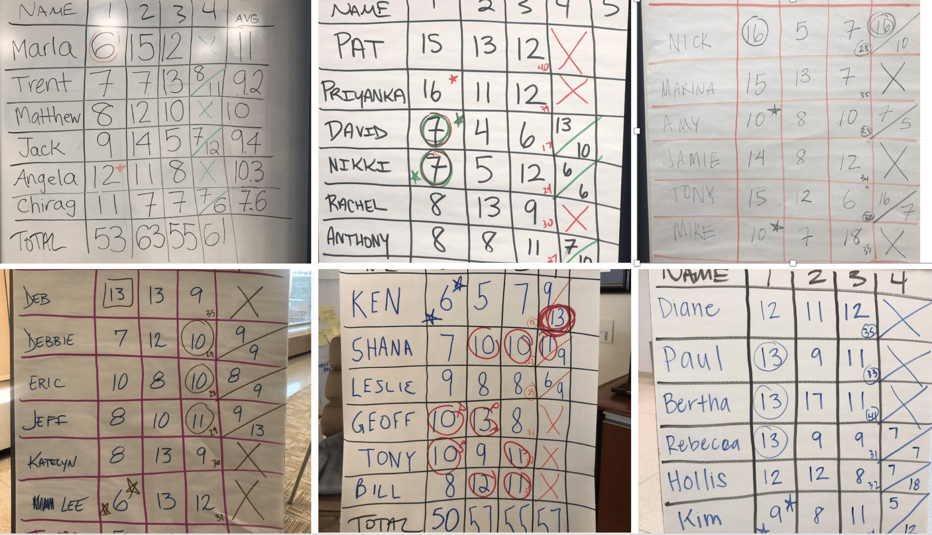
Lists of numbers aren't super helpful for metrics, so we can draw Process Behavior Charts as a better alternative.
When we plot the number of red beads that are drawn each time as a time series, it looks like these graphs (just four of the recent times):
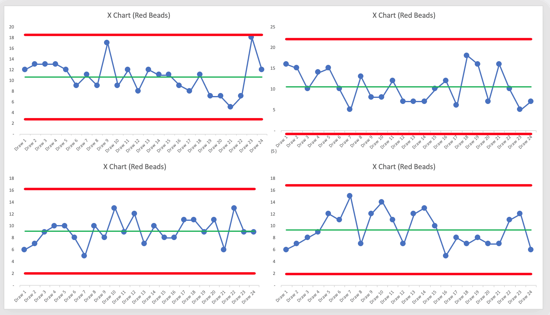
The Process Behavior Charts show that the results are all “noise.” There's rarely a “near signal” (see the upper left chart where one draw of 18 red beads was just below the calculated Upper Natural Process Limit). I think I've seen a “false signal” just once.
Remember, seeing “noise” tells that nothing is changing in the underlying system. There's always going to be variation in a metric. The Process Behavior Chart tells us how much variation is routine or typical. This allows us to filter out noise and we can look for “signals” that the underlying system has changed in a significant way.
When we looked at the surgical complication rates last time, it reminded me of a story I told in my book Measures of Success.
When I've facilitated workshop debrief discussions after the Red Bead Game, I always ask, “What are the ‘red beads' in your work?”
In one session, the Chief Medical Officer of a large medical center said:
“I think all of our patient safety measures are ‘red beads.' Sometimes those numbers are higher and sometimes they are lower. I'm not sure what to do about it.”
Back to the Red Bead participants. Instead of plotting a single time series, I decided to slice-and-dice the data differently, looking at the average number of defects for each willing worker. This might be similar to the complication rates of surgeons, as uncomfortable as that idea might be.
If I have their names in alphabetical order (remember, any random order will do), the chart looks like this:
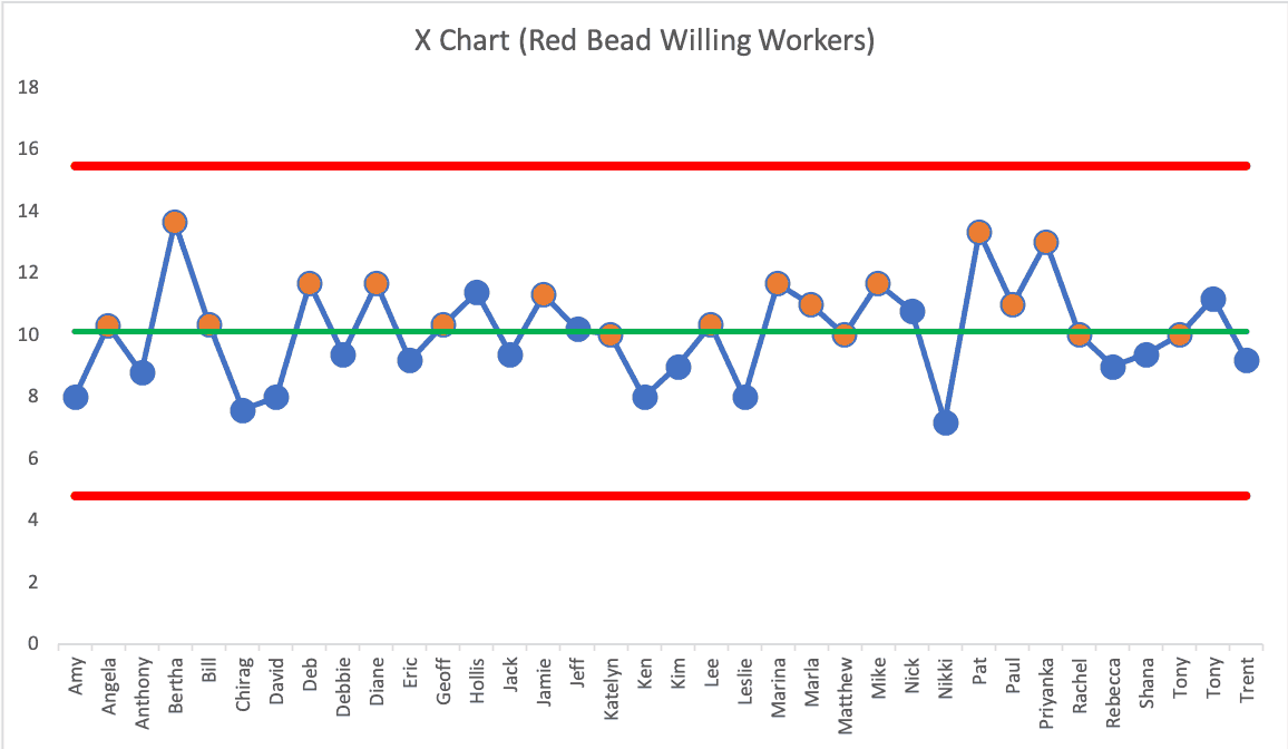
The averages for the 36 people are all noise. All of the performance is driven by the system and its inherent variation and randomness.
Each person would likely get an average between the calculated limits of 4.82 and 15.47 (so between 5 and 15). If a person had an average of four or less, you might well suspect them of cheating.
The orange circles are the people who were fired each time for being in the bottom half of performance in their group. Note that some of them are almost exactly average or slightly better than average for the entire population of willing workers.
Was it fair to fire those who were in the bottom half of performance? Of course people realize it's unfair in the moment as we play the Red Bead Game. Would it less unfair to fire just the bottom performer each time?
It's unfair or unjust to fire anybody in the Red Bead Game. Performance is driven by the system. Why should we fire or reward people based on randomness?
How often do we do things like this in the real world, punishing individuals, teams, or organizations for system-driven results?
Are These Baseball Teams Above Average Home Run Hitters or Historically Good?
I'm not trying to prove a point that says performance is NEVER driven by individual excellence. There are times when we can point to people or teams as being outliers — looking for signals in the midst of noise.
Last year, in the 2018 Major League Baseball season, the New York Yankees led MLB in home runs, hitting 267 as a team.
We could describe their performance in various text-driven terms, saying:
- That's 32 home runs more the 2nd highest team
- That's 44 percent higher than the MLB average
- That's more than twice as many home runs as the lowest MLB team
Those descriptions are true and, perhaps, interesting, but does it mean the 2018 Yankees are an outlier?
Here's a Process Behavior Chart with the 30 MLB teams in alphabetical order:
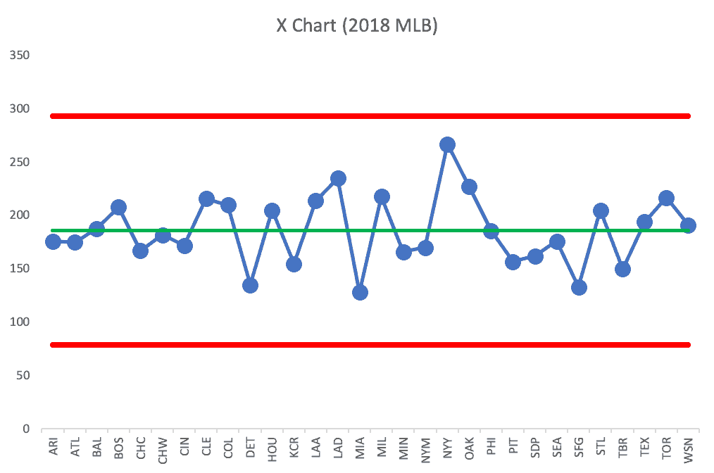
Every team, including the Yankees, is within the realm of noise. Now, we might rather be the Yankees (a very good team, home runs or not) than the Miami Marlins (who only hit 128)… but hitting home runs doesn't fully translate to winning. The Boston Red Sox won the World Series after hitting 208 home runs in the regular season.
When I thought back to a historical team that might truly be an outlier, I thought of the 1927 New York Yankees.
Here's the chart comparing teams in 1927:
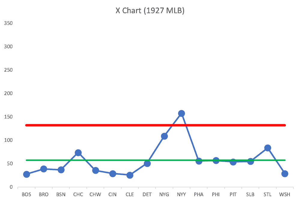
The Yankees are an outlier.
When we see a signal, that's an appropriate time to ask “Why?”
Why?
Babe Ruth.
Babe Ruth alone hit 60 home runs, which was more than 12 teams hit for the season (out of 17 MLB teams that year).
That was a historically legendary season for Babe Ruth and his team. We can ascribe their performance to a true outlier.
Does that mean true outliers are going to be that rare in our organizations? Maybe not.
Back to a Workplace Comparison Example
I have a data set from an organization that shows the number of Kaizen improvements that were implemented under each director through the hospital system. Here is that as a Process Behavior Chart with the names in alphabetical order:
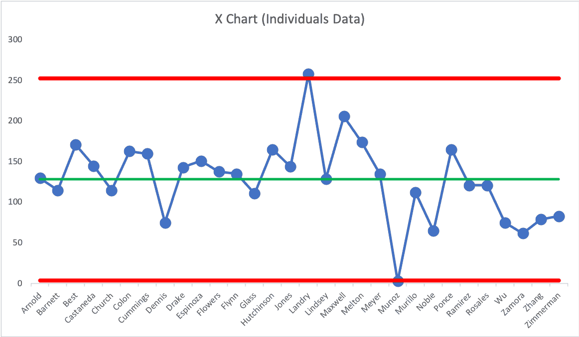
There's one director who is an outlier on the positive end, slightly above the Upper Natural Process Limit. It would be helpful for the organization to ask what that director is doing differently.
Likewise, there is one director who is an outlier at the low end, below the calculated Lower Natural Process Limit. This is a director who requires attention and coaching.
Everyone else's performance is driven primarily by the system. They're all in the middle part of what might not exactly be a bell curve (a Process Behavior Chart doesn't require normally-distributed data).
We shouldn't single out directors with “below average” performance. We likewise shouldn't choose some other arbitrary threshold like “the bottom 10%.” Some of those bottom 10% (all but the one outlier) are within the range of system-driven results.
If the CEO wants a higher Kaizen participation rate and average, they should think about what they can do to improve the system that is the organization as a whole, rather than blaming individual leaders (well, except maybe for one).
Please scroll down (or click) to post a comment. Connect with me on LinkedIn.
Let’s build a culture of continuous improvement and psychological safety—together. If you're a leader aiming for lasting change (not just more projects), I help organizations:
- Engage people at all levels in sustainable improvement
- Shift from fear of mistakes to learning from them
- Apply Lean thinking in practical, people-centered ways
Interested in coaching or a keynote talk? Let’s talk.
Join me for a Lean Healthcare Accelerator Trip to Japan! Learn More


