I grew up as a Detroit Pistons fan, back during the “Bad Boys” era of (the original) Isiah Thomas (not the guy who plays for the Cleveland Cavaliers today), Bill Laimbeer, Dennis Rodman, etc. In recent years, I've become a huge San Antonio Spurs fan, as I've blogged about.
The past few seasons, Andre Drummond, center for the Pistons, got a reputation as one of the worst free throw shooters in NBA history, as described in this USA Today article. At the time that article was written about two years ago, his career free throw percentage was just 38.6%.
That's incredibly bad. The current league average for all NBA players this season is 76.5% or almost exactly twice as high as Drummond's average. So what, you might ask? Being such a poor free throw shooter (and otherwise being an outstanding player) means that opponents could intentionally foul him, reducing the expected “points per possession” by putting him on the line, as described here:
The Rockets fouled Andre Drummond on purpose 12 straight times to begin the 2nd half, and it worked
To avoid this, the Pistons would sometimes remove Drummond from the game, losing a key asset.
As the USA Today wrote, having poor performance doesn't mean you're doomed to forever have bad performance:
“players like Karl Malone have proven that changing your free throw misfortune isn't an impossible task.”
Malone's free throw percentage his first two seasons was .481 and .598. He ended his 18-year career as a .742 shooter, just about league average.
Drummond's Annual Data
Andre Drummond worked really hard in the off season to improve – and it paid off:
“How Andre Drummond suddenly went from the NBA's worst free-throw shooter to a good one“
That article includes some video that shows the “before” and “after” of his shooting form. It's a great example of working on a new process as a way to get better results.
This year, his season-to-date FT percentage is .605. In the first month of the season, he was shooting .700, making about twice as many shots as his career average. He didn't go from “good to great” – he went from historically bad to just below average.
As I tend to do (and as I'm writing about in an upcoming book), I don't want to just see a few numbers and a few two-data point comparisons. I want to see a chart, a visualization of the data.
The data in a table isn't as compelling:
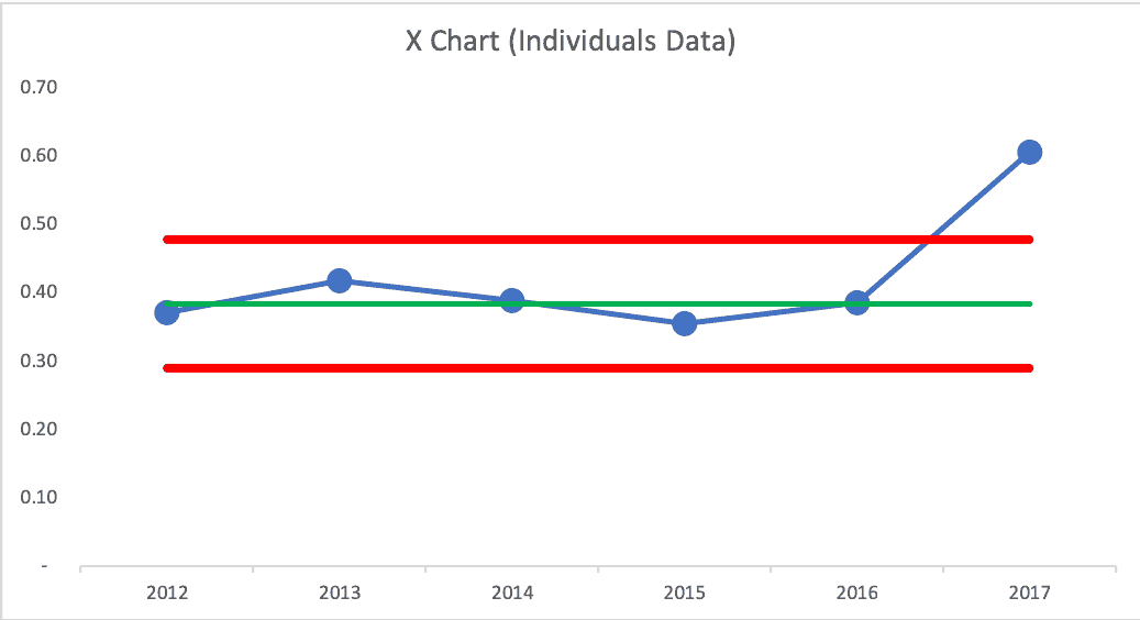
I created a “process behavior chart” where I plotted the data and added horizontal lines for the:
- Average
- Lower “natural process behavior limit”
- Upper “natural process behavior limit”
Those are calculated from the baseline data. Having just six data points isn't the most statistically valid process behavior chart (it's better to have 20 or 25 baseline data points).
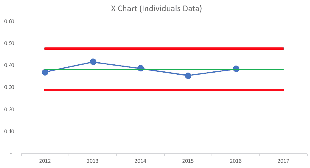
If we had drawn a process behavior chart with annual (season) data at the end of last season (just five data points), it would have looked like this:
The calculated limits (the red lines) would have said that our prediction for the next season is that he free throw percentage would likely be between 29% and 48%. Anything in that range could be likely due to chance and season-to-season variation.
This season at 60% would have been a “special cause” data point or a “signal,” meaning something changed in the system (and Drummond changing his form is clearly a change in the system).
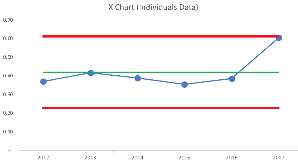
If we calculated the limits and drew a chart including this season's partial-season statistics, the calculated limits are wider. That last data point is very near the calculated limit suggesting there might be a signal there. Having just six data points makes the chart less precise than a chart with a larger baseline data set.
See my spreadsheet here if you want to check my work.
A better way might be to “lock in” the average and limits from the baseline of the first five seasons. That makes sense since Drummond has a new process for his sixth season. Evaluated that way, the sixth season is a clear signal that's an outlier compared to the first five years.

What About Monthly Data?
Using monthly data provides more data points that allow us to:
- Calculate more statistically valid limits (using 15 or 20 data points is better than 5) and
- Detect different types of trends more quickly
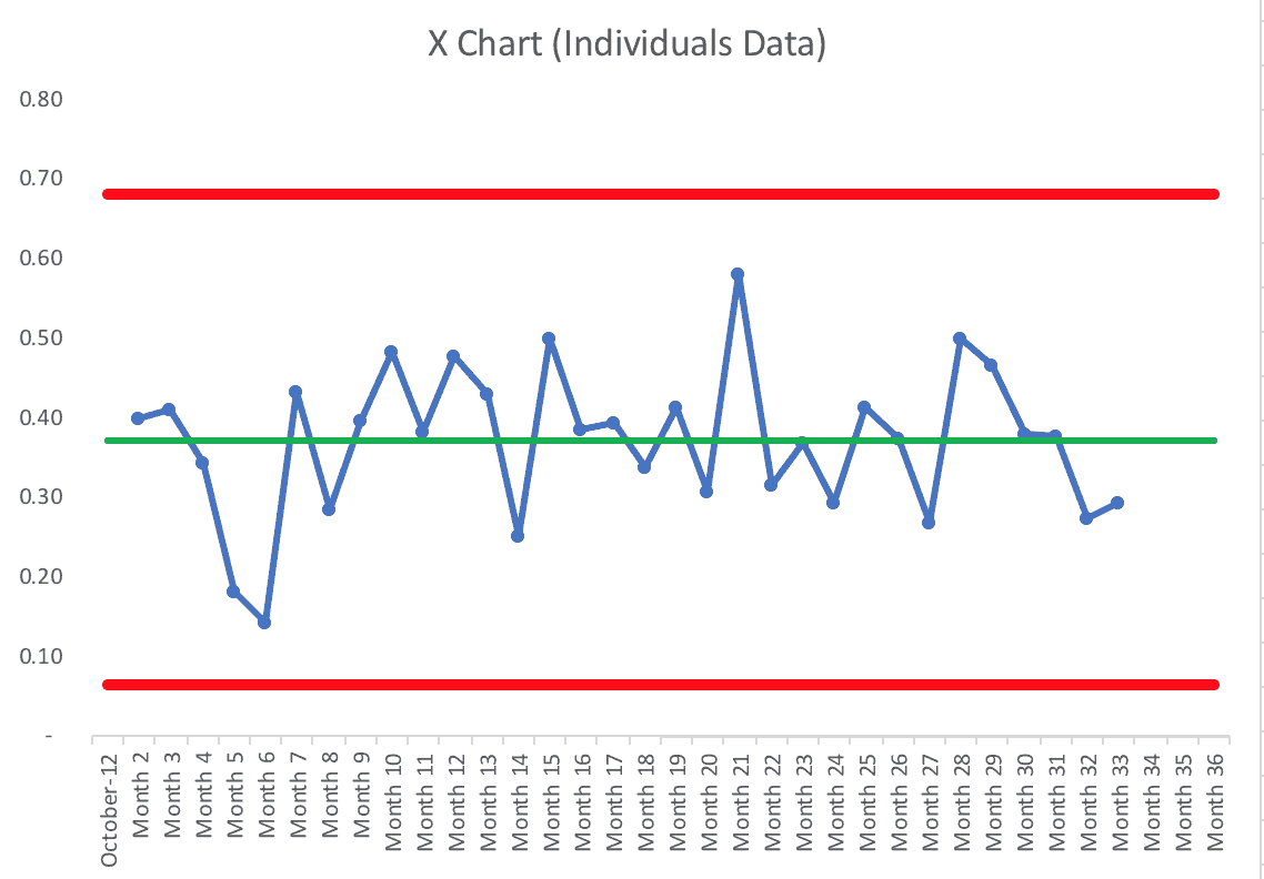
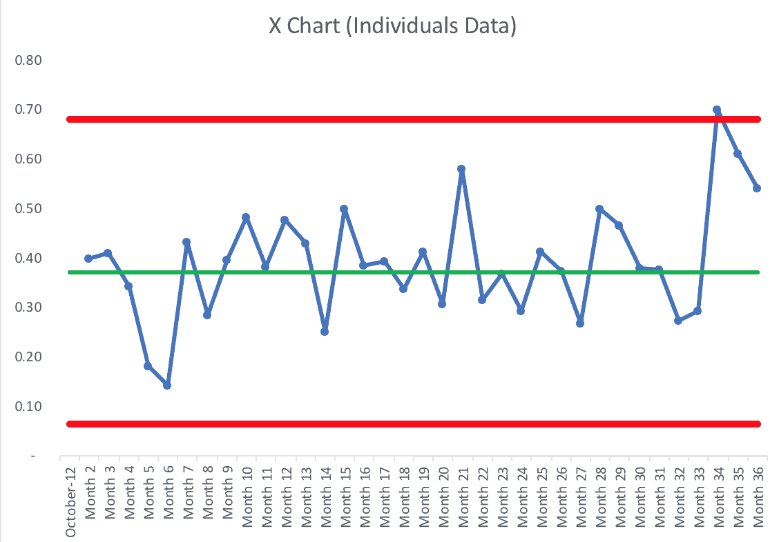
I calculated the average and the upper/lower limits based on the first 25 months of Drummond's career (using more data points for the baseline isn't much more valid or precise).
At the end of last season, his career monthly percentages chart would have looked like this:
We see the typical behavior of a stable and predictable system. Some months are better than others. We'd predict, going forward, that in any given month, he'd be likely to shoot between .064 and .680.
Now if we look at the first three months of this season, we see a data point (the first month of the season) that's very unlikely to be the result of randomness. It's likely a signal that something changed:
Looking at the chart, it does give me some concern that Drummond is regressing to the mean. Will he fall back into bad shooting form habits? Watching the process can help him manage his results.
Using the “Western Electric Rules,” that one data point above the upper limit is a signal. Another form of signal we'd look for is eight consecutive months above his old average (.372).
He might not now be a career 70% shooter, but even if he settles into a new average of 60%, that nullifies the “Hack a Drummond” strategy and makes Andre Drummond a far more valuable player to the Pistons.
For now, I'd say, “Yes, Andre Drummond IS a significantly better free throw shooter this season. A better process has led to better results.”
Please scroll down (or click) to post a comment. Connect with me on LinkedIn.
Let’s build a culture of continuous improvement and psychological safety—together. If you're a leader aiming for lasting change (not just more projects), I help organizations:
- Engage people at all levels in sustainable improvement
- Shift from fear of mistakes to learning from them
- Apply Lean thinking in practical, people-centered ways
Interested in coaching or a keynote talk? Let’s talk.
Join me for a Lean Healthcare Accelerator Trip to Japan! Learn More




There is also a fairly convincingly better method to shoot free throws – underhanded. As I stated in my post, Why Do People Fail to Adopt Better Management Methods?
https://management.curiouscatblog.net/2017/02/02/why-do-people-fail-to-adopt-better-management-methods/
“People can be very attached to the way things have always been done. Or they can just be uncomfortable with the prospect of trying something new.
…
Wilt Chamberlain was 28 for 32 from the line shooting underhanded in his 100 point game (the most points anyone has scored in a NBA basketball game).
He was a career 51% free throw shooter (almost entirely shooting traditionally).
But he had a good reason not to use underhand style more often. He felt like a sissy using that style and making them. I am sure the Boston Celtics were happy to let him focus on being scared of looking foolish while they won championships. You are correct if you don’t think I really meant he had a good reason.”
This reluctance to use better methods is not limited to underhanded free throw shooting. Managers fail to adopt better management methods every day that are equivalent to failing to improve free throw results using a proven method.
Great example Mark. I’m currently reading Matthew Syed’s ‘Bounce’, where he talks about the value of practice in high performance – Drummond has clearly practised in the off-season. However, Syed makes the point that is has to be ‘purposeful practice’ – where we aim for a consistent stable process, understand the sources of variation and work to reduce them and stretch our current abilities. All of which needs data for good feedback on whether it’s working or not – just the sort of thing you’re referring to here.
As the season draws to a close, Drummond is shooting free throws at 61.2% (or .612) for the season.
Nice demonstration of process behavior charts to guide improvement effort. I did a similar investigation of our local football team over the weekend. Their winning average over 103 years was 48%, and the last 20 years were no different. One signal only in the MR chart…
That sounds like a good application of this methodology… does that help fans or a team owner avoid overreacting to one “bad” season? When a team keeps firing coaches and doesn’t improve performance, maybe the problem is not the coaches?
Comments are closed.