As I've been writing about “process behavior charts” – a simple, yet effective method for charting and reacting to (or not overreacting to) metrics, it's made curious what some of the modern Toyota books say about metrics and performance measures…. or at least the first two in The Toyota Way series.
The Toyota Way
Jeff Liker‘s book The Toyota Way is one of the seminal modern books about Lean and the Toyota Production System.
Searching the Kindle edition for the word “metric,” I first find an appropriate warning against traditional top-down command-and-control management methods that look only at metrics and then pressure people to do better. Metrics, even using the process behavior chart methodology are NOT a substitute for going to the “gemba” and engaging everybody in improvement.
“How effective can you be if you are trying to run the organization through command and control without any intimate understanding of what is going on? Your only choice is to make a lot of rules and policies and measure performance relative to those rules and policies. This leads to metrics-driven management that takes the focus away from satisfying customers or building a learning organization.”
Liker, Jeffrey. The Toyota Way: 14 Management Principles from the World's Greatest Manufacturer (Kindle Locations 3513-3516). McGraw-Hill Education. Kindle Edition.
Used properly, process behavior charts help a team better understand their own process and it should prevent managers from asking for too many explanations about “what went wrong yesterday?” when it was just noise in the measure.
There's a section in the book about the “role of metrics” at Toyota. Of course Toyota has metrics:
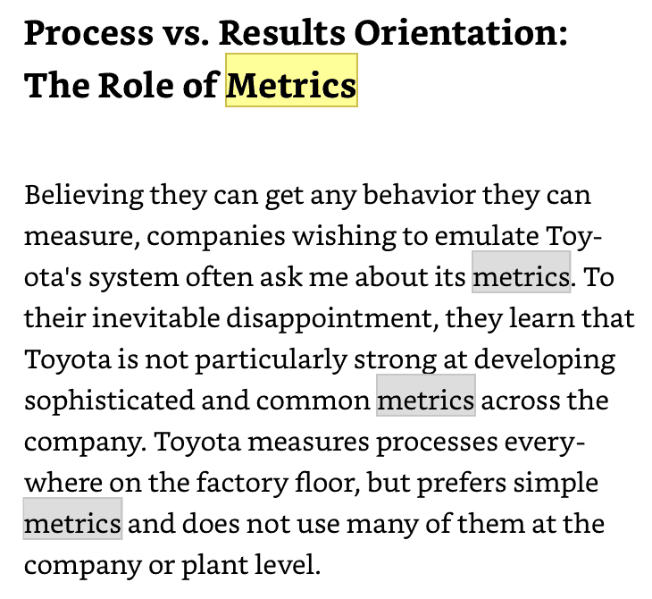
I know, from visiting Toyota plants, that tour guides have said that the company teaches every employee the seven basic Q.I. methods, which includes “control charts” (the same idea as “process behavior charts” – using the Wheeler term that he coined). Toyota can use statistical methods without formally practicing Six Sigma.
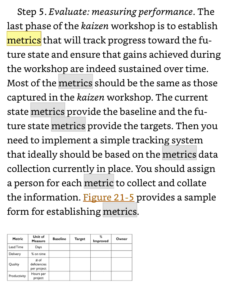
In a later section on process improvement metrics, Liker suggests using “baseline” and “target” numbers, along with a “% improved” – basically a two-data-point comparison.
As I've blogged about before, I'd rather see a run chart or a process behavior chart instead of a simple before-and-after:
With a simple before and after, there's too much opportunity for “cherry picking” numbers, something they'd call “success theater” in the Lean Startup movement and I'd be surprised if Toyota would allow much of that.
I think a process behavior chart, like the one below, that shows a shift in the average performance is more compelling than a before and after.
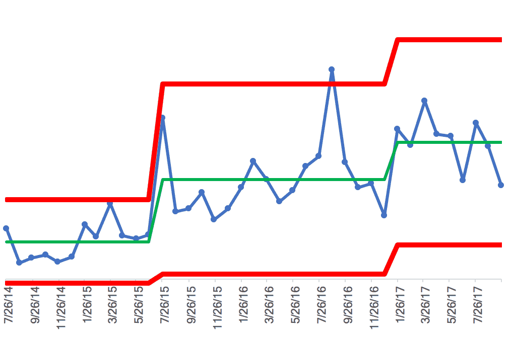
The book doesn't give much specific guidance about how to visualize metrics or how to react to them (or how not to overreact).
There's nothing in the book that comes up in a search for SPC, statistical process control, or control charts:

The Toyota Way Fieldbook
The follow up field book, co-authored by Liker and former Toyota manager David Meier, does talk about the need to visually manage metrics.
The book talks about how, for example, the number of Kaizen events conducted is probably not a very good measure of success with Lean or as an organization. The book makes reference to “lean metrics”:
“…such as lead-time, first-time quality capability, and overall equipment effectiveness (OEE). Worker morale is determined by conducting a survey.”
Liker, Jeffrey; David Meier. The Toyota Way Fieldbook (Kindle Locations 8421-8422). McGraw-Hill. Kindle Edition.
I was surprised to not find the acronyms SQDC or SQDCM in the book (Safety, Quality, Delivery, Cost and Morale). See this post on SQDCM:
The book also says, and I agree, that you “can't measure your way to a lean learning organization, but metrics do play a critical role in any improvement process.”
Liker and Meier recommend “SMART objectives,” and they emphasize the importance of intrinsic motivations, not just chasing metrics or offering rewards for hitting them.
If improvement were as easy as setting goals and offering rewards, then hospitals wouldn't have infections or long waiting times in the emergency department. The CEO would just set a target and then dole out rewards or punishment. But, the real world isn't so simple.
The book advocates for the use of “simple visual trend charts.”
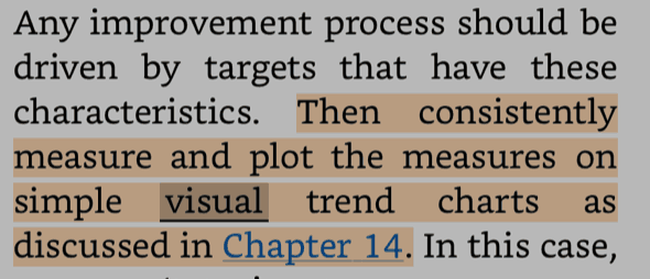
Chapter 14 shows some examples of “visual trend charts:”
The book says:
“The trend graph should include enough historical data to show how long the condition has existed (for long-term performance improvement opportunities a minimum of six months is recommended if available). The data should be displayed so the characteristics of the problem are seen.”
Liker, Jeffrey; David Meier. The Toyota Way Fieldbook (Kindle Locations 7092-7094). McGraw-Hill. Kindle Edition.
I agree with the idea of showing a good amount of historical data. If you have weekly measures, six months is 26 data points, which is a good baseline for seeing trends (in a statistically valid sense).
The book says we should understand if the performance appears to be:
- getting better
- worse, or
- staying the same
Process behavior charts give us a simple, yet valid methodology to determine this without guessing, eyeballing it, simply comparing to a target in a red/green way, or using dubious linear trend lines.
The book has an example of a chart:
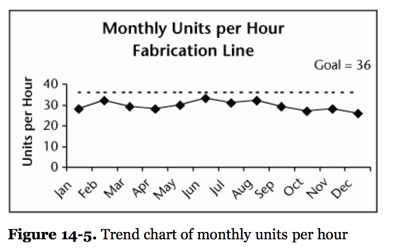
It's good that it's a run chart (a line chart, as opposed to a bar/column chart). The process is not meeting the goal, even for a single month.
There are two questions to ask when looking at a chart:
- Is the process capable? Is it meeting the target some or all of the time?
- Is the process stable and predictable? Do we see any “signals” or do we only see “noise” in the data?
What they showed in The Toyota Way Fieldbook only allows us to answer the first question. It's not hitting the goal. But is the process getting better, getting worse, or staying the same?
It appears that it's staying the same over time. We can draw a process behavior chart with calculated upper and lower limits… this helps us see an answer to the second question:
As I had suspected, this looks to be a stable and predictable process, since there are no data points outside of the limits and no apparent trends. I did my best to determine the numbers from the book's chart. Here is my spreadsheet.
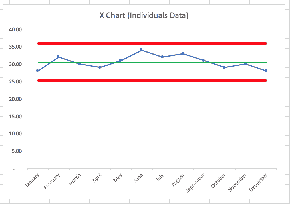
I think the “simple visual” chart in the book isn't made too much more complicated by adding calculated limits and an average. It's more visual, I think.
The use of process behavior charts can help meet this objective from the book:
“The goal is to portray the situation so an accurate assessment is possible. This is best achieved using actual facts and not assumptions or “feelings.”
Liker, Jeffrey; David Meier. The Toyota Way Fieldbook (Kindle Locations 7100-7101). McGraw-Hill. Kindle Edition.
Seeing the actual situation (and not “success theater”) is an important stage in the improvement process.
The book says that problems should be prioritized based on these criteria: Importance, urgency, and tendency.
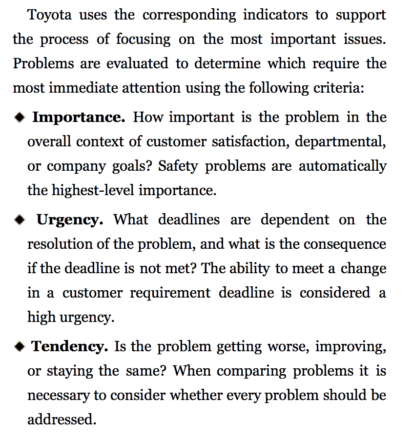
Importance and urgency are a matter of opinion and judgment calls. Some of the importance and urgency might depend upon where targets or goals were set. The size of the gap between “what should be happening” and “what's actually happening” might increase importance or urgency.
But, “tendency” should be determined through process behavior charts, not judgment or guesses.
If we have a metric with a lot of points outside of the calculated limits, that's not a stable and predictable system. We can use root cause analysis and other methods to reactively work on eliminating the “special causes” of signals.
But, we often have a metric that's “staying the same” – it's just fluctuating around an average that might be lower than our target or goal. We still have importance and/or urgency here, even with no tendency.
Improving a stable and predictable process is done by:
- going to the gemba,
- talking to the people who do the work, and
- involving everybody in systemic improvement.
We're not likely to improve a stable system by asking “why was December a bad month?” The same system that generated June's higher results also generated December's lower results.
We have to improve the system. That means using an A3 or doing other more calm, less reactive improvement work. If the system gets better, we'll see it in the process behavior chart. We can see signs of or signals of statistically-significant improvement instead of just feeling like it's improving.
What do you think? Do you recall any of these topics being discussed in any of the Toyota books? Other Lean books? Books specifically on Lean daily management?
The lack of coverage of SPC and related methods in the Lean literature is a big part of the reason I'm going to be working on this book project that's still being defined. I'd love to get your input and thoughts on it.
Please scroll down (or click) to post a comment. Connect with me on LinkedIn.
Let’s work together to build a culture of continuous improvement and psychological safety. If you're a leader looking to create lasting change—not just projects—I help organizations:
- Engage people at all levels in sustainable improvement
- Shift from fear of mistakes to learning from them
- Apply Lean thinking in practical, people-centered ways
Interested in coaching or a keynote talk? Let’s start a conversation.


LinkedIn Comment(s):
Andre DeMerchant
Another comprehensive and timely post………thanks Mark! I was reminded yesterday that Dr. Shigeo Shingo said: “the best approach is to dig out and eliminate problems where they are assumed not to exist.’ Metrics playa key role in pointing the way to these problems, it is important that they are ‘honest’ and tell the whole story, not just illustrate the story we WANT to tell.
My reply:
Thanks, Andre DeMerchant! I agree about the honesty, looking at “the voice of the process” and what the data is saying rather than trying to manipulate data (or our visualization of it) to tell the story we want (or need) to tell. When I did the Red Bead Experiment at Lean Startup Week, Eric Ries made some great comments in the debrief about the ethics involved in presenting data properly and honestly. I’d also tie it back to the Toyota Way and long-term thinking — if you’re using metrics to try to snow your VCs or investors, are you really helping yourself in the long term? I guess sometimes corporate leaders or entrepreneurs get forced into “survival mode” where they can’t focus on the long term?