As regular readers know, I recently had LeanBlog.org redesigned, as I blogged about here. During the project, the service provider who partnered with me set up some “dev” or “staging” sites on my website host's server. Those servers allowed them to do work in a way that didn't disrupt the “live” LeanBlog.org site. It also allowed us to experiment with changes in a safe environment.
Along the way, there were three development spaces that accumulated. As part of the go-live process, I was able to delete those development sites through my host's website.
And, when I did so, I discovered some error proofing that prevents me (or I should say makes it harder) for me to delete the wrong site. Deleting the live website would be catastrophically bad. The host shouldn't make it easy to delete anything from the servers… and it should go beyond an “Are you sure?” software prompt.

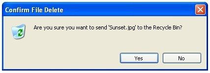
With that single prompt, it's too easy to click the wrong box (I know I've done it). We can't just tell people to “be more careful.” We don't want a bunch of annoying “are you sures” in succession.
To learn more about mistake proofing, I suggest visiting Prof. John Grout's mistakeproofing.com website. If you're in healthcare, you'll want to download his free eBook on healthcare mistake proofing.
Also, see my blog posts on this topic.
An Earlier AA.com Example
A few years ago, I pointed out that the American Airlines reservation website made it too easy to cancel the wrong flight (something I might have done). The rows with flights were really tightly spaced and the “confirmation” screen didn't say which flight you were canceling. The Windows file delete at least shows you the file name.
So I had blogged about the AA.com problem here:
I Wish American Airlines Would Error Proof This on Their Website
To my surprise, American Airlines took my suggestion and ran with it… they even thanked me, as I blogged about here:
The Web Host's Error Proofing
Here are the steps that are required to delete an install (these screen shots were taken after I deleted the first dev site and noticed the error proofing or mistake proofing.
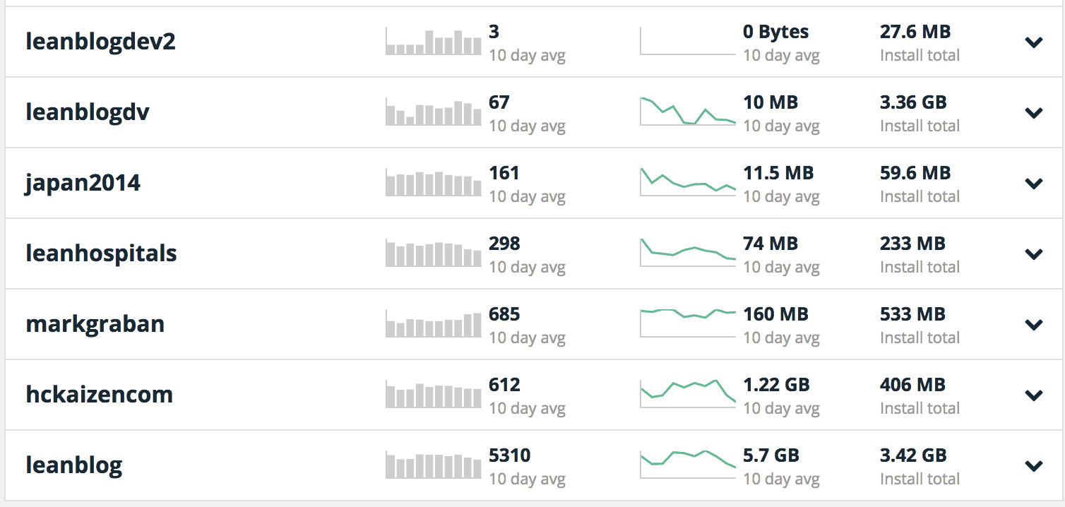
First, click on the correct install name. They're in alphabetical order, so the live site is first in the list. They're spaced further apart than the old AA.com reservation list… leanblog is the one I do NOT want to delete.

So, I took an additional error proofing step — clicking a head to sort the sites by the amount of bandwidth consumed. That would put the live site far away from the dev sites, as you see here:

Now, I'd feel safer about clicking on the correct one, “leanblogdev2.” So, I did that.
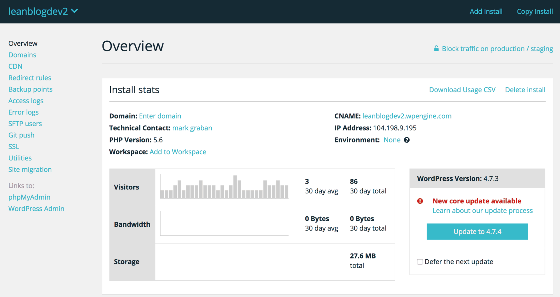
I then had to click on “Delete Install” on a screen that allows me to confirm that I've clicked on the correct site since it says “leanblogdev2” in the upper left.

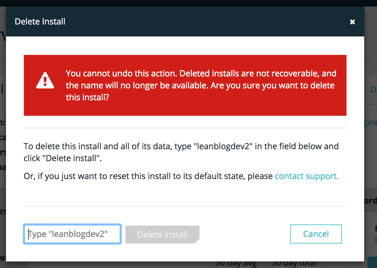
The site gave me an “are you sure?” warning. But it almost makes type the name of the site as a way of giving positive confirmation that I'm not accidentally deleting the wrong one.

And that's it. Deleted. The correct one.
Lessons for Other Software Users or Providers
Error proofing, in general, is about making it easy for people to do the right thing… and making it difficult (or, ideally, making it impossible) to do the wrong thing.
Do you use software that's not error proofed? Do you have to rely on being careful? What can you do to be an advocate for the software being improved?
What if you're a software company or developer? Do you take seriously the responsibility of mistake proofing or error proofing your software? How much “user error” can you help prevent?
Please scroll down (or click) to post a comment. Connect with me on LinkedIn.
Let’s work together to build a culture of continuous improvement and psychological safety. If you're a leader looking to create lasting change—not just projects—I help organizations:
- Engage people at all levels in sustainable improvement
- Shift from fear of mistakes to learning from them
- Apply Lean thinking in practical, people-centered ways
Interested in coaching or a keynote talk? Let’s start a conversation.


