Reminder: You can register to view a recording of the free webinar I presented, hosted by the good people at KaiNexus:
How to Manage Your Improvement Metrics More Efficiently and Effectively
One topic that I didn't have time for in today's workshop is a relatively minor point, but something I wanted to get your thoughts on.
I'm talking about the use of “bar charts” vs. “line charts” when tracking performance measures through Lean Daily Management, Strategy Deployment, or other methods.
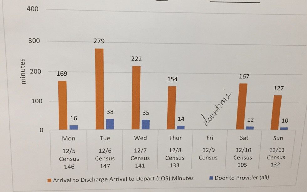
More often than not, when I see Lean Daily Management boards in my visits, I see more of what's commonly called “bar charts” than anything, like this:
or this:
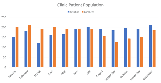
Most people call them “bar charts,” but the technical term for vertical bars is “column charts” (as they are called in Excel). Bar charts have bars that run horizontally, instead of vertically.
Back to the chart above… don't get me wrong… I'd rather see daily metrics being charted in ANY way, rather than not at all — or being charted monthly, which is far too infrequent to be used for much improvement. This is probably in the category of nitpicking instead of more meaningful criticism – such as the times when people interpret charts badly (one of the themes of today's webinar).
When I was taught to track performance measures, it was always as line charts.
For one, they're easier to draw when done by hand (and I sometimes happily see this in hospitals). It's an outgrowth of drawing Statistical Process Control (SPC) charts by hand on the factory floor (as I saw at GM, even before anything Toyota/Lean was being adopted).
Secondly, I think line charts are better for reading and seeing trends.
I subscribe to the view that's shared in the helpful book Meaningful Graphs by James M. Smith, PhD.
Smith writes:
“Column charts are primarily used to convey data on discrete categories (hospitals, wards, clinics, etc). They can also be used to display data over time periods but only for a limited number of time periods [up to 8].”
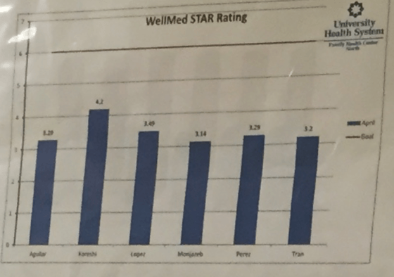
Here is an example of what I think (and Smith would agree) as a good use of a column chart – a static comparison in a point in time… it's a good use of a column chart in the wild, comparing the ratings of (I think) different physicians. Again, this is a snapshot in time, not a time series.
Smith writes:
“Line charts are ideal for showing trends over time or successive events. They can be used for either short or long time periods.”
I agree.
When used to show a time series (or, in this next case, two), I think column charts do more than just waste printer ink. I think they hide and masks trends that we need to carefully evaluate and react to (again, as I'll discuss in today's webinar).
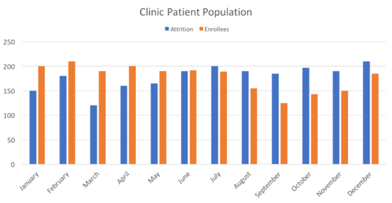
If you're using column charts, I'm not condemning you (again, the interpretation over time is more important). You might have been taught to do it that way. Or, you saw examples.
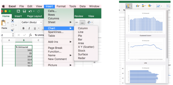
Excel takes some blame, as it nudges you to create column charts, as that's listed before the line chart option, in the top menu or the chart “wizard.”
I think a line chart shows trends much more clearly if we're going to “eyeball it.”
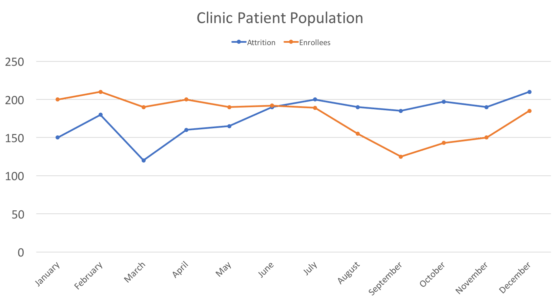
Better than “eyeballing it” would be the use of relatively simple statistical methods as, again, I'll discuss in today's webinar.
Or check out my book Measures of Success to learn more.
What do you use or see in charts in your organization? Column charts or line charts?
Do you think it makes a big difference in seeing trends and interpreting the charts? Is this post a big deal over nothing?
Leave a comment and let me know what you think.
Please scroll down (or click) to post a comment. Connect with me on LinkedIn.
Let’s work together to build a culture of continuous improvement and psychological safety. If you're a leader looking to create lasting change—not just projects—I help organizations:
- Engage people at all levels in sustainable improvement
- Shift from fear of mistakes to learning from them
- Apply Lean thinking in practical, people-centered ways
Interested in coaching or a keynote talk? Let’s start a conversation.


Mark
I agree with you and with Jim Smith. Plotting time series data in columns just makes interpreting harder. I ask delegates on my courses to notice where their eye ends up when they just look at a column chart. They often say ‘in the middle’. I think that’s because the long vertical lines take precedence in our brain. So we have to fight our natural inclination if we want to track the top of the column to follow any trends.
Good explanation, Mike. I’ve had trouble articulating why columns are harder to interpret. A dot or point in a line chart draws your eye to that. With a column chart, the number is an edge of… like you say… a really tall column that draws your eye.
It seems like a line chart could be better so you can visually incorporate a target, or a specific number where it triggers additional action (IE root cause analysis)
Do you include upper and lower standard limits on your charts? Or include ranges for acceptable or historical ranges of variation?
If so I think a line chart would be more visually efficient to include those targets. You could quickly discern your process performance levels and it would be easy to tell if it has somewhat acceptable, fantasic, or unacceptable performance.
I’ve always found Tufte’s data-ink principle useful in this case. His principle would suggest that the only valuable ink on the column chart is the ink comprising the top of the column, as it’s the only portion that represents data (kind of like it’s the only value-added portion of the ink and the rest of the column is “waste”). A line chart uses a lot less ink and more efficiently represents data. Less wasteful ink can create more simple and elegant displays of data (not always but probably true in this case)
Line charts are the way to go to understand what is happening in the process or system over time. This is a key issue in organizations stuck in the prevailing management mindset. additionally line charts are the most effective way to also create control charts in order to better understand the stability of the system and the nature of the variation: common cause or special cause and thus the more likely appropriate response. (=change the system most of the time). bar charts can be used for static deep dives to ascertain prime contributors to the problem. i.e. 80/20 rule.
Thanks for your comment.
You’re right that using line charts instead of column charts is just the first step… they have to be managed properly.
That’s why I put together the webinar mentioned in this blog post.