Last Thursday, I flew to Ohio after my 93-year-old grandfather was moved from the hospital to hospice. He passed away peacefully Saturday morning in the company of my dad and his three siblings.
So, I have a heavy heart even though he passed away after a very full and long life. I will probably blog more about him in coming days, as he was the rare combination of an incredibly kind, yet strong, person. That's why they call his “The Greatest Generation” (although, like many of them, he would modestly reject that phrase). “Ah, baloney,” he would probably say.
During my five nights at a hotel in northeastern Ohio, I took two silly pictures that I'll share here, as they illustrate some solid principles around Lean and usability.
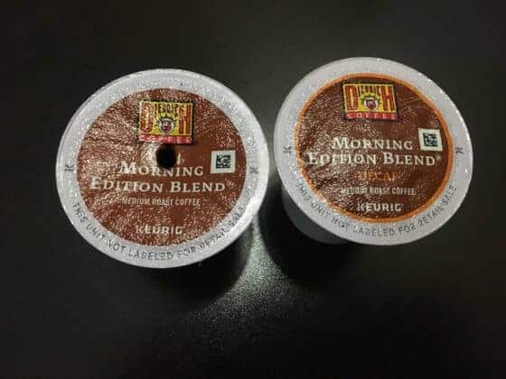
The first picture was taken near the in-room Keurig single-cup coffee brewer that was in my room at the Holiday Inn Express:

On the second morning, I noticed that I almost grabbed a decaf coffee pod by mistake (the horror!!!). I don't drink decaf.
These coffee pods had very similar packaging. The only distinguishing feature between the two is the word “DECAF” in small orange letters on the one on the right. In low light and being not quite awake yet, that was a mistake waiting to happen.
Edit: There is also a small orange ring around the brown circle, but I didn't notice that, even after looking at this picture a bunch of times.
Even the typical Bunn coffee pot in a greasy diner or a hospital break room has one lonely pot with an orange handle for the decaf coffee. That's better “mistake proofing” than those small orange letters.
Shame on you, Diedrich Brothers, for such a poorly designed product (my grandfather would have never complained bout such petty things). :-)
Some suggestions would include an orange background circle for the decaf coffee to contrast with the brown circle on the regular version of “Morning Edition Blend.”
Well, getting decaf coffee by mistake isn't going to be a fatal mistake (although it could bother or harm somebody to get regular coffee by mistake, I guess).
The “lookalike packaging” between the regular and decaf pods reminded me of a real and deadly serious problem in healthcare – the lookalike packaging of pharmaceuticals. See the Quaid twins' case for an example of this and the picture below that shows how similar heparin and heplock looked before the packaging was redesigned.

How many times, even today, is the wrong medication or wrong dose given to a patient thanks to poorly designed or undifferentiated packaging?
The Lean lesson:
- Error proof against mistakes, instead of just asking or demanding people to be careful.
The second picture was taken in the free breakfast area of the hotel. On my fifth and final morning of eating instant oatmeal, thawed omelets, and/or tempting cinnamon rolls, I noticed this green thing with a sign on it:

It reminded me of a classic book that I read years ago (and have blogged about): The Design of Everyday Things.
One lesson from that book about usability says that if something requires a sign or label to be added, that means it has been poorly designed for users.
There's nothing in the design of that green plate that says, “push me!” or “I'm hiding electrical outlets!” It makes me wonder why the outlets had to be hidden at all. Who finds electrical outlets to be ugly or offensive?
Even if the design was lacking, the hotel could just leave the outlets exposed instead of being hidden, right?
The Lean lesson:
- Make it easy for people to do the right thing, whether that's grabbing the right medication from a shelf or doing something in an electronic system. Make functionality and features obvious so they are easy to use.
Imagine the impact of violating these guidelines in situations that are more meaningful than a hotel?
Please scroll down (or click) to post a comment. Connect with me on LinkedIn.
Let’s build a culture of continuous improvement and psychological safety—together. If you're a leader aiming for lasting change (not just more projects), I help organizations:
- Engage people at all levels in sustainable improvement
- Shift from fear of mistakes to learning from them
- Apply Lean thinking in practical, people-centered ways
Interested in coaching or a keynote talk? Let’s talk.
Join me for a Lean Healthcare Accelerator Trip to Japan! Learn More


Bill Waddell said on Facebook:
See the discussion about this on LinkedIn too.
Very sorry to learn about your grandfather, Mark. Sounds like he was one special man and had a very blessed life.
Is there some legal reason these can’t be labeled COFFEE and DECAF in big letters?
Seems that would be more clear.
[…] These Two Things Are Designed Badly, But Nobody Gets Hurt… […]
Comments are closed.