My wife and I are getting ready to leave tomorrow night for a two-week vacation, so it jogged my memory about this story I saw back in December in the WSJ: Airlines Try to Make Coach Classier. Anything that makes long flights more bearable is good news to me.
One detail that caught my attention in the WSJ article was this:
“Etihad is rolling out new economy features taken from business and first class. There's nighttime turndown service–flight attendants put the window shade down, put a blanket over the passenger and offer hot chocolate or camomile tea.
There's a new coach amenity kit coming, with a sleep mask that's green on one side if you want someone to wake you up for breakfast and red on the other if you want to sleep as long as possible. The amenity kit doubles as a storage pouch for eyeglasses and stray pocket items you don't want to sleep on.”
Here's a photo, a screen grab I took from a WSJ video, that shows the “do not disturb” side:

And here's a photo, via Etihad, of the green side that says “wake me up.”

You could call the red and green a “visual control” as a Lean practice.
It's also very customer focused and courteous. The Etihad visual management eyeshade avoids two different problems:
- Not bothering/waking a passenger who wanted to eat breakfast
- Bothering/waking a passenger who really just wanted to sleep more
You do need to educate the passenger about how the flight attendants will use the visual. “Wake me up” isn't a blanket request to wake me up at any time.
Listen to Mark read this post (subscribe to the podcast):
Visual Management Isn't Just Charts on the Wall
I see people often misunderstand visual management as just being about posting metrics and charts on the wall. Visual management is meant to help you understand and manage a process in real time, so you can make decisions and avoid problems. Visual management helps you see the status of your operations – what's normal and what's abnormal?
As Toyota's Fujio Cho says, the goal is:
There's some visual management in healthcare. Color coded flags outside of exam rooms or patient rooms can be helpful indicators (if they're used consistently).
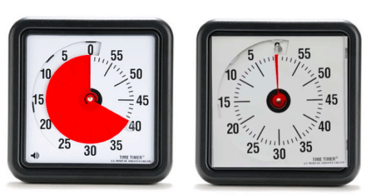
I saw one hospital use these visual timers to help make hourly rounding visual (answering the question of “how long since this patient has been rounded on?). If the standard is at least every 60 minutes, the clock can make this visual. The left clock says it's been 20 minutes since rounding. The one on the right says that the hour is up. If rounding is not occurring often enough, leaders need to ask why.
Listen to my podcasts with Dr. Gwendolyn Galsworth on the topic of visuality in the workplace. Her books are really helpful guides to reduce what she calls “information deficits” in the workplace. Think about the examples shared here… what information is provided by the visual signals? Above, the information deficit might be “how long since that patient has been rounded on?” “Does the passenger want to be woken up for breakfast?”
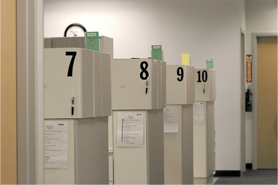
The visual clock makes that pretty clear for one room or for an entire hallway, as I've mocked up here:
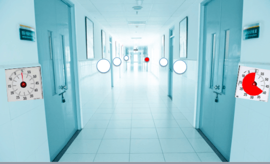
If you're a manager and you look down the hallway, you can see at a glance if hourly rounding is taking place right now, in this current hour. We don't need to wait for a monthly report or a metric being updated. Seeing a lot of white clocks down the hallway tells you that there's a problem to investigate. Are nurses and tech overwhelmed at the moment? What can you do to help?
Visual management doesn't just make the problem apparent… we have to MANAGE the situation, not just see the problem.
Visual management requires two pieces - both the visual AND somebody managing it. Share on XA Lean, Visual Dentist
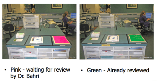
I like this following example from the office of my friend Sami Bahri, DDS, “the world's first Lean dentist.” The pink and green cover sheets help him see the status of paperwork that needs to be signed (and his staff can see the status of him signing it or not). Visuals like this help prevent verbal questions or the need to track somebody down.
Dr. Bahri's office also uses visual controls at each of the patient care bays:
The green means everything is fine. Red would mean they need help (as a signal for the “flow manager” to come) or it's a sign that something is broken down. Yellow indicates that the “cerec machine” is currently located there.
Back in 2012, I also shared an example of visual management from our local Central Market grocery store in San Antonio. The visual answers the question of “has the food safety check been done?” Of course, visuals like these depend on employees accurately turning over the red or green color. The manager needs to know when the “mid-day” check is supposed to be done or not. If it's, say, 2 pm, and the mid-day check is supposed to be done at noon but the color is showing red, a store manager can stop and ask why that is (rather than just yelling and blaming an individual).
If visual management just means “posting charts on the wall” for your organization, let me challenge you to go beyond that.
Share Your Examples
Do you have examples of visual management in your workplace? How does that visual management help drive real-time decision making? If you have pictures to share, you can send them via this web form. It says “share a kaizen” but you can use it as “share a visual management example.” Please explain that problem the visual is solving or what information deficit is being closed.
Please scroll down (or click) to post a comment. Connect with me on LinkedIn.
Let’s build a culture of continuous improvement and psychological safety—together. If you're a leader aiming for lasting change (not just more projects), I help organizations:
- Engage people at all levels in sustainable improvement
- Shift from fear of mistakes to learning from them
- Apply Lean thinking in practical, people-centered ways
Interested in coaching or a keynote talk? Let’s talk.


At one of our client law firms, they use a visual red/green system to indicate when lawyers or other employees need help from the circulating IT people. A red card in the slot outside an office door or above a desk means “I need IT help.” It allows IT people to get support or additional training to those who need it, without requiring a phone call, support ticket, or needless interruption.
Cool. That also sounds like a pull system for support.
I guess the visual also shows if somebody has requested help but isn’t getting it promptly? Somebody is managing that?
Visual management requires two pieces – both the visual AND somebody managing it.
One of my favorite examples is the coin or chip you get from a Brazilian steakhouse. Orange means “more food” and Black means “No, Thank you”. Pretty simple and effective.
I continue to come across more and more individuals that want these systems automated. While I agree that it does add a level of efficiency and can save time, it does start to defeat the purpose. As you pointed out, it requires management of not only the visual, but what’s causing it. I’ve seen too often that once an automated system is implemented it begins to get overlooked and the discipline gets lost. We begin to become immune to the signal and overlook things. I always try to start with a simple manual process to instill that discipline before moving onto something automated.
Yeah, that’s a system that works well. It’s both a visual control and a “pull signal” that says “more meat!”
I wonder if they use orange and black because of the issues that some color blind people have with red and green?
After some years deploying Visual Management my colleagues and I came up with this definition:
Visual Management is the application of visual signals, prompts or indicators in order to:
1. Prevent abnormalities occurring by promoting the correct action at the right time.
2. Indicate immediately if an abnormality does occur.
3. Monitor performance i.e. what has happened, what is happening and what is going to happen.
Good Visual Management needs no interpretation and immediately provokes the correct reaction.
[…] hospitals, leaders are often concerned if hourly rounding is happening as it should. As I wrote about here, a department might keep an hourly check sheet that shows if hourly rounding occurred each hour. […]