 In the category of “not so new” (this blog is nine years old) and hopefully “somewhat improved,” you might notice a slightly different design today here at LeanBlog.org.
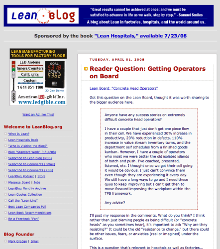
The last major refresh I did to the site's look and feel was in late 2009. There's a screenshot further down in the post showing the pre-2009 look. As you can see, it was a pretty major overhaul. It was sort of the equivalent of building a new hospital tower and then moving all of the content into it. I switched platforms, from Blogger to WordPress, and a I debuted a new logo and a new look. These were major changes that required the help of a consultant.
That change wasn't “Kaizen” as much as it was “Kaikaku” (or radical change).
The changes I made over the weekend, by myself, are more along the lines of Kaizen, or continuous improvement – smaller, incremental change.
The look of the site isn't radically different. I changed the logo just a bit. What else changed under the hood?
Looking at the Kaizen methodology and philosophy, it's not just about change… it's about improvement. Kaizen breaks down into Kai and Zen, which means “change” and “good.” Good change, or improvement.
You shouldn't judge a book by its cover… it's really about the content. And, I hope the same is true on this blog… it's about the content.
But, what changed?
1) Switching to a “responsive” theme
WordPress technology has changed since 2009. Before this weekend, the site didn't “render” well on mobile devices. If you pulled up LeanBlog.org on your smart phone, you'd see a slightly different version of the site.
My blog's new theme is a “responsive” theme, which means the same site (same visuals and all) will appear on your computer, tablet, or smart phone. Things should be more consistent, including how you post comments, etc. The look and feel of the site is more “standardized” across different devices, if you will.
2) Faster loading
Before I switched to the new theme, I did “small tests of change” in what's called a “sandbox” environment. I wasn't experimenting with the live site. I think this is keep with Lean and Kaizen principles… testing changes in a safe environment that wouldn't break the production site.
This is equivalent to mocking up and experimenting with new physical spaces, in a hospital or a factory, before we go and actually build a new physical location. This reduces risks and allows you to identify problems before the real space or site is built.
I hope you find that the site loads faster, which will reduce your “waste of waiting” as a customer (a reader of this site).
3) Improved navigation
The navigation of the site has changed a bit. I hope you find it to be an improvement, not just a change. It's different, but I hope it's better.
The site's main menu has stayed the same. I've added a secondary menu (in orange) that has quick links to posts that are on a particular topic. I hope this helps new visitors quickly discover posts on different themes that matter to them.
The front page of the site now features, from the top down:
- The three most recent posts (and you can click on them to view the entire post)
- The three most recent podcasts
- Two “featured videos” that will change over time
- Additional recent posts
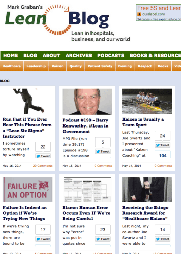
If you used to read the traditional “blog” view (where all of the posts just appeared in sequence, that view is now more visual. I'm guessing some of you might not like it, so please post comments telling me what you like and don't like.
The new blog view is a grid of posts… it's more visual, seeing the main graphic and title, but you have to click on each post to read. In the old view, you could read ten posts or so on a single page just by scrolling. I have the option to change this back to the old approach. As I try to practice “PDSA,” I've Planned and Done… now I will Study and, if needed, Adjust. Sometimes we make a change and we go back to the old way. That's Kaizen.
Here's how the new blog view looks:
There's a similar visual view for scrolling through old podcasts (or the traditional page that just lists them all).
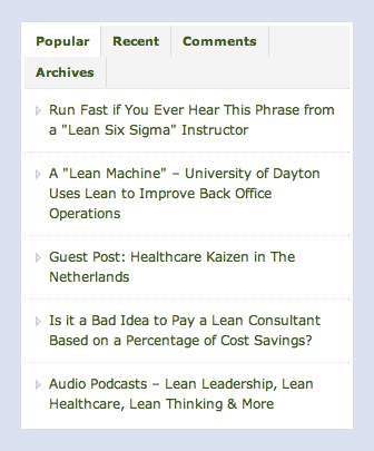
In the right hand column, there's a section that allows you to view:
- Most popular posts
- Recent posts
- Recent comments
- Archives (by month over time).
If you find any bugs or problems, please let me know. If you have any feedback or comments, please leave one below…
I'll be back to regular content tomorrow…
Here's how the blog looked back in mid 2009:
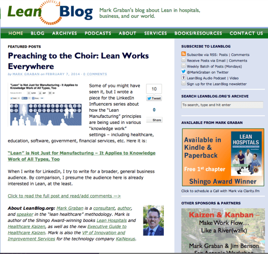
And here's how it looked earlier this year:
As always, thanks for your support and feedback…
Please scroll down (or click) to post a comment. Connect with me on LinkedIn.
If you’re working to build a culture where people feel safe to speak up, solve problems, and improve every day, I’d be glad to help. Let’s talk about how to strengthen Psychological Safety and Continuous Improvement in your organization.




Great kaizen on the website! I like how you are making the blog posts more consistent with mobile devices and making it more visual with pictures.
As a frequent reader, pictures do not matter as much to me as content does. It would be better to be able to read the first parts of a blog post instead of looking at photos, how many comments were made or how many people have shared it on social media.
Keep up the good work and congrats on nine years of blog writing success!
Thanks, Ashley.
I think there are definitely pros and cons to the new design.
The blog view page does show the number of comments for each post and you can usually also see the box that shows the number of tweets about it…
Mark,
I really like the new look of your blog.
Kaizen opportunity: I tried to search for an old post, the search worked quite well and I like the graphical results, however I didn’t like how you have to click the link twice to actually get to the content. It was non-intuitive to me (and probably others), It would be better if it worked like the graphical list in the blog link.
Thanks, Brandon.
I’m not having the “click twice” problem. It seems to work the same way as it did last week.
1) I searched for a term (“kainexus”)
2) I got search results in a grid (last week, it would have been a list of posts)
3) I clicked on one of the posts and could read it
It would be easier to “go to gemba” if we were sitting next to each other. Maybe later we can do a Skype or Google Hangout chat where I can see what you’re seeing on your screen? Send me an email if you want to try that…
Thanks for the feedback.
I validated and feel a little silly. The three links that I clicked were all external articles, so clicking on them the second time took me to an external site, which looked similar to your new layout so I didn’t even realize it.
Yes it does work correctly with your blog posts, and the double click behavior is probably the desired behavior for external articles. An alternate would be to have it show the source of the article and be a direct link to that, but that brings up a bunch more questions, and would probably take more effort to implement than the benefit from the change.
Ah, OK. I don’t think there’s a way to avoid a third click for a link to an outside article that’s contained inside the blog post…
Comments are closed.