One of the more trivial things I saw on my recent vacation to Scotland and England was a badly designed toilet on a Virgin train. My wife and I were on our way to Birmingham to do a Range Rover factory tour (something I'll write about soon, along with some fun visits to scotch whisky distilleries).

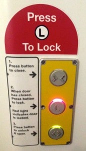
First off, the train's toilet door was overly complicated and over-engineered. Instead of just being able to slide the door closed manually (as you would do on an airplane) I had to search for buttons… eventually finding buttons and a TWO step process for closing and then locking the door. I'm not sure why this couldn't have been a single button. Unlocking and opening was a single button. Click the photo for a larger view.
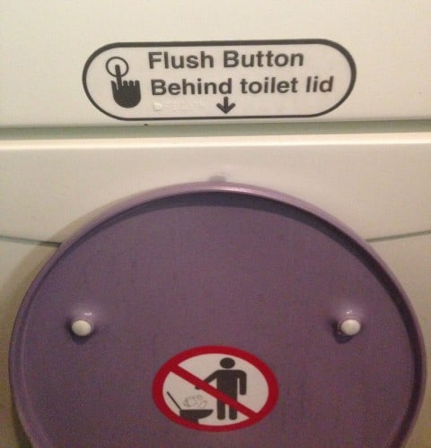
Figuring out how to flush the toilet was worse.
Why do toilets and buttons and signs matter? Processes (as well as software and devices) should be designed to be intuitive, making it easy for people to do the right thing. Requiring signs and instructions is often a sign of bad design, a lesson I learned reading the great book The Design of Everyday Things many years ago.
So what about flushing the toilet?
The flush button was badly placed — BEHIND the open toilet lid. Therefore, it was hidden – thus requiring a sign.
Thankfully, the sign was located right where you'd be looking at it.
I guess it was cheaper for the toilet designers to add a sign than it was to relocate the button to a location that wasn't hidden.
Flying home on American Airlines, there was a much better example of a flush button that wasn't hidden:
There, how hard is that?
The “don't throw stuff in the toilet” warning sign is pretty similar… but it's a funny detail that American's warning has five items, where the train only had three (including, apparently, a sack lunch). I guess it would be difficult to “mistake proof” against throwing objects into the toilet… so I guess a warning (well placed) is the best way.
Thinking back to the design of our workspaces, patient rooms, etc. — are we hiding the flush button? Are we posting signs and instructions instead of making use obvious and intuitive?
Are we making it easy for people to do the right thing?
What do you think? Please scroll down (or click) to post a comment. Or please share the post with your thoughts on LinkedIn – and follow me or connect with me there.
Did you like this post? Make sure you don't miss a post or podcast — Subscribe to get notified about posts via email daily or weekly.
Check out my latest book, The Mistakes That Make Us: Cultivating a Culture of Learning and Innovation:


Happened the same way to me too – back then , I did not have a smartphone to pic and post this unusual happening
Very astonished to know things haven’t changed at all :( Thanks for highlighting this, Mark
Thanks for the observations Mark. In many ways the folks in the UK are ahead of us. I suspect that the design of the flush button behind the seat is to force users to close the seat before flushing. Closing the seat does 2 things. It keeps the nasty bits inside the bowl and it satisfies out mother (and wife) request to put the seat down.
It goes to show it might actually be brilliantly designed, depending in the design intent and one’s goal in the design process.
I suspect it’s a noise concern, rattling down the tracks. Due to the higher cabin pressure on the 787, the vacuum toilet is quite loud and has an interlock so it won’t flush until the lid is closed. Now, a clever engineer would have designed it so closing the lid flushed the toilet without a button–but you’d need an instruction sign for that one step process.
Thanks, Andy.
Maybe this whole thing is an example where I, as a customer, got confused because I didn’t know the design intent of what I was interacting with.
It’s similar to my reaction about the “wasteful” Old Spice logo that used to be (I think it’s now past tense) stamped into the top of a stick.
LINK
It’s always good to ask “why is it this way?” I didn’t have anybody to ask on the train.
In a workplace, when things seem silly, wasteful, or unclear, we have people we can talk to (hopefully!).
On a similar theme (bad design)… why do so many public showers (for example at gyms or public swimming pools) have slippery floor tiles, which then necessitates one or more of those fluorescent yellow plastic “BEWARE: Slippery when wet” signs. Why not just choose non-slip tiles, for example?
There is a similar problem with the concrete deck around the pool at my condo building – very slippery. You’d have to anticipate that the floor around showers or pools will get wet.
I’m guessing that one silo of a project or an organization is choosing the cheapest materials or they focus on appearance over safety. If somebody slips and falls and then sues, the person who made the decision to not use non-slip surfaces probably isn’t getting sued…
Love your insights Mark and I’m also wondering if the Virgin flush design was a female touch to encourage men to shut the toilet lid? A massive pet hate of ladies all over the world… :-)
I’ve always thought that it would be a good idea to somehow encourage people to keep the seat of pubic toilets ‘up’ after they are used. Only because men, who seem to be a lazy bunch, are quite happy to stand and pee with the seat down with predictably bad aim and thus unpleasantness for the next user.
Unfortunately these flash trains do nothing for the overall customer experience. The seats and aisle on standard class are narrow, and reliability is tolerable but not great. Virgin training g&t want to go back to their customers to understand what is important to then.
[…] If a Toilet Requires Instructions, It’s Probably Badly Designed […]
Here is another bathroom soap dispenser that’s so stylish, nobody could figure out how to use it. Hence, the sign:
It blows my mind that somebody would design a device that doesn’t have an obvious pressing surface or button. It’s not a hands-free dispenser, either…