I've added to a new post to my LinkedIn Influencers series: “The Ability to Iterate is Not an Excuse to Do It Badly the First Time.” You can read the article on LinkedIn or I'll share the full text below.
It's about the new American Airlines digital airport signage that's being rolled out across airports — signage that I think is a big step backward in readability…. but they look pretty.
I'm certainly an advocate of “continuous improvement” and the Plan-Do-Study-Adjust cycle, but there are times when we need to test ideas and “get them right” before putting them in front of customers, right? How do we strike the balance?
You should be able to read the LinkedIn piece even if you're not a LinkedIn user. Feel free to comment there or here on the blog.
I'm in Helsinki, Finland through Saturday. I get to do some gemba walks at a hospital on Tuesday afternoon and I'm speaking at a Lean Healthcare conference on Thursday. I'll do my best to post updates this week on these travels and visits.
Full Article:
In the Lean management methodology, we promote the iterative “PDSA” cycle (Plan, Do, Study, Adjust) as a model for continuous improvement, primarily for existing processes. In “The Lean Startup” approach, the “Build, Measure, Learn” cycle has been popularized by Eric Ries as a model for the iterative development of a product or service and a business model.
Both approaches embrace “failure” to some extent. It almost becomes cliché to say, “It's not a failure – it's an opportunity for improvement!” That said, it's easier to embrace failing and iterating when you are a startup iOS app that nobody really uses yet. If you're launching a new car or building a new hospital building, you have an obligation to try to “do it right the first time,” as is also often said in Lean.
So, how does a company like American Airlines find the proper balance when launching new branding and new digital signage for customers?
I have flown between 50,000 and 100,000 miles on American Airlines most years over the past 12 years or so. I know them well – their strengths and weaknesses as a company, at least from a passenger-facing perspective.
With the US Airways merger in progress, American has some new leadership and has promised improvements. Their marketing and messaging to customers has said something to the effect that things are designed around the customer (which would sound reminiscent of a customer-centric “Lean” approach to improvement, whether in factories, hospitals, or startup companies).
The head of the Aadvantage customer loyalty program wrote, emphasis mine:
I speak for everyone at American when I say we remain committed to providing an exceptional travel experience with you, our customers, positioned firmly at the center of everything we do.”
When I recently flew from my home in San Antonio, via DFW, I saw some evidence that American might not be practicing what they are now preaching.
American has a new logo and new branding (how this benefits the customer, I'm not sure) and they had to redesign their gate signs. I am just old enough to remember the old days when an airport gate had a physical sign with BIG CAPITAL LETTERS that made it easy to see, from a distance, if you were at the right gate. Southwest Airlines still uses this tried and true method in some airports.
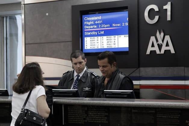
Previously, American has used digital signage that was actually easy to read from the aisle of the terminal. I could read the city, departure time, and flight number in bold letters. I could even see their display of the standby and upgrade lists from a distance, such as this:

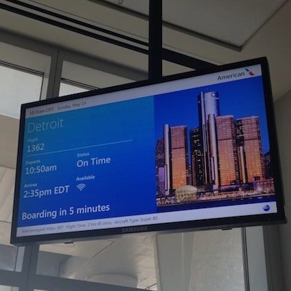
The new sign, below, seems to have not gone through much testing with users – it might be pretty, but it's far less readable and far less functional, in my opinion:

That's not an “exceptional travel experience.” “Detroit” is written in a stylish yet faint font. It's virtually unreadable from the aisle. I had to walk up to be basically directly under the sign to read it (and I have 20/20 vision with my glasses). There's a visual depiction of Detroit, but you have to know that it is the Renaissance Center for that to be helpful (it's not as recognizable as, say, the Statue of Liberty, for a flight to New York).
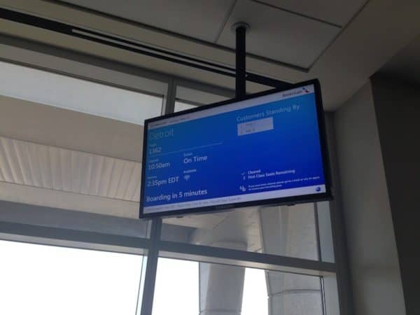
The standby/upgrade list was even smaller and even MORE unreadable, as shown below (the upper right corner of the screen):

It sure doesn't look like the customer was put “at the center of everything they do.”
What is the cost to the customers and the airline?
- Frustrated or confused customers (worse service)
- Gate agents having to answer more questions about upgrades instead of the signs effectively displaying that information (higher cost or longer lines – worse service)
When I teach about the “Kaizen” improvement methodology, I explain that the Japanese word has two characters: Kai (change) and Zen (good). A Kaizen is a “change for the better.” Not all changes are actually better, as we often see in the workplace and in the example of this changed, but not improved, signage.
Organizations have the ability to do iterative development or design (via the PDSA model or as adapted for The Lean Startup or as being used in hospital design). However, this should NOT be an excuse to shortcut planning and cycles of customer feedback because we can just fix it later. Can American update and improve these new signs to be more readable? Well, sure (I hope they do).
American is not the only company that has struggled to find the balance between taking risks and “doing it right. In this article about Starbucks from Fast Company, I found this quote:
Not all experts are fans of Starbucks's quick-draw bravado. “It's a bad strategy and a bad philosophy, and I think when customers are exposed to this behavior, they're just ripped,” says Mark A. Cohen, a former CEO of Sears Canada who is now a Columbia Business School professor. “It diminishes your brand equity. You should do everything possible to get it right on day one. Starbucks is not a startup. To behave as a startup is completely irresponsible. Innovation is good, but unwarranted testing at the customer's expense, even at a rather small scale, is unacceptable.”
The American Airlines signs could have been (and should have been) tested with real customer feedback. If a hospital like Seattle Children's Hospital can go through the effort to build cardboard mockups of a hospital department to test out the design for staff and patients, then an airline can test digital signage with cusomers.
The signs need not only look pretty (I guess that was one of their requirements) and incorporate the company's new branding, but be functional. I think had these signs been tested at one gate (with company employees getting feedback from passengers), I think they would have made changes. It seemed to have been rolled out to the entire DFW airport in this flawed form. Maybe there was a flawed design assumption that this digital signage would be on 100″ screens instead of 42″ screens?
I complained to American via their Twitter account and was told basically, “We haven't gotten any complaints about the signs via this channel.” As we know in business and quality improvement, a lack of complaints is not a sign of good quality.
This experience, while just mildly annoying, makes me wonder if the “New” American Airlines is just like the “New” General Motors – out of bankruptcy and with new leadership, but still operating the same old frustrating ways.
What is your organization doing to iteratively test product or process designs BEFORE they are put into real customer use? How do you strike a balance between getting something out there and iterating versus testing and “getting it right” before launching?
Please scroll down (or click) to post a comment. Connect with me on LinkedIn.
If you’re working to build a culture where people feel safe to speak up, solve problems, and improve every day, I’d be glad to help. Let’s talk about how to strengthen Psychological Safety and Continuous Improvement in your organization.


I didn’t get a picture, but it appears that (at DFW) American has changed the font for the city name so it is bolder and easier to read. Good for them.
Comments are closed.