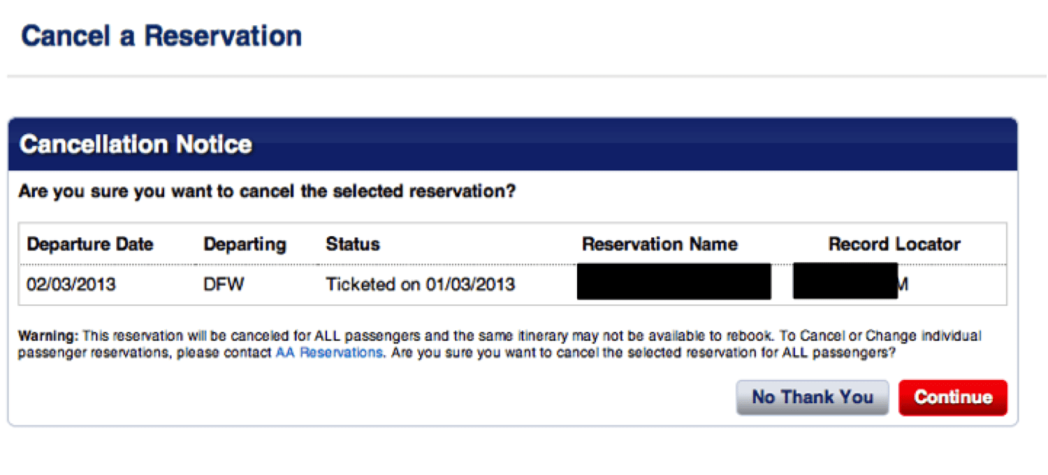
You might recall my post from July 2012 (“I Wish American Airlines Would Error Proof This on Their Website“) where I pointed out how easy it was for an American Airlines customer to accidentally cancel the wrong flight (an error I had made once).
The “cancel” links were too close together and the “confirmation page” didn't confirm which flight you were actually canceling.
After blogging about it, I got a Twitter response from @AmericanAir that said:
I thought, “yeah, right, you'll pass that along.” Well, it turns out they did… and it led to something good.
Recently, I received an email from a leader at American (excerpts shared with permission) that spelled out some changes that my blog post helped make happen.
I want to thank you for your comments in “I Wish American Airlines Would Error Proof This on Their Website.” They were brought to my attention a couple of months ago. You were clearly right, and we made some changes to AA.com last night in response to your feedback. This was something we'd observed before, but your comments got us moving again. It is a good change, and I want to thank you for speaking up in favor of it.
This was something we knew, but like lots of good ideas, we weren't focused on it, and it was losing out to other demands.
I thought you articulated the problem, and a solution, really well and I found it compelling. We challenged the team to get something done to address the issue. It isn't perfect, but we tried to focus of progress over perfection, and in that context I'm pleased.
You never know where ideas and motivations are going to crop up, but I can honestly say that in this case, you got us moving again on this issue and for that I want to share my appreciation.
The site just got better, and I'm grateful to you for that.
I'm grateful that American Airlines would:
- Accept the constructive feedback
- Do something about it
- Take the time to reach out and thank me
Compared to the old workflow, things are much better. I agree that focusing on “progress over perfection” is often a great idea (and it's a core Lean and Kaizen principle, sort of like “don't get perfect get in the way of better.”)
For one, there's better spacing between the “Cancel” links, making it harder to click on the wrong link.

And the confirmation is actually a helpful confirmation because it shows you which flight you are canceling and gives you a chance to detect and correct an error.

American Airlines still needs a lot of improvement (as do many companies)… but I'll take this small step as a sign of (hopefully) better things to come from American, things that continue to improve the customer experience.
Please scroll down (or click) to post a comment. Connect with me on LinkedIn.
Let’s work together to build a culture of continuous improvement and psychological safety. If you're a leader looking to create lasting change—not just projects—I help organizations:
- Engage people at all levels in sustainable improvement
- Shift from fear of mistakes to learning from them
- Apply Lean thinking in practical, people-centered ways
Interested in coaching or a keynote talk? Let’s start a conversation.


The paint is hideous, and to an aviation enthusiast, a sad, but inevitable end of an era: American was the last major “bare metal” airline. With more and more composite airframes coming, it was inevitable that they’d have to start painting ’em.
One thing I’ll say about paint jobs…
A good one doesn’t sway my purchase decision, but a bad/hideous/unkempt one certainly does.
In other news, glad to hear about this! If only I could get GolfNow to respond in a positive manner like this…
From Twitter:
My thoughts: I had hoped my blog post would be more effective than just complaining or bitching and moaning. I tried to present possibilities, which I think is a better change management strategy than just pointing out problems. I think it is important, also, to have a good problem statement that expresses things in terms of the impact to the customer.
Hated the paint scheme initially, but now that I’ve seen it live I like it. No question which team they’re on.
Inside and out I’m beginning to see a responsiveness that has been dormant for 20 years (or more). This is a great example.
[…] UPDATE (January 2013): American Airlines made changes to their website based on this blog post! […]