As a frequent flyer on American Airlines and a former DFW-area resident, I pay a lot of attention to the troubled airline. American is currently going through a bankruptcy, er “restructuring,” and there's a lot of what's called “labor strife” happening right now. I'm curious why these labor/management disputes are never called “management strife,” but that's a different topic.
After a judge allowed the airline to kill the union contract with the pilots, the pilots are understandably upset. Back in 2003, the pilots and other employees took pay cuts to help avoid bankruptcy (for which, airline executives gave themselves huge bonuses)… despicable. There have been a lot of delayed flights and cancelations lately… is it due to a pilot “sick out,” as claimed by management? And are there lessons that relate to hospital data and trends?
The pilots union says there is not a sickout happening, saying instead that the airline is understaffed.
What do we see in the data?
From a blog by an aviation reporter at the Dallas Morning News: “Union says sick leave numbers show that pilots aren't calling in sick in elevated numbers,” you can see selected data on the percentage of pilots who call out sick on the 18th of each month going back 12 months. If the 18th of the month isn't always a weekday, the data could be skewed by that, but let's assume that a pilot has an equally likely chance of being sick on any given day of the week.
The reporter makes two comparisons of two data points, something that leads to faulty conclusions, as the great Donald Wheeler teaches in his seminal book Understanding Variation: The Key to Managing Chaos.
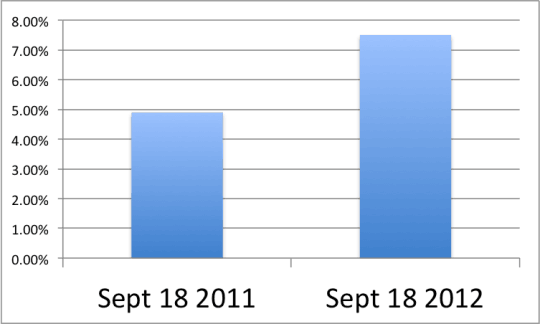
“By my calculations, the number of pilots on sick leave was 45.7 percent higher on Sept. 18, 2012, than on Sept. 18, 2011, up 177 pilots, That seems like an increase in sick leave usage.”
OK, it's higher on 9/18/2012 than on 9/18/2011. What does that tell us? Just that it was higher on the one day than it was on the other. It's hard to find a trend from just two data points. I made a chart showing that comparison:
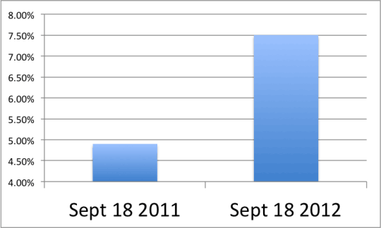
Of course, you could abuse the data by making the Y-axis scale go from 4% to 8%, making the difference look bigger (which would, of course, be misleading):
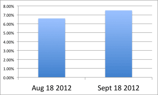
You could also look at a two data point comparison of August and September 2012:
That shows an increase… but is there evidence of a sick out?
As the writer says:
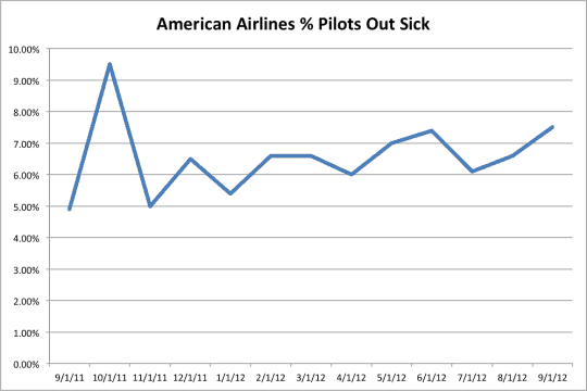
[September 2012] is lower than the high point over the past 12 months, October 2011, and in the vicinity of sick leave in recent months.
The company claims the data show evidence of a sickout, but it's in their interest to cherry pick two data points or to claim a trend when it might not be there. My approach would be to use the lessons from Wheeler's book to draw a simple SPC chart (or what Wheeler calls a “process behavior chart”)… or at least draw a run chart showing the 12-month trend, as I've done below:
As Wheeler teaches, this chart provides so much more context than just two data points. In my view, this chart is far less compelling in terms of the airline management's case… I don't see evidence of a sickout or elevated sick day levels.
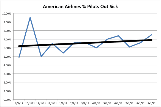
Now, if you use Excel to draw a simple linear trend line (as people often do) you see this:
There might be an upward trend, but it's slight and might not represent a “sickout” – who knows? I'd think a “sick out” would be a large increase in sick days, one large enough that it would really cause chaos in the operations of American Airlines. Were there huge cancelation and delay problems in October 2011 and June 2012? If there's any month that looks like a “sick out,” it would be October 2011 (it looks a bit like a “special cause” in the parlance of SPC). Maybe the slightly higher percentage of sicknesses is causing big service interruptions because the airline is now understaffed, as the union would claim.
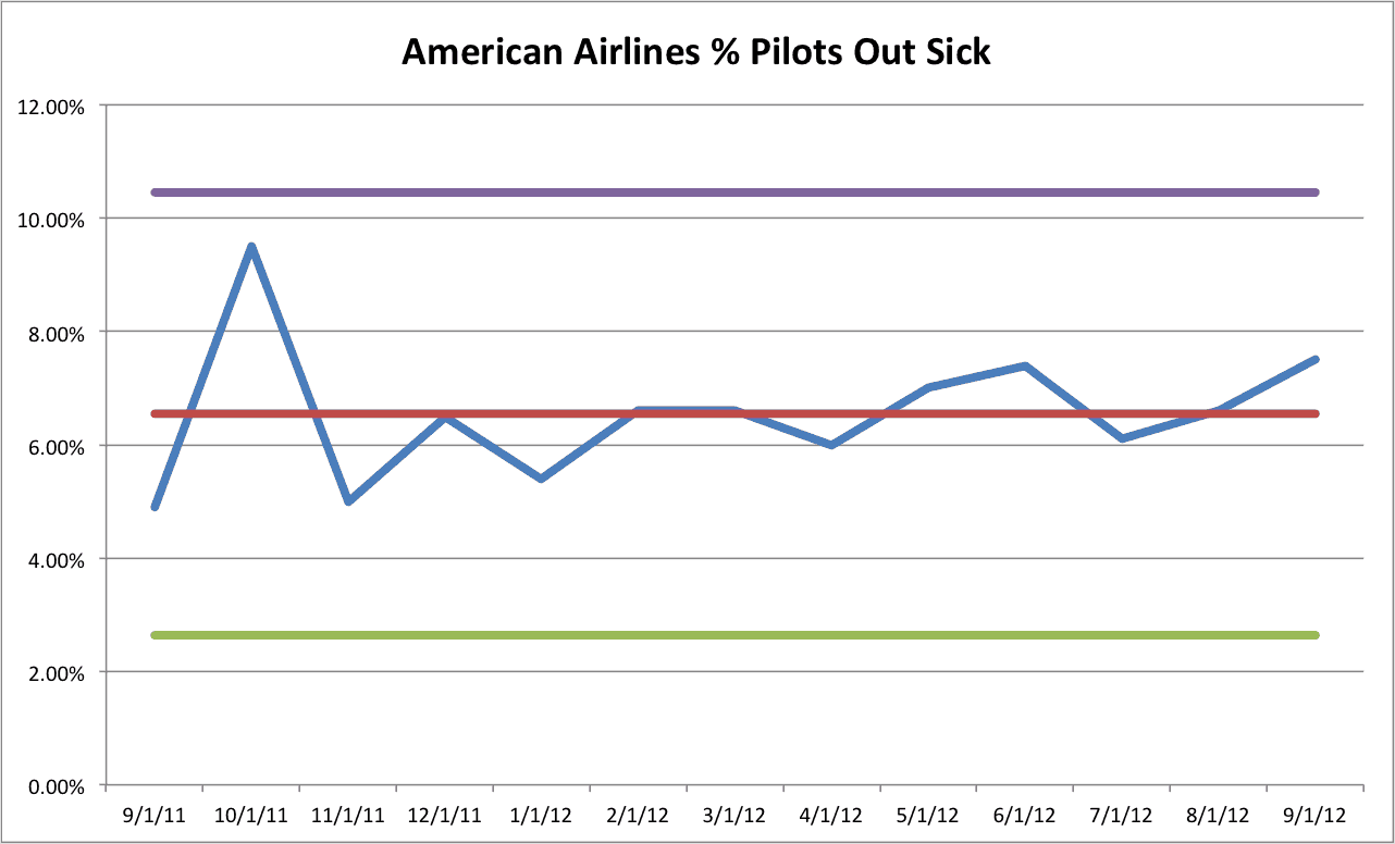
A full-blown SPC chart would look like this:
The supposed “sick out” data point (Sept 2012) isn't anywhere close to the Upper Control Limit (the purple line) that's calculated from the data points (keep in mind an SPC chart should have about 20 data points to be most valid, so I'd love to see data back to the start of 2011). When looking at some of the “Western Electric Rules” used to evaluate control charts to find evidence of a “special cause” (like a sick out):
- 8 consecutive points above the mean (the red line) — nope
- 8 consecutive increasing data points — nope
- A single point above the purple line — nope
It's hard to prove this is a “sickout” from the data – I just don't see it.
I hope American is able to get me to the Northeast Shingo Prize Conference in Worcester, Massachusetts, where I'll be speaking tomorrow… I hope to see some of you there. I also hope American is able to get me and wife off on our planned vacation… I'll have guest posts in this spot from October 1 through October 11.
I've seen plenty of hospitals using faulty comparisons of two data points to show “trends” that aren't really there. Are we reducing E.D. length of stay, the number of pressure ulcers, the number of patient falls, etc.? To prove it, you need more than two data points – the number can't be better than last month or better than last year for it to be proven…
How do you see this data? How would you analyze it?
Here is the spreadsheet that I was using to create the charts.
Please scroll down (or click) to post a comment. Connect with me on LinkedIn.
Let’s work together to build a culture of continuous improvement and psychological safety. If you're a leader looking to create lasting change—not just projects—I help organizations:
- Engage people at all levels in sustainable improvement
- Shift from fear of mistakes to learning from them
- Apply Lean thinking in practical, people-centered ways
Interested in coaching or a keynote talk? Let’s start a conversation.




Well said. How can 6% of the pilots be out sick everyday? What is the out sick rate for US based (non-deployed) United States Air Force pilots? At a 6% out sick rate the thing I would be worried about is how sickly our employees are in general.
We definitely need to use more control chart thinking. At the same time you look for special causes you should look for unacceptable system results. I don’t understand how 6% sickness rate could be seen as an acceptable state of affairs. Sick leave use is often correlated to job satisfaction. You can see that as people that are sick of their jobs physically get sick or those that are sick of their jobs see that as a good reason to call in sick. Based on the data you show it does seem there is no evidence of an increase in pilots taking sick leave.
I also agree with your management strife label. The incompetence of American Airlines management leads me to think they are responsible for most of the problems. It does seem to me pilots got vastly overpaid in the days when airlines were printing money and it wouldn’t surprise me that management hasn’t been able to adjust to reasonable rates over the last few decades (given management’s track record on things that are visible).
Great comment, John.
You’re right, the 6% seems high and there needs to be system improvement to bring that average down.
I can’t imagine that Toyota or even Starbucks has 1 in 16 employees out sick everyday… that said, if a pilot is even the least bit ill, it’s a good safety practice to call in sick rather than try to be a hero — as we saw in the case of a commuter jet crash… a part of aviation where young pilots are scandalously underpaid:
http://www.usatoday.com/news/nation/2009-07-27-buffalo-plane-crash_N.htm
As people have said (often about GM) — companies get the unions (and union relationships) that they deserve… this seems to include American.
Pay for pilots is crazy (though when I looked into this is some detail was quite a few years ago maybe the system has improved though I don’t believe it has, much anyway). As you say the pay at all these commuter airlines is super low (even when were above “full employment”). It seems 1) people really want to be pilots and so take less pay and 2) they hope to hit the lottery and get the huge pay of legacy air carriers pilots.
A public safety comparison, could be truck drivers. I would imagine truck drivers are in accidents resulting in many more deaths every year (I have no data that is just a guess). I wonder what their sick use is like compared to the legacy airline pilots? My guess is if you are looking at both and wanted to increase in public safety the payback would be much greater in making sure truckers were not too sick/tired…
Pilot health/readiness is a concern. At 6% my first inclination is using the public safety excuse is an excuse. But I have nothing to do with the industry, I would need much more data and understanding to really see. As you say there is likely a greater inclination to make the “sick” call more quickly (if you are operating at 80% of normal due to sickness that might not be good enough for a pilot) for pilots than someone looking at spreadsheets at their desk all day.
I think hoping for the lottery legacy pilot payouts should be going away – but it is hard to judge. That might mean the “farm system” has to increase pay as they don’t have this lottery incentive hanging out there.
But CEO’s are scandalously overpaid and rates should have been going down for over a decade instead CEOs have increased their raids on corporate treasuries so who knows if super high pay for pilots can continue (I would image pay is down from a decade ago, maybe it is already not super high – I don’t know).
One reason why something like hugging the control line is important is it can mean the system is being manipulated (it can also mean there are non-human systems issues that cause odd data). So, for example, it could be an indication “sickness” is not a individual independent decision. But instead, is based on things like, oh I can’t be “sick” today because we already have 4 sick pilots at this site. In fact it would be surprising if this were not partially true. There is almost certainly a grey area of feeling under the weather and determining if that really warrants calling in sick. If you let noone down it is easy, if you being sick means a flight is cancelled (because their is no way to get a replacement) my guess is that can make a difference. If you are super sick it likely would not. But if you are borderline it very well may.
Yes, I see how the data could be distorted so that it’s artificially close to 6% much of the time. Maybe 6% is some sort of “goal” that’s communicated by the airline and the union, so it’s “managed” to make sure it doesn’t get much above (or below) that. I hadn’t thought of it that way, but makes sense.
From LinkedIn:
Andy Hyde: Exactly the same happened in Norway this summer with massive delays. Management blamed the workers until it became apparent that the problem was caused by too many workers being rostered on holiday or courses at the same time and at the time of the busiest summer traffic. Who planned for so many to be on holiday or on courses hasn’t really come out yet. The CEO of Avinor did appologise after he found out it was his fault !!
[…] Mark Graban on September 25, 2012 · 0 comments Even with American Airlines’ problems, I made it to Worcester, MA without any trouble, where I’m speaking this afternoon at the […]
Great post. Thanks for making data real for the readership. Easy, breezy, beautiful!
Technically, there is one signal with this data set… point 13 in the MR chart fails test 2 (more than 9 points on same side of center line).
Also, while Wheeler doesn’t mention this in his book (at least I don’t think he does) 13 data points isn’t nearly enough samples to create reliable control limits. In fact, software like Minitab, will squawk at you if you attempt to create I-MR charts with less than 100 data points. Of course you still can but should consider the results preliminary and not bet the farm on the results.
I’d be very interested to see this same control chart (with MR chart included since that chart should be examined before the I chart) using weekly data for the last few years or at least last 12 months. I wonder if that data is available?
Thanks for your comment, Ron.
I agree that my SPC chart isn’t the most valid. I don’t have Wheeler’s book in front of me, but I’m pretty sure he recommended 25 (or at minimum 20) data points.
I should also look at the MR-bar chart for this to be more valid. Thank you for doing that… can you post a picture or a link to a spreadsheet where you did that, for the benefit of the readers?
I think my post demonstrates the value of a run chart over two data points or a list of numbers (as Wheeler suggests in his book). It’s not full blown SPC… I probably should have titled this post “Can a Run Chart….”
Here is a chart that Ron created:
https://twitter.com/MarkGraban/status/251326267201318912/photo/1
Great conversation. After reading this blog I got thinking about the recommended number of data points. I cast my mind back to Wheeler’s book but couldn’t remember the figure (although the number 12 kept popping into my head).
Then I read one of Ron’s recent posts and saw 100 mentioned. This really got me thinking (and searching for my copy of the book).
I’m happy to say I’ve dug the book out and can report the following:
“Useful limits may be constructed with as few as five or six values. The uncertainty in the computed limits decreases as the amount of data used to compute the limits increases.” (page 60)
Like you say fewer data points are good for preliminary control limits and those based on 100 or more will be even better.
Thanks, Gary!
[…] value of SPC is hard to describe. But Mark Graban’s latest blog post “Can SPC Show if American Airlines Pilots are Staging a “Sick Out”? does a great job of showing how SPC charts can help us find the truth in the numbers we care […]
If it takes SPC, Six Sigma or other statistical methodology to determine a “sick out” its probably not a effective labor strategy. Management will just consider it an anomaly and move on. Its just too bad airline pilots don’t have the clout and public support as NFL referees.
David – agreed, I wouldn’t want management to rely on a report and data. But, that’s the best we can do as outsiders. I mean, I can talk to a random pilot or two while I travel…
I agree that I wish the pilots had more support from the public.
Hello mark, Thanks for your interesting post. I was wondering why you consider n = 13 for control limits. I am not sure, but I think n is 7700 or somewhere around. What do you think? Thanks
Fouad
Because it is a “control chart for individuals.”
Hi – thanks for the post. From my knowledge of p-charts, I agree with Fouad that the sample size here is around 7700, which would make the upper control limit 7.4% and the lower control limit 5.7% (i.e. much tighter limits), which would then suggest that the sick rates are not stable. By looking at your SPC chart (the first one), it looks like you may have assumed a sample size of 387, which was the sick count from September 2011, not the size of the sample.