 As a frequent flyer on American Airlines, I often have five or six itineraries booked at a time. Unfortunately, the poor design of the American Airlines website includes the risk that I might cancel the wrong itinerary and flight. The Lean principle of mistake proofing would go a long way… and I'm sure a simple bit of programming could easily alleviate this risk.
Here's the workflow and what happened… yesterday, I had put a “hold” on an itinerary, but I had to cancel it because I wanted to book a ticket with different flight times.
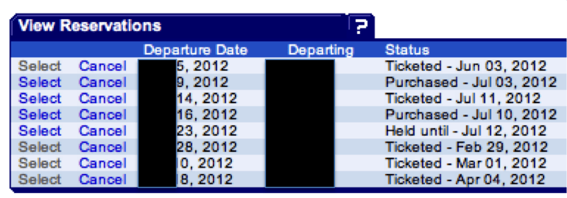
So here's my list of itineraries, booked and held (with dates and locations hidden for privacy):
To cancel a held itinerary, I would have to click a very small “Cancel” link next to the correct date (the fifth one down). The pictured links are about the size they really are on screen. They are pretty small links without a lot of separation.
The held flight that I wanted to cancel was JUST above a long-planned vacation itinerary. I was trying to be really careful to NOT click on the wrong “Cancel” link (an error I've made before).
You might think, “What's the big worry? There's probably a confirmation screen.”
Yes, but it sucks.
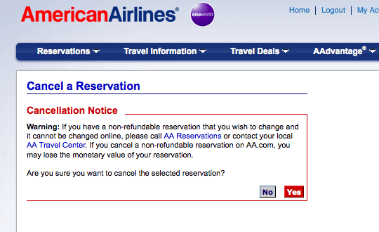
Here is said “confirmation”:
It says “the selected reservation” but it doesn't display WHICH one the user selected. Exactly which itinerary am I about to cancel? It's a leap of faith that I had clicked in the correct spot on the previous screen.
How hard would it really be to say “Are you sure you want to cancel the selected reservation: [dates and locations]?”
Or even display the record locator number. Something that would be REAL confirmation.
I can only imagine how many times a day a customer mistakenly cancels the wrong flight. This can cause problems down the line if the the customer doesn't realize it right away. Even if the customer does notice it, it would lead to a panicked phone call to the airline, tying up their time and resources. Some customers might get screwed out of “non-refundable” tickets, I'd imagine.
In a world of electronic medical records, how many times a day are doctors or pharmacists clicking on the wrong spot, leading to a medication error?
If your response to a situation like this is “well, just be careful, then and don't click in the wrong place” – I'd argue you're not a Lean thinker.
UPDATE (January 2013): American Airlines made changes to their website based on this blog post!
Please scroll down (or click) to post a comment. Connect with me on LinkedIn.
Let’s work together to build a culture of continuous improvement and psychological safety. If you're a leader looking to create lasting change—not just projects—I help organizations:
- Engage people at all levels in sustainable improvement
- Shift from fear of mistakes to learning from them
- Apply Lean thinking in practical, people-centered ways
Interested in coaching or a keynote talk? Let’s start a conversation.


![When Was the Last Time a Leader Around You Admitted They Were Wrong? [Poll]](https://www.leanblog.org/wp-content/uploads/2025/07/Lean-Blog-Post-Cover-Image-2025-07-01T212509.843-100x75.jpg)
Andy Rooney never really died. His spirit and consciousness were reincarnated in the form of Mark Graban. ;-)
Seriously, yes, I sometimes encounter similar instances like this or in the same vein when ordering goods or services online and when I’m expressing my frustration verbally, usually a family member in the room is saying something to the tune of, “You just have to be careful.” Makes me wonder what kind of customer feedback or trials, if any, were done prior to release of the format.
American Airlines? Respond to customer feedback???? What?
:-)
I’ll be interested to see if American Airlines follows bloggers. Please let us know if they respond to your post.
JH
I just tweeted it to them, so let’s see if they read or respond.
American’s response, for what it’s worth:
https://twitter.com/AmericanAir/status/223452549267726337
[…] might recall my post from from July 2012 (I Wish American Airlines Would Error Proof This on Their Website) where I pointed out how easy it was for an American Airlines customer to accidentally cancel the […]
It looks like there would be an update on this now, correct? :D
Yes! I forgot to reference it… here and I will update the post.
American DID make a great change to their system:
https://www.leanblog.org/2013/01/follow-up-american-airlines-actually-error-proofed-this/
[…] I Wish American Airlines Would Error Proof This on Their Website […]