The two primary web browsers I use these days on my Mac are Safari and Chrome. I've always been a big user of keyboard shortcuts, whether in Microsoft Office or other software.
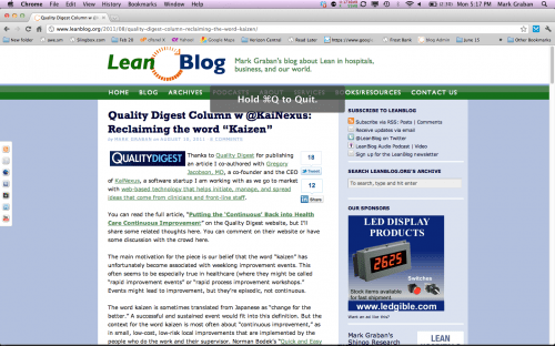
In Safari, when trying to close a single tab, the shortcut is Command-W. If you accidentally hit Command-Q (right next to W, of course), you erroneously quit the whole browser. Chrome has a clever way of error proofing this – as pictured at left.
With Chrome, you have to hold down Command-Q for a second or two. If you tap Command-Q, you get the message shown in the pictures, reminding you to hold the keys.
I think this illustrates an example of a “Like Lean” concept – something that's probably not driven by formal use of Lean methods, but just reminds us of Lean.
As I blogged about before, in this post Apple & Microsoft – Please Move “Control-W”!!!!, clever mistake proofing makes it harder for the user to do the wrong thing, without putting too many barriers in place for times when you are really trying to hit Command-Q.
What about the applications of this idea in software like EMR systems or in KaiNexus?
What do you think? Please scroll down (or click) to post a comment. Or please share the post with your thoughts on LinkedIn – and follow me or connect with me there.
Did you like this post? Make sure you don't miss a post or podcast — Subscribe to get notified about posts via email daily or weekly.
Check out my latest book, The Mistakes That Make Us: Cultivating a Culture of Learning and Innovation:


Maybe Apple will be more open to these error-proofing methods with an industrial engineering-trained CEO at the helm.
I’ve learned (often the hard way) that confirmations are almost always a good idea. My company produces ERP-type software programs where users can enter in information in several fields at once. It’s crucial to have either 1) a way for the users to see what action they just performed (i.e., if enrolling someone in a health plan, a page that shows enrollee/health plan/start date appears after the action is taken), or 2) a confirmation stating what actions are being taken.
It’s hard to judge what checks will be needed until users actually get their hands on the software, though. The way I use a program while doing development/testing is rapidly different than someone who will be using it on a day-to-day basis. Eric Ries is spot-on with saying to put the product out quickly and simply, and then have users direct where it will go from there (we’ve wasted time building validations before a product is launched that we must scramble to remove after the fact; also inevitably have to add in some in a poka-yoke effort).
I find that particular type of solution… “make it take longer or annoy you in some way” to be a poor solution in this domain.
When stakes are high, such as when lives or finance are at stake, ensuring it’s right the first time is often the right answer. However, when looking at something like “I accidentally closed my browser” it seems that the right solution is to make the failure very easy to recover from, such as hitting command-shift-T to restore the tabs when you reopen the browser or automatically restoring the windows that were open when you last closed the browser. As is, it seems like a case of building the feature to the special cause variation instead of the common cause.
(as an aside, the thought of holding down keys would take considerable retraining and feel inconsistent as the only two uses I know for it now are “hard-kill the machine” and “eject the DVD”)
That’s a great point, Eric. I’m sure certain users would want this to be a configurable option in the software, to hold or just press Command Q. When this was a beta feature in Chrome, you had to turn it on specifically (and you could turn it off). Now it’s on by default and can’t be turned off, I think. (EDIT — NOPE, YOU CAN INDEED TURN THIS FEATURE OFF IN CHROME)
You’re right that Chrome and Safari both make it easy to recover and automatically reopen tabs/windows that might have been closed mistakenly. But that’s not a good option if you’re offline and you accidentally close the browser.
I’d propose (as I did in my previous blog post) that better error proofing would be to not have “close tab” be Command W – this would prevent the error of having the keys right next to each other.
There’s a great general point that we have to be careful that error proofing doesn’t introduce other problems or annoyances. In the workplace, this can lead people to try to circumvent the error proofing, which is a different problem altogether.
The beauty of the Mac OS and now OS X is that it has a consistent, responsive, user-interface. The hold-to-quit feature breaks that interface.
Confirmations are a poor substitute for good UI. Undo is much more powerful then constantly asking if someone is sure. For example, in Windows, highlighting an icon and clicking delete leads to a dialog asking if you are sure. In Windows, clicking command-delete puts a file straight to the trash, but if you want it out of the trash, you can get it back.
A far superior solution to breaking a consistent UI would be to offer the equivalent of the undo function. Upon the next launch, Chrome could offer a way of restoring the windows.
That said, I’m off to press the submit button, which will immediately submit this comment without me holding it down for a while.