 Today's post isn't strictly about Lean, but I was reminded by a reader to mention something really cool that I saw in Wired Magazine late last year. In the Lean methodology, we focus a lot on “visual management” of processes and information (or “visuality” as Gwen Galsworth calls it).
Wired had a design contest and article on “The Blood Test Gets a Makeover” that's worth checking out – I bet it will prompt some interesting ideas for your lab or for your organization, regardless of what you do.
Lab results are, to many, a pretty boring thing. And the lab results printouts are beyond boring – something like this (the next two photos posted with permission from “David McCandless @ informationisbeautiful.net“):

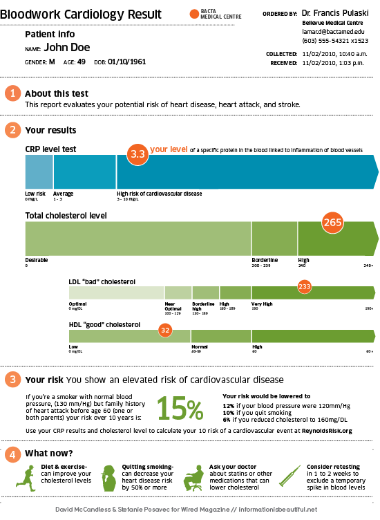
How much more effective would the report be if it A) looked better and B) communicated more/better information? Like this:

How much better is that? Not just prettier, but more effective. It's actually readable and understandable by a layperson. I've seen hospital labs do similar work (not as pretty) to make lab results more readable for the “internal customer,” the pathologist. A little design can go a long way…
Check out the full Wired Report with multiple examples here.
What does that make me think of? It makes me think that sometimes a little bit of thoughtful design can make things WAY better, whether it is:
- The design of physical workspaces
- The design of workflow or standardized work
- Wayfaring signs in hospitals
It's not EASY to make this little effort, I'm sure it's quite hard. It requires involving lots of stakeholders, getting the input of patients and others – not just doing the quick and easy thing. It means DESIGNING things, not just letting them evolve (such as that boring, staid, and hard-to-read lab report).
What does it make you think of? What can you do to design a better workplace that works better for patients and staff members?
Note: I will be at the Society for Health Systems and HIMSS conferences in Orlando, Friday and Saturday (SHS) and Monday and Tuesday (HIMSS). Let me know if you will be there. With HIMSS, I will be a special guest at the FormFast booth, come and see us.
What do you think? Please scroll down (or click) to post a comment. Or please share the post with your thoughts on LinkedIn – and follow me or connect with me there.
Did you like this post? Make sure you don't miss a post or podcast — Subscribe to get notified about posts via email daily or weekly.
Check out my latest book, The Mistakes That Make Us: Cultivating a Culture of Learning and Innovation:


[…] This post was mentioned on Twitter by Lean News Feeds, Garments Engineer. Garments Engineer said: LeanBlog Presenting Lab Test Results in a More Visual Way – Lessons and Inspirations?: Today’s post isn’t strict… http://bit.ly/eF1xZa […]
This actually reminds me first off about design of pill bottles that are easier to use and even start to inform health back, like the bottles they use at Target, which made a huge splash a few years ago, or Glowcaps.
Design of physical space and wayfinding are definitely important in hospitals, they are intimidating places if you’re not used to them and can’t find your way around.