Last month, I wrote a post titled “Consulting Case Studies Need Statistical Validity” where I discussed the need to show more than simple “before and after” numbers in case studies. I promised some follow up posts on his topic, so today I'll talk about two ways that healthcare organizations present data in a way that can be confusing or misleading.
These are:
- Using bar charts instead of line charts
- Misleading non-zero Y axis
- Showing different years' data as diferent lines on the chart
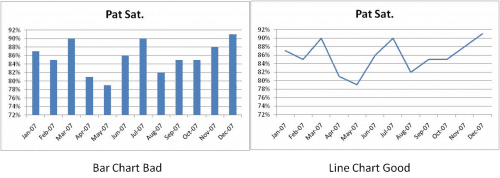
I'm a big fan of run charts to show sequential time series data instead of bar/column charts, as shown below:
Maybe it's my early training in Statistical Process Control, but I find the line chart (aka a run chart) on the right much easier and clearer to read. I find it easier to detect trends and to see the continuity of the data. Maybe this one is just personal preference, but I've heard others share this preference. What do you think?
To the second point, I've intentionally made a certain “error” in the construction of charts above…. I used a non-zero Y-axis. I think for most workplace metrics reporting, a non-zero axis tricks us into thinking changes are more significant than they are. Of, course a full-blown SPC chart is really the best (only?) way to detect significant process shifts, but if people are just eye-balling things, let's try to present an accurate picture to those eyes.
Compare the above charts to the versions below with the Y-axis that runs from 0 to 100% for patient satisfaction:
I think this latest set of charts creates less risk of being misleading and, again, I think the line chart on the right is easier to read than the column chart to the left.
As a minor and possibly meaningless kaizen point – the line chart requires less ink to print. Please PayPal me 10% of your cost savings from ink cartridges :-)
Again, the line/run chart on the right would be better as a full-blown SPC chart (which I'll cover in the next post).
Finally, let's think about multiple years worth of data. I've seen a number of organizations chart such data like this:
I don't like seeing multiple years of data placed on top of each other like that. I think it's easy to look and say “well generally each year is higher than the last, so we must be improving.”
Maybe, maybe not.
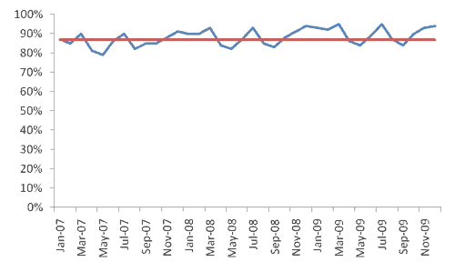
I'd rather see all 36 data points laid out in a single run/line chart, like this:
Hmmm, is there really that clear of a trend? I'll throw another chart at you, showing the mean-line (average) for an SPC-style chart where the average is based on the first 20 data points (and it has a non-zero Y-axis):
It doesn't look like there is a clear trend there. We don't have eight consecutive points above the mean. Is there really an upward trend? From this view, it appears not.
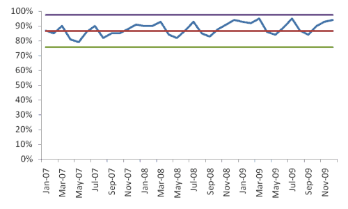
Here is a full-blown SPC chart, showing upper and lower control limits:
Here are those charts side by side – which do you think presents a more accurate representation of the trend, or lack thereof?
Anyway, maybe it's just personal preference and these are three charting practices that just bug me… what do you say?
Please scroll down (or click) to post a comment. Connect with me on LinkedIn.
Let’s build a culture of continuous improvement and psychological safety—together. If you're a leader aiming for lasting change (not just more projects), I help organizations:
- Engage people at all levels in sustainable improvement
- Shift from fear of mistakes to learning from them
- Apply Lean thinking in practical, people-centered ways
Interested in coaching or a keynote talk? Let’s talk.
Join me for a Lean Healthcare Accelerator Trip to Japan! Learn More


I see value in the overlay version for certain types of seasonality planning. It appears that the ups and downs repeat. If these are demand figures, this would be good input information for capacity planning. If, on the other hand, they are organization performance figures, they likely call for a Kaizen activity aimed at removing the root cause(s) of seasonal performance.
To know how one is doing over time, the continuous run chart is obviously better, as you stated.
Move over Don Wheeler and sign me up for your next webinar on Graphing. Very nice job Mark!
Meaningful Dashboards i.e. Charts are an art in themselves and I have found few people that are capable of putting a package together with the though process you walked through.
I go back to the Covey saying: “Begin with the end in mind.”
Couldn’t agree with you more on all points, Mark. The only thing I’d add is how the non-zero charts could lead to a tendency toward overcontrol on the part of those who own the process, since they can present data as more variable than it truly is. Excellent post.
Thanks – that’s a great way of saying it, Mark W. Avoiding overreaction and overcontrol to common cause variation (noise), since that overreaction leads to more variation (as Deming’s funnel experiment shows) – and the SPC charts are an even better way to visualize what’s common cause and what’s special cause.
You may be right, generally, that when showing time-series ordered data that a continuous line represents the data “best”, but I could also argue the classic point that “it depends”. It depends upon what you want to know and what you are trying to depict. Not all bar charts are bad, not all non-zero y-axes are bad, and not all overlayed lines are bad. Like Karl commented, looking at overlays may be helpful in depicting/understanding repetitive patterns in the data. Looking at it that way for long-term trends may, as you suggest, be misleading, but it’s pretty helpful for other examinations. I think you could also use a zero axis to mislead if the variation you are concerned with becomes undecipherable given the scale of the chart. If the customer is sensitive to small variations then you have to choose a chart that highlights the phenomenon you are interested in examining or depicting; whether the y-axis is zero is not relevant. And the comment about looking too closely such that reactions occur due to small variations is abated by proper use of SPC techniques (as you expertly showed the value of). If we react to every up and down in the data, that equates to Deming’s “meddling”.
This comes down to the “truth in statistics”. You can make data say whatever you want. As an explorer, I think you want to chart the data in every way you can to try and find out what the data says rather than making the data say what you want. So bars v. lines, zero or not, overlayed or in time-ordered series: it depends.
Yes, fantastic point Steve. I think my suggestions are less a set of “never do this” ideas but some illustrations of the types of situations where the specific presentation of data has been confusing. Maybe a better rule of thumb is to ask how a chart might possibly be misinterpreted and how can we stay mindful of that?
Completely agree with the use of run charts for ongoing operations however I usually use bar charts for the first 60 days after a kaizen event with a line across showing target measure. The target line crosses the bars to quickly see if hitting target or not.
In my experience, most clients do not a high n size of performance data prior to an event (either daily or monthly). We may only have a few weeks of data prior. With only three data points for formal leadership reporting after an event (pre-event, 30 day, and 60 day + target measure), I find the bar chart more visually impactful in meetings. I usually recommend clients to use run charts ongoing after the first 60 days.
However, typing this response makes me think I should just get everyone used to updating and looking at a run chart without needing a change at 60 days!
I also agree with using a 0 y-axis. I am surprised that Excel sometimes defaults aways from that since I consider it usually a bad practice.
Apple Numbers charts rock.
Great post and great comments. Some people may make these “mistakes” simply because whatever charting program they are using defaults to the format you’ve called out (bars instead of lines or y-axis not being zero). If nothing else, this should challenge them to consider what they are presenting, which as Steve pointed out may or may not be the correct format because it may “depend”.
Also agree with Karl that seasonality in demand may well need to be “stacked” in order to visualize or understand correctly.
I think the important part highlighted by you, Mark, and other commenters is to make sure you are not misrepresenting what you are portraying and to review that the visualization you are using is legitimately moving you to the right actions.
Haha! Just looked at my comment. I may be guilty of this:
http://www.unnecessaryquotes.com/
Sorry!
I’ll add my comment that it depends on what you are trying to achieve (always keep the goal in mind).
I think a non-zero axis is fine, providing there is sufficient room in the scale to show the relative differences in the larger scheme of things, Imagine if you are charting things in the thousands, with increments of 1-5, a zero scale would be fairly pointless.
If in your example a pat sat of <72% equals a business disaster then that is really the only part of the curve that you need to be concerned with. If the mantra that "variation is evil" then the expanded scale helps this – after all is there a potential payback to the business from improving pat sat from 80% to 84% ? The expanded scale chart will show this, the zero scale chart may have difficulty showing the small incremental, continuous improvements which are a key to lean as I understand it.
Bar charts are good for making comparisons, the 3 years worth of data presented in bar chart form might show up whether there has been a year on year improvement as well.
My personal preference for the data you have presented would be to use the 36 point continuous run, with the X axis starting at 72 (although I probably would have used, say 50%), with the mean and control limits on it.
I feel that your final chart makes the case that pat sat is stable, high and does not require improvement. I think an expanded scale offers the level of detail necessary to identify smaller improvement opportunities. Once again would there be any benefit to the business if pat sat was consistently at the levels of Mar, Jul & Nov? Would the business be better off by targetting a consistent 80%, such as in May?
The SPC chart clearly shows the system is in control. The real question is do you want to improve it? I'd be concerned if the people that make that decision are easily misled by a chart axis.
Mark:
Thanks! A topic near and dear to my data-hound heart! It’s all about telling stories.
The general guideline (rule, as I learned it long ago) for deciding between bar charts and line graphs is this: when the x-axis represents a continuous variable and the observations (y-axis) are somehow mutually related (time courses, for example) a line graph is called for. When the x-axis is qualitative (apples, oranges, pears, e.g.) a bar chart is in order. And if the observations are independent of one another vs a continuous x-axis, it’s time for a scatterplot.
I’ll go along with the occasional a bar chart for continuous variables, as some commenters have suggested, if it tells the story better, but it misses one of the key elements: the interpolation between points that is implied by a line. But when a line is used to connect qualitative independent variables (apples, oranges, etc.) as you see sometimes, that REALLY doesn’t make any sense. There is no valid case for interpolation between apples and oranges!
And pity the poor grapher who only knows lines or bars and has scatterplot data. Quite a mess! I’ve seen it done.
The point of any graph is to tell the story of the facts as we know them. Given that it is story-telling, we need to be wary of introducing (or disguising) bias of all the sorts discussed above, and many more. That understanding is probably more important than hard-and-fast rules.
For great storytelling with graphic representation of information see the work of Edward Tufte. The first page of his “The Visual Display of Quantitative Information” is worth the price. He presents “Anscombe’s Quartet”, four data sets with identical mean, std dev, regression stats, sample size, r-square, etc., but when you graph them, they are wildly different. Tricky!
This is a great post. One of my biggest pet peeves is people using the bar charts to try and show a trend. It is very hard to read. I like the extra thought on the savings in printing less ink too.
I have never ran into anyone that stacked year over year as multiple lines. I agree. It should be just one line showing the trend over time. Much easier to read and a better visual to understand the data quicker and easier……….which is eliminating the waste of misunderstanding and clarifying.
Matt – I’ve seen it a few times recently. It was just posted on a bulletin board with no context, explanation, or purpose. I agree with the earlier comment that stacked lines could be helpful for viewing seasonality, but I think the general meaning of posted stats is to display “how are we doing?” or “are we improving?”
The stacked chart, to me, showed neither.
Mark,
This is an incredibility important topic because it involves how to make charts more value-added and less wasteful. A year ago, I discovered the work of Stephen Few, who saved me from engaging in speculative thinking (I have no training in charting) by offering great thinking on what charts serve which purposes, based on research on how the eyes and brain work. e.g. Line graphs are best for time series when you want to see overall patterns; pie charts are rarely useful because the human eye is lousy at discriminating differences in angles (so a horizontal bar graph is better for part-to-whole comparisons). Here’s a short article based on Few’s work. It’s nominally about Chart Tamer, a wonderful Excel add-in I use, but practically a summary of which charts to use when:
http://www.bonavistasystems.com/Download2/Chart%20Tamer%20Introduction.pdf
Mark,
A great topic and some good discussions. I believe that this is a very common topic in the BI world. I have been following Stephen Few who has written a book (Information Dashboard Design) about this topic with many great examples. He also has a blog http://www.perceptualedge.com/blog with more information. Some of what he advocates reinforces your message here.
Thanks to everyone for the tip on Stephen Few!
Here is one example of his chart analysis:
http://www.perceptualedge.com/example14.php
Comments are closed.