Yesterday, my blog post featured a YouTube video that Everett Clinic was kind enough to share with the world, showing their Daily Huddle process (“Video of a Daily Huddle at Everett Clinic“).
In that post, I alluded to there being one thing in the video that I would want to improve upon and one commenter was sort of on the mark about what it was, or at least Karen was in the right general direction. Please, please, please don't take this post as a slam on Everett Clinic. I'm using this as a teaching example with a few suppositions and made-up scenarios building on their video.
Everett Clinic appeared to be reviewing metrics daily, which can be a good thing. But, it appears they're falling into an old trap from manufacturing: comparing performance to an arbitrary specification. Here comes my Dr. Deming soapbox… I need a picture of myself like this one… in this post I'll present a better alternative to comparing a single data point against a goal.
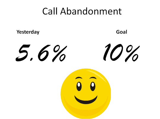
From the Daily Huddle video, we saw the leader say they only had a 5.x% call abandonment rate. The leaders seemed to pat themselves on the back that the results were OK because it was below their goal of a 10% abandonment rate.
I'm making up this visual, but you might see something like this hanging on the wall in a typical organization:
As Wheeler points out, comparing a single data point against a goal isn't very helpful in terms of managing and improving the system. If the rate was 5.x% today, what do we expect it to be tomorrow? How do we know if we're headed in the right direction? This two point comparison doesn't tell us anything particularly useful.
About the 10% goal…. who cares about the goal? Honestly. Who sets the goal? Management did. Why not 12%? Why not 3%? The goal is often somewhat arbitrary. Is it supposed to inspire people to get better (a “stretch goal”)? Sometimes the goal is rationalized and chosen through benchmarking, but what if the benchmark organizations have similar processes, systems, and results? Many people I know in healthcare value benchmarking less after being exposed to Lean, because they realize they were benchmarking against organizations that had the same waste they did.
I'd argue that customers don't care about goals or benchmarks. How do the customers feel about the system's performance? I bet 5.x% of them weren't happy that they couldn't get through to the clinic. Stretch goals might be frustrating (and unrealistic), but I might be a bit demoralized thinking the goal was something as high as 10% and we were easily hitting that every day (doesn't management think we can figure out how to do better?)
Please, don't get me wrong – I'm not implying that Everett Clinic doesn't care about the 5.x% rate or that they don't wish it could be lower. My point here is about the presentation of the data, it's not meant to be a broad criticism of them, but rather a general learning case. I see most organizations present performance measures the same way. Again, we can do better.
Manufacturers often fell (my optimistic past tense) into the trap of measuring their product quality against specs instead of things that truly mattered to the customer. Let's say you're drilling a hole that has to be within a certain size range – the lower and upper bounds are called specification limits or tolerances.
In any setting if you're not meeting specs, the easiest thing to do is… to change the specs!!! If a factory is having trouble meeting the tolerances (this often happened at one of my previous manufacturing employers), then plant management would often complaint that the specs should be wider and easier to hit.
The same could happen in a service setting. If an organization had a goal of 2.0% call abandonment and they were always at 5 or 6%, they could complain that the goal should be higher, or “more realistic” some might say. Again, that's all beside the point.
If Everett Clinic had a 5% “goal” for call abandonment, would they have reacted differently, with the 5.x% number being above that goal?
What matters is working toward a goal of zero call abandonment. Looking at 5.x% and comparing it against an arbitrary goal does little to tell us about the health of the work system. Is 5.x% the typical average performance? Is that much higher than usual?
This is a great opportunity to use the methods of Statistical Process Control. The main management decision is to decide “react” or “not react” to that daily data point. SPC helps us with this (again, Wheeler's brilliant little book explains this far better than I can in a blog post).
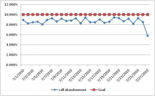
If we choose “not react” because 5.x% is lower than the goal, we might be missing an opportunity for process improvement. Generally, it's better to present more than one data point – even if you don't do full-blown SPC, you should present a “run chart.' See this chart that I made up (a simplified run chart, not a full SPC chart):
In the days leading up to the 5.X% number, the history would have told us to expect a rate between 8 and 10% — it looks like the definition of a system that is “in control,” statistically speaking.
In my made up example, the day with 5.X% is clearly outside of the normal range – there is likely some “special cause” variation that occurred. If we simply said “OK, better than goal” and moved on, what are we missing out on?
Maybe something happened differently in the system – did somebody make a process change? What happened? That's important to figure out — so, in a good, way the right response in my scenario would be “REACT.” What changed in the system and how do we celebrate and capture that day's system so it's our system going forward (until we find a new way!).
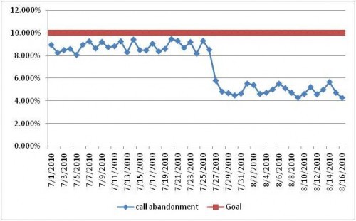
If that were made the new process, the chart might look like this over the next month:
In this case, that 5.X% established the start of a new stable process where we'd rightfully expect to have an abandonment rate between 4 and 6% every day. In this new system, a single day of 5.X% would lead to us “not reacting” because there is no special cause – that day's performance would be due to common cause variation. Finding and attacking that common cause variation is a different thought process than “what happened yesterday?” and it's certainly different than a blaming response of “who messed up yesterday?”
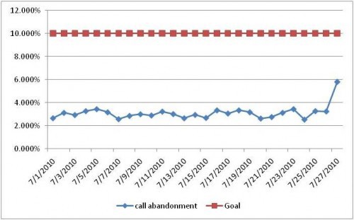
Back to the first chart, where the 5.x% showed an improvement to react to, the same thinking would hold true in the opposite case, as shown here:
In this case, although the 5.x% is still lower than the goal, the manager SHOULD react. “But it's still in spec,” someone might say… but, no, it's a likely “special cause,” this time in the bad direction. What changed in the system this day? We don't ask, whose fault it is. What can you do to make sure that was truly an anomaly? Then, the next question is to ask what you can to make sure you detect that problem (if it happens again) BEFORE the end of the day when the data is tabulated. How can you have real-time problem detection?
So, to wrap up – what matters is NOT our performance for a day versus a goal. Goals are pretty irrelevant, at least in terms of making daily management decisions. What DOES matter is looking at our day's performance in the context of a run-chart or SPC history. I think that's the best way to manage daily data like this.
And that's easy to do. At a recent hospital gemba visit, I saw daily run charts being maintained by front-line staff with a pen, updating the chart manually each day. Using run-charts and managing that way doesn't require daily printing of an Excel chart (although I would personally keep a history of the data in Excel).
What are your experiences with this type of approach to management data?
Please scroll down (or click) to post a comment. Connect with me on LinkedIn.
Let’s build a culture of continuous improvement and psychological safety—together. If you're a leader aiming for lasting change (not just more projects), I help organizations:
- Engage people at all levels in sustainable improvement
- Shift from fear of mistakes to learning from them
- Apply Lean thinking in practical, people-centered ways
Interested in coaching or a keynote talk? Let’s talk.
Join me for a Lean Healthcare Accelerator Trip to Japan! Learn More


Well put. A simple run chart can be very helpful. One of the uses is to identify special causes. And then to use special cause thinking in those cases. What is important about special cause thinking? That you want to identify what is special about the data point (instead of focusing on all the results as you normally would). What is important about doing that? You want to do it right away (not a week or a month later). Keeping the chart lets you identify when to use special cause thinking and react quickly (to fix problems or capture good special causes to try and replicate them).
You have to be careful as we tend to examine most everything as a special cause, when most likely it is just the expected result of the system (with normal variation in the data). Special cause thinking is not an effective strategy for common cause results.
An intersting point re not reacting to a special cause that is better than target. This is one of the keys to understanding how TPS differs to many typical ways of thinking. In the TPS world they are just as intrigued as to why something went better than expected as to something that turned out worse. This theory or “experimentation” drives improvement and more importantly how things improve.
If the reasons for a special cause that results in a good day being understood is that as you point out, can be standardised and an improved capability realised.
I had an interesting discussion during a recent workshop (and not the first time I might add) surrounding a perceived problem that the process was not capable of what was being asked. As the quality problems mounted a problem solving exercise was launched.
The “forced” outcome of the problem solving was that the process was not capable of achieving the design tolerances and therefore should be challenged; after all the product was usually accepted after a waiver (a way of accepting poor quality).
My question and a question I use regularly was, “Have you ever made the product to the correct specification?” The answer was (and is always) yes so my next question was “How?”
They did not know the answer mainly because they were not interested in how they had managed to make things correctly, only when they made something wrong. They did however accept my arguement that the process was clearly capable because they had made products to standard in the past.
I always use this method of questioning during similar debates, I don’t ask “what went wrong?” I ask “what went right?”
This is the foundation of Continuous Improvement.
I find it nearly impossible to do continuous improvement without a run chart. Without a history, how do you know if you have gotten any better or not or if you sustained the improvement? Run charts are critical to help point out special causes (good or bad).
I have used the question kopstar mentioned above, “Have you ever made the product to spec (or correctly) before?” That helps most of the time. They always say yes and I ask if it was fate or if the process worked and if so how. Although, one time I did have a chemist tell me the stars and moon were aligned and that was the only reason we could get a positive outcome. So that approach doesn’t always work.
Wow, long post but spot on. Along the way I think you’ve described the difference between 6 sigma and lean improvement. 6 sigma is looking for statistical improvement and control while lean is looking to bend the trend line towards improvement.
Thanks, Anonymous. I don’t know if this is a Six Sigma / Lean difference, but I tend to see “continuous improvement” as a serious of step functions. Stable system gets improved, becomes stable at a new mean – if even for a short time. Then, you continue improvement. Statistical control needs continuous improvement laid over it, I think.
[…] The Need for SPC Thinking dal Lean Blog di Mark Graban: Capire la variazione, nel buono e nel cattivo. Un solo punto di confronto o un obiettivo mal definito possono portarci a fare delle conclusioni sbagliate e di non agire quando l’azione sarebbe d’obbligo (traduzione automatica) […]