The other day, I had a DirecTV service tech coming to the house to make a repair (their customer service has been FAR better than my recent experiences with Verizon, I'm happy to say).
I received a “robo-call” the day before, confirming my appointment. All systems are a go, but I think I discovered a chance to error proof their process a bit…
I answered the call on my iPhone and was told, “If everything is working and you want to cancel the appointment, press 1. If you want to keep the appointment, press 2.”
I pressed “2”. I think. Actually, I got a confirmation that I did re-confirm my appointment.
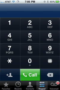
 The iPhone keypad, of course, is a flat glass surface without tactile feedback. It would be VERY easy to mistakenly press “1” when you mean to press “2” or vice versa.
When this happens, I'm sure it creates a lot of re-work and extra phone calls to DirecTV (adding cost). And, the customer might have their service delayed if you lose your place in the queue.
My unsolicited advice to DirecTV would be to have the keys be “1” to cancel and “9” to confirm.
With the extra spacing, customers would be less likely to press the wrong key. I'd bet the cost in terms of changing the phone software would be pretty low (or it would have been free if they designed it that way to begin with).
I think this shows that error proofing is not a “tool,” it's a way of thinking — you often don't recognize effective error-proofing when it's there, but you notice it when it's missing.
So maybe today's challenge is this: if you're designing anything:
- Some software code
- A piece of machinery
- A system or process
Can you anticipate something that might go wrong and design in a way that makes the error impossible (or much less possible)? Hanging a “be careful” sign doesn't count!
Come back this afternoon for a somewhat related Part 2 to this tale. (LINK)
What do you think? Please scroll down (or click) to post a comment. Or please share the post with your thoughts on LinkedIn – and follow me or connect with me there.
Did you like this post? Make sure you don't miss a post or podcast — Subscribe to get notified about posts via email daily or weekly.
Check out my latest book, The Mistakes That Make Us: Cultivating a Culture of Learning and Innovation:


I would like it if the phone companies got together and decided on a standard for voicemail functions. They all seem to have different buttons for the same things. I think it should be
1 – to listen to the message again
2 – to save the message
3 – to delete the message
4 – listen to the next message
5 – to return the call
Or if we took your suggestion:
1 – to listen to the message again
3 – to save the message
5 – to delete the message
7 – listen to the next message
9 – to return the call
Best,
Rob
Why should you have to hit any button if the plan should proceed as previously agreed? I would prefer, “Hit 9 to cancel your appointment (followed by another confirmation of the cancelation), or simply hang up to confirm your appointment.” I’m not an idiot — I made the appointment for a reason, so canceling would be a major change of circumstances that is unlikely to have occurred.
For me, it is very difficult getting an appointment when I can be at home, and if I lose my place in the queue, I will normally cancel the service with the provider and get a competitor’s service, because that is usually easier than rescheduling a service call.
As a P.S., my father saw his first touch-tone phone at the AT&T pavilion at the New York World’s Fair in 1964. He absolutely blew his stack when he saw that they had set up the buttons upside down from those on a calculator.
Has anyone else dialed the wrong number using touch typing after doing a bunch of work on the computer’s numeric keypad? I have.
Karl – great point on the default being “just hang up to confirm” if keeping the appointment is the most likely option. I hear what you’re saying about the keypads! I’m really good on a numeric keypad and if I were ever in some sort of big data entry mode, I’d then screw up dialing phone calls!
Always nice to see good thinking in action.
With voice recognition where it is today, pressing numbers is pointless. Say “cancel” to cancel, or hang up to confirm. Done.
This is a case of new technology in the front end conflicting w/established technology on the back end. The method of starting at 1, and moving forward is related to old rotary phones, where you want to click-click-click that dial as few times as possible.
-bZj
From my experience, voice prompt technology is really inaccurate. I asked DirecTV for “equipment” last time I called and the computer said “ok, programming, I will connect you.” Argh.
[…] up the DirecTV service call that I blogged about this morning, there was some clear, obvious waste that could have been avoided through better training. It makes […]
When the choice is “any sound at all resembling ‘cancel’ = cancel” or “silence + ‘click’ = do nothing”, I think we’ve got the technology…. ;^)
-bZj