When I was in Sweden, the one hospital I visited had an automated coffee machine that made a variety of drinks. In getting a cup of coffee, or trying, I found an example of everyday error proofing.
When I first put the mug under the spout and pressed the coffee button, nothing happened. I thought the machine was broken, so I tried its twin sitting to the right. Same problem. Then, I realized, I had been outsmarted by the error proofing.
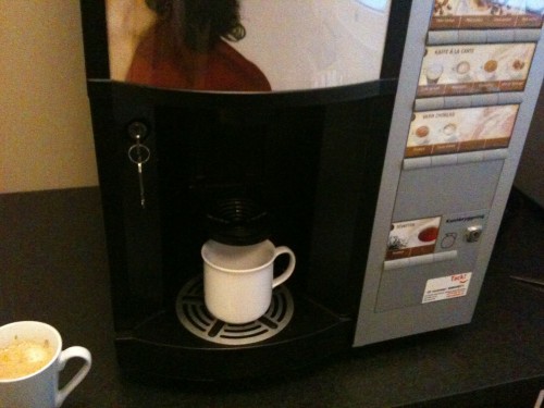
Based on the visual of the machine, I set the mug in what I thought was the correct place, as shown below.
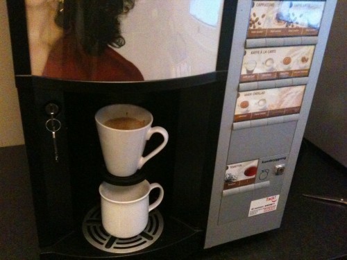
As it turns out, that's actually the drain and the correct place to set the cup is above on the black holder that juts out from the machine.
The machine was mistake proofed, as it sensed that there was no mug sitting on the correct spot. If there had been no mug at all, that would have created a big mess. Having a mug sitting where I had it might have made a little mess, as hot liquid would have splashed through the black holder above the mug. Maybe they could have had a sensor on the bottom grate, but that adds cost (well, so did the mistake proofing logic).
This is a mistake you don't make twice, once you learn how the machine works.
Below is a picture showing where the mug should have gone (above the original mug):
What do you think — clever error proofing or overly engineered?
You could also argue, maybe, that it should have been more visually clear where to put the mug… then maybe error proofing wouldn't have been necessary. Maybe I would have been more likely to get the right spot if the drain had been black and the mug holder had silver?
Please scroll down (or click) to post a comment. Connect with me on LinkedIn.
Let’s build a culture of continuous improvement and psychological safety—together. If you're a leader aiming for lasting change (not just more projects), I help organizations:
- Engage people at all levels in sustainable improvement
- Shift from fear of mistakes to learning from them
- Apply Lean thinking in practical, people-centered ways
Interested in coaching or a keynote talk? Let’s talk.
Join me for a Lean Healthcare Accelerator Trip to Japan! Learn More


I say over-engineered. You may not have made a mess, but still had the error of wasted time! Should only be one option of where to put the cup. Maybe a sensor to make sure there is a cup would still be a good idea, but shouldn’t be two cup-sized options.
Over-engineered solutions is a favorite subject of mine. When I was in manufacturing and we had an amazing in-house machine shop, they could make anything we asked for. The problem was that well-intentioned engineers and technicians would design these crazy “Rube Goldberg” contraptions with sensors and microswitches because they thought that complexity was sexy. A common trap. Real sophistication comes from simplicity, not complexity.
Way over-engineered.
How about just having only one place where your mug would even FIT? If you have to think about it, and then the machine has to think about how you thought about it and give you feedback, it is too complicated.
Take the ATM machine. Loud beeping as feedback that you left your card behind is after the fact error proofing. Only swiping your card so it never leaves your hand prevent the problem from even being possible.
.-= Jamie Flinchbaugh ´s last blog ..To lean, or not to lean? =-.
Mark,
I saw a similar machine last week. It also had another poka yoke. it wouldn’t start a second cup until the first one was removed.
Jeff Hajek
Actually, I like the error-proofed engineering, but they missed on visual cues as to where the mug goes. A lot of wasted time because of just that one detail left out. An easy fix, though, I’d believe.
Error proofing to cover a poor design is a crime. And we even have a mugshot… :)
The real answer is neither.
Clever error proofing would have left the machine designed so that a cup can only go in one place.
Over engineering would have had more than what was needed. I would say it is an example of poor under engineering, they only solve part of the problem. Much like building a jig so that you can put parts into it in the wrong directions as well as the right direction.
It is a great example of a poorly designed Poka Yoke. Any chance I could use the photos and story in our presentations.
Perfect engineering with an imperfect, non-intuitive implementation.
Some well-intentioned person probably wrote a specifications document which sought to keep schlemazels like me from turning the travertine tile at the local Hampton Inn into a insurance risk area.
Those good intentions were offset by my own talents and abilities for cross threading anything smaller than a 1 inch bolt; taking apart natural gas fittings by going counterclockwise and dropping a frozen turkey into a bubbling hot deep fryer.
Just keepin’ you safe, they were.
Robert – sure, feel free to use the pictures, just please give me credit or citation back to the blog.
I agree with the “over-engineered” conclusion. I was quite frustrated when I thought the machines didn’t work, like I said, the mistake proofing outsmarted me :-)
I agree with Mark Welch – visual cues would complete the solution and make it functional.
Comments are closed.