I was fortunate to be in England for five days last week. I saw the “gemba” at five hospitals in three days and attended the Lean Enterprise Academy Lean Healthcare Transformation Summit on Friday.
One thing I was taking pictures of in my travels were all of the warning signs — the “cautions” and “be carefuls.” I love England and London, so I'm not trying to make fun… but it sure seemed like there were a ton of warning signs everywhere. Is this due to an extremely litigious society (you'd think the U.S. was bad) or general British politeness and helpfulness? One sign at a rail station cautioned “Do not run on stairs.” Good advice.
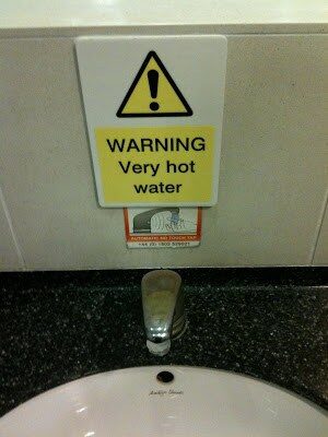
Some of the warnings do seem to be a bit much, though, including these two different warning signs for hot water taps:
]Signs like these are often an issue in hospitals, where warnings and cautions to the employees and physicians are posted everywhere.
These signs, like the “Warning: Very Hot Water” seem like poor examples of problem solving. If the water is that dangerously hot — why not adjust the plumbing so it is cooler? Isn't that easier than making and posting a sign? I can't for the life of me remember a similar sign in a U.S. bathroom. Have you?
I've got quite a collection of hospital warning signs, including:On some pharmacy robotics: “Danger: Do not reach inside machine when running.”
Why is the automation designed that you could even reach inside and hurt yourself? Where is the interlock that prevents the door from opening or shuts the machine down if the door is opened? Is “be careful” right right approach?
A sign on a piece of laboratory equipment read: “Do not spill.”
The sign was warning the technologists to not spill patient specimens into the machine when loading them. Why? Because there was a bare circuit board exposed underneath the loading area. Why rely on people to not spill? Why not design the machine so the board is protected against the inevitable spill?I think people probably also tune out the warning signs and start ignoring them if there are too many. Visual clutter means people don't pay attention to what's posted, I think.H
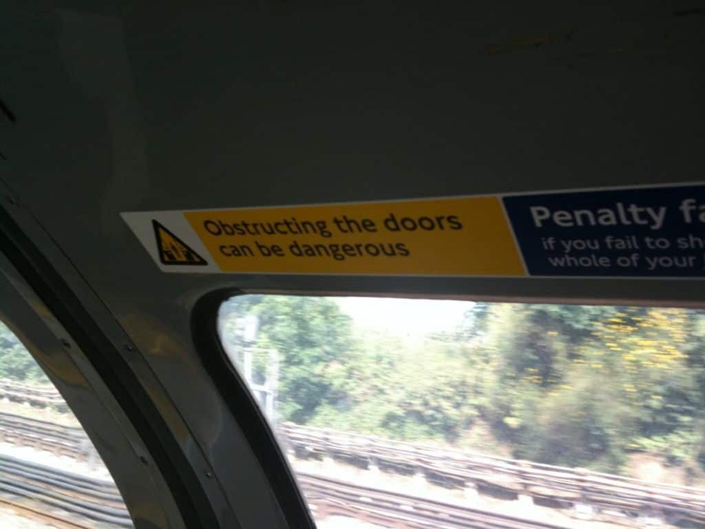
Here's a common sense warning in a Tube car:
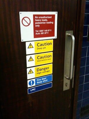
Here's a door in an Underground station — how many warnings can they pack on that single door?
Does your organization abuse warning and caution signs? When I present about this to healthcare audiences, I typically challenge the audience to keep your eyes open today… how many warnings, cautions, and “be carefuls” can you find?
For each, is there an opportunity to use some error proofing methods to prevent the error instead?
What do you think? Please scroll down (or click) to post a comment. Or please share the post with your thoughts on LinkedIn – and follow me or connect with me there.
Did you like this post? Make sure you don't miss a post or podcast — Subscribe to get notified about posts via email daily or weekly.
Check out my latest book, The Mistakes That Make Us: Cultivating a Culture of Learning and Innovation:


This is typical of the nanny stanlinist health and safety state that we live in……..
The government do not trust us to do anything, not walk on the third rail (750 Volts), not to poor cups of boiling water on ourselves, not to burn ourselves with the hot tap (this water may be hot is a favorite sign)
Some, like electricty warnings on railways are understandable, as are the ones on the door where idiots that hold it open as its closing get their arms broken…….there is some force behind those doors.
Others though are absurd….
andrew
Andrew – your point is valid that some warnings are more helpful than others. I would have assumed (wrongly, perhaps) that the Tube doors are like an elevator that gently sense your arm and pop back open.
We could question why the doors are designed that way to begin with, where they could harm someone, but then we'd be thrown in the gulag!
Signs about hot water seem nanny-ish, indeed.
Fun to think about the question or the problem behind the sign or the warning. I'm sure you see signs like this all the time in your hospitals over there too.
Mark, you should have taken a "mind the gap" picture. The first time I ever saw one I wasn't sure what it meant… then a train came flying by and I quickly understood!
Ron – good point. I almost took some video of the constant "mind the gap" audio warnings.
One other story I forgot to tell was the chatting warning elevators.
I assume these are designed for the visually impaired, but it's gets to be a bit much.
Riding the hotel elevator from floor 9 to the ground floor, it must have stopped on 5 floors.
Each time, the elevator talks:
"Floor number 6… doors opening…. mind the doors…. doors closing… Floor number 5… doors opening… mind the doors…"
One British woman, by about floor 3 commented "OK, we get it by now, be careful with the doors."
It's a fine line between helpful and annoying.
Ron –
I didn't have to take a video, there are plenty on YouTube, including this one:
LINK
Excessive numbers of warning signs, of course, mean that none of them–including the important ones–actually get read. The typical manual for a consumer product is now so overloaded with warnings and disclaimers that it's almost unusable.
I read somewhere about an airliner that was having problems with accidental extension of the spoilers. There was a 3-position switch: OFF, ARMED, and DEPLOY. The "armed" position would automatically deploy once weight on the wheels was sensed, and the "deploy" position would override the sensors and deploy immediately. Problem: pilots inadvertantly moving switch too far and selecting "deploy" when they wanted "armed," with not-very-happy results.
Solution? A placard that said "deployment in flight prohibited." Someone observed that it would have been equally valuable to have a placard that said "do not crash this airplane."
On the tube, one of the doors will give if blocked but not both so if your arm is in the wrong place it will get broken. I think people have actually had head injuries from the doors.
What I really like, is not the mind the gap, but where they say. "The approaching train does not stop here".
At milton keynes, those trains travel through that station at over 100mph and there is no barrier between platform and train and I always get a little nervous when they come through.
Last night someone apparently intentionally minded the gap and delayed all the trains where I live for 2 hours as they were removed from the tracks.
I will take a photo of where I am currently working.
There is a sign, the layout of the hospital and it is indecipherable.
I was standing next to reception for about an hour and every person arrives, looks at the map, then turns round and asks where "X" is.
So I say, does this happen often and the bloke says "all the time".
The next couple arrive, look, dont ask climb the stairs and he says "its the exception that proves the rule". Next thing you know is that they are back and asking where something is…………
Unbelievable, signs are a largely ignored or useless.
Andrewmc
David:
Seems like a better sequence would be:
ARMED
OFF
DEPLOY
right?
I've seen warnings around planes on jetbridges that say, basically, "do not crash jetbridge into plane" while some appear to have error proofing devices that stop the jetbridge automatically.
Mark…sounds like a definite improvement. I think the best answer would be probably be a guarded switch, so that two hand movements would be necessary to select the "deploy" position.
David – even better. How to design so it's tough to accidentally deploy it at the wrong time, but not making it too hard to deploy when you really want to…
On the tube, one of the doors will give if blocked but not both so if your arm is in the wrong place it will get broken. I think people have actually had head injuries from the doors.
Haha, I have noticed the same thing!
I have been studying in England for the last 2 years and its impossible to fathom exactly how much “Health and Safety” has worked its way into the culture here. The thing is at what point to signs and warnings become “Super-liminal” as in people don’t notice them at all any more. Could be an interesting study for the Health and Safety commission to undertake. Definitely not mistake proofing though that’s for sure!!