Why do you need a “be careful” warning message when you've already error proofed something? For liability's sake?
I am going to be flying back and forth to the UK a lot this summer, so I needed an airplane power adapter/converter. The one I ordered had this packaging insert, pictured below.
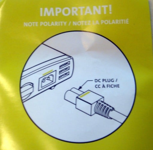
Why is the warning even needed? The product is designed with two types of error proofing in mind. First, there are colored lines that help visually indicate the correct orientation of the plug insert. Not the most effective error proofing, but it's something.
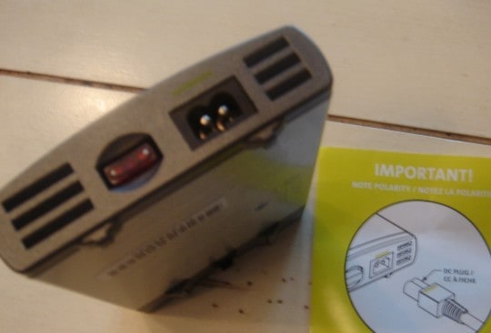
The second form of error proofing is much more effective — the plug and port are asymmetrical. It seems pretty impossible to insert it the wrong way, even if you forced it. That's the smarter way of designing things — make it truly impossible to do something the wrong way. So is the “IMPORTANT” reminder unnecessary? Seems like it.
This reminded me of a similar situation I saw in a hospital laboratory. They had two pieces of testing instrumentation, both from the same vendor. The one instrument (ironically, the newer one) had no error proofing. It was possible to load a rack of test tubes (pictured below) backward, which would have jammed up the instrument.
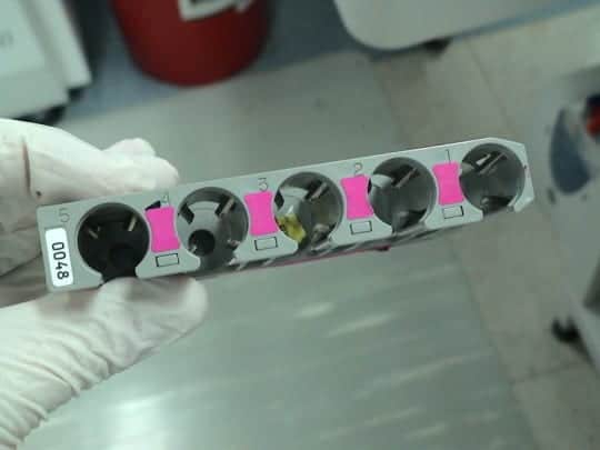
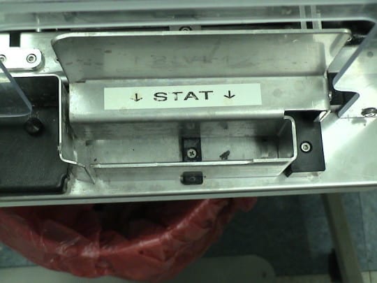
So, there was a warning sign on the chute, pictured below, exhorting the technologists to be careful. How effective was this? Somebody managed to load it backward about once a week, they told me. You see, even if people are trained and they are “careful”, human error is exactly that — we make mistakes because we are human. Error proofing would have been a better approach
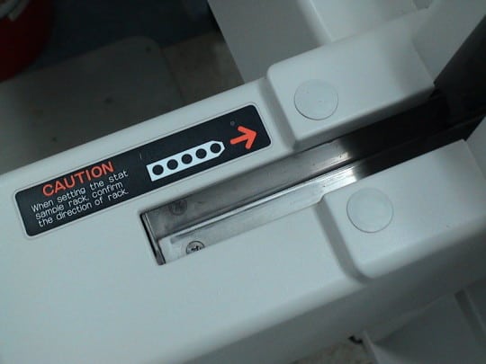
The loading chute for the older instrument (again, this manufacturer had taken a step BACKWARD in the new generation) was error proofed brilliantly. See the angled corner in the lower left side of the slot? It's shaped perfectly so the rack cannot be loaded backward. Just like my DC power adapter. No need for a warning or a caution or a “Be Careful!” It's not as “pretty” as the new instrument, but it's more effective. More “elegant,” you might say.
I see far too many “Be Careful” signs in hospitals. I have quite a collection of photos of them. Maybe I can share them in some format, maybe a monograph on not exhorting people to “be careful”??
Updated: See my website www.BeMoreCareful.com.
What do you think? Please scroll down (or click) to post a comment. Or please share the post with your thoughts on LinkedIn – and follow me or connect with me there.
Did you like this post? Make sure you don't miss a post or podcast — Subscribe to get notified about posts via email daily or weekly.
Check out my latest book, The Mistakes That Make Us: Cultivating a Culture of Learning and Innovation:


