


This article was sent by a friend and blog reader from Winnipeg the other day:
“ER wait times down, but only slightly”

Oh good, the waiting times are down. But what does “only slightly” mean? Have ER wait times gone down in a meaningful way? Or are they just comparing two data points? Is this “down” a signal or is it just noise in the system? These are the types of questions that can be answered by methods in my new book Measures of Success: React Less, Lead Better, Improve More. In the book, I propose a handful of questions that should be asked about a metric:
Question 1: Are we achieving our target or goal?
- Are we doing so occasionally?
- Are we doing so consistently?
Question 2: Are we improving?
- Can we predict future performance?
Question 3: How do we improve?
- When do we react?
- When do we step back and improve the system?
- How will know if we've improved?
Watch Mark talk through this post (or listen) — Subscribe to the podcast
Too many organizations only ask Question 1 — are we meeting our target? They might misunderstand a blip in the metric as “improving” (Question 2). And constantly reacting to each up and down probably doesn't help us answer Question 3. Back to the Winnipeg article:
Emergency room wait times were down slightly in Winnipeg hospitals last month compared to May.
“Down slightly” could just mean the metric is fluctuating in the realm of “noise” (sometimes called “routine variation” or “common cause variation”). Being “down slightly” doesn't mean it's a significant difference. I'd wager that it might “go back up slightly” the next month.
But the figures, released by the Winnipeg Regional Health Authority Wednesday, show median wait times were largely unchanged from the same month a year ago.
So, it's “down slightly” from last month, but about the same as a year ago. That sounds like a metric that's just fluctuating around an average. A complex system tends to be a consistent system, so it will give predictable results. But, a metric is ALWAYS going to have some level of variation (a.k.a. routine variation). Text descriptions of metrics don't provide enough context to be helpful.
The median wait time for all ERs in the city was 1.57 hours in June, down from 1.67 hours in May.
The number is down 0.10 hours. Six minutes. Down six percent. Is that a meaningful difference? We cannot tell in isolation. If the waiting time normally fluctuated between 1.65 and 1.70 hours, then 1.57 might be a significant number worth investigating or explaining. But, again, we don't know without more data. What conclusions can we draw and what decisions should we make from that data?
…the median wait time in June 2018 was virtually the same as it was in June 2017 at 1.53 hours.
Within a band of routine variation (where a metric fluctuates), different numbers are “virtually the same,” exactly right. It's like political polling where you're given numbers with a “margin of error.” Candidates polling at 52% vs 46% might be “virtually tied” if the margin of error is +/- 3% (the results might really be 49/49). We need to think of our business metrics the same way. There's measurement error and other “margins of error” in our data. We shouldn't overreact to every up and down in the data. There's one other important bit of context about the definition of “waiting time”:
“Both wait times measure the length of time it takes for patients to see a doctor or nurse practitioner. The wait times do not reflect the time it takes to be treated and released from the ER.”
I'm surprised that the article doesn't discuss a goal or target. Organizations and news stories often obsess over this, like the four-hour wait time target in the NHS in England (see this blog post of mine from 2008). The three data points don't give us much of a Run Chart and it's not enough to allow us to create a “Process Behavior Chart” with calculated Lower and Upper Natural Process Limits.
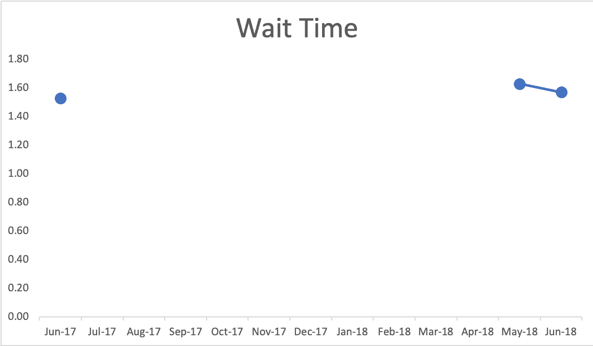
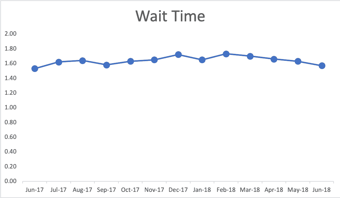
Even those three data points provide context. Your mind might fill in the gaps and see a possible reality like this (which I've made up since I can't find detailed monthly data on the WRHA website). Does real performance look like this? Again, we might see fluctuation or seasonality:
Again, I tried finding data on the Winnipeg Regional Health Authority website. They display the type of comparison table that's commonly seen, but isn't very helpful (see below). I see comparisons like this on metrics boards, PowerPoint slides, etc.
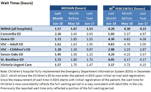
All we get is a comparison to last month and a comparison to the same month last year. Again, that's not enough context to separate signal from noise. Using my made-up data, this is how it would look as a Process Behavior Chart (below I'm showing the “X Chart” portion of this that shows the metric itself, ignoring the companion “MR Chart” for now):
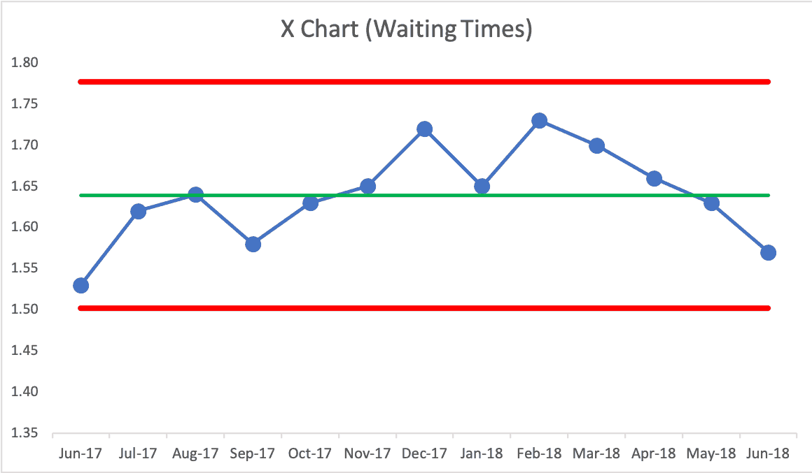
Here is my spreadsheet. Again, IF this were real data, this Process Behavior Chart would say we have a “predictable system.” There are no signals that tell us anything has changed in the system. Some months are going to be better than others.
If we ask “why was waiting time high in February?” there's no meaningful answer. You might say “flu season,” which might be true… but this chart would tell us that flu season is not a strong enough effect to meaningfully change the metric. If the target was 1.5 hours, this system clearly could not meet that.
Being a predictable system, we confidently predict that future waiting time medians will fall between the calculated limits of 1.50 and 1.78. Any number outside of those limits would be a signal that something changed. We have three main rules we used to look for signals, by the way:
- Rule 1: Any data point outside of the limits.
- Rule 2: Eight consecutive points on the same side of the central line.
- Rule 3: Three out of four consecutive data points that are closer to the same limit than they are to the central line.
If the WRHA is working on reducing waiting times (and I bet they are), we can use those rules to evaluate whether or not we have real progress in the results. For example, if we have eight consecutive data points below the established average, that's a signal that the system has changed. It might now be fluctuating around a new, lower average. But, it always fluctuates. Process Behavior Charts are a great tool for seeing the difference between signal and noise.
As I write in Measures of Success, you'll waste less time reacting to every bit of noise in a metric, which will free up the time to focus on meaningful signals, allowing you to improve more. And improvement is the real goal, not making charts. But, charts can help us in our improvement efforts. If can find or get real data, I'll update this post accordingly.
What do you think? Please scroll down (or click) to post a comment. Or please share the post with your thoughts on LinkedIn – and follow me or connect with me there.
Did you like this post? Make sure you don't miss a post or podcast — Subscribe to get notified about posts via email daily or weekly.
Check out my latest book, The Mistakes That Make Us: Cultivating a Culture of Learning and Innovation:


Now, a month later, headlines in Winnipeg talk about E.R. waiting times being HIGHER.
https://winnipegsun.com/opinion/columnists/brodbeck-er-wait-times-up-18-at-grace-hospital
Maybe the news needs to stop reporting on every up and down in these metrics, especially when they’re not “significant” amounts??
ED Wait Time can be a really dangerous metric, but it also doesn’t tell you a lot without additional segmentation. The x bar chart can hide a lot of bad variation if your mean is skewed by short wait times for a high volume of low acuity patients and high wait times for high acuity patients. Unless you’re segmenting your data by specific variables impacting wait time variation, you’re not really making data driven decisions.
Either way, I’d rather see a hospital INCREASE their wait times by better utilization of urgent care for low acuity patients (and psychosocial support for those that need it). That would probably drive up average since you’re potentially eliminating skewed low wait times, but still providing more dedicated care for high acuity patients.
Yes, the context of these metrics is very important, not just the statistical analysis. My main lesson from the post is to not overreact to every up and down in a metric. There are other important lessons about the context of such metrics, so thanks for your comment. We shouldn’t game the system or suboptimize a metric. For example, “door to doc” time can be skewed and gamed in ways that make a metric look better without improving patient care.