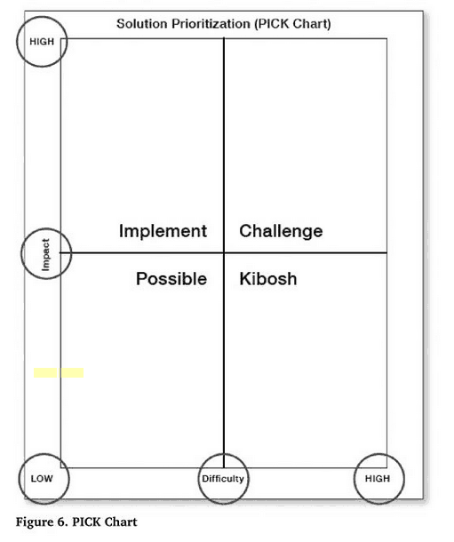
The so-called “PICK chart” has become a pretty common sight in healthcare as a way of visualizing and prioritizing Lean or Kaizen improvement ideas. The concept was supposedly invented at Lockheed Martin, but it's a pretty common-sensical approach that's used to sort and rank ideas based on two dimensions:
- Impact the idea would have (low to high)
- Difficulty to implement the idea
While the PICK chart is used at health systems like ThedaCare, here's a picture that was recently tweeted by my friend Karl Wadensten at his manufacturing company, VIBCO:
Today we introduced our brand new Idea Board here at VIBCO: pic.twitter.com/cNJClpSGjP
— Karl Wadensten (@KDubsLeanNation) July 9, 2014
You can see the two by two matrix. Often the four quadrants are labeled as one of the PICK letters:
- Low impact, easy to implement – Possible
- High impact, easy to implement – Implement
- High impact, hard to implement – Challenge
- Low impact, hard to implement – Kill
Generally, you choose the Implement ideas first – easy to do and a high impact. People generally ignore the Kill ideas as being not worth the effort. The Possible and Challenge ideas fall somewhat in between in terms of priority.
At ThedaCare, being a nice, kind, healing environment, they decided that the word “Kibosh” was better than “Kill.” Kim Barnas included a diagram of a PICK chart in her recent book Beyond Heroes: A Lean Management System for Healthcare (listen to my podcast with her here).

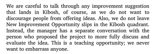
In the book, Barnas makes a great point that ideas in the Kibosh quadrant shouldn't just be ignored. This is good advice for any Kaizen idea and it's one reason that traditional suggestion box systems failed… too many ideas are just ignored and blown off. That discourages people. Barnas writes:

I think a different teaching opportunity is to talk with an employee about why an idea is deemed to be of high difficulty. I've seen many PICK chart discussions (at hospitals other than ThedaCare) where the high difficulty ideas are dismissed, as if being put in that quadrant is the end of the road for the idea (even if the manager has a respectful discussion with the employee).
We Can Do Better Than Kibosh
Instead of letting things wither in the Kill/Kibosh column, I think leaders and team members can be more collaborative… working toward something that CAN Be implemented (as we teach in the Kaizen methodology). Effective improvement isn't just about ranking and sorting ideas — it's about finding something (or many things) to implement.
When something is in the Kibosh quadrant (and even in the Challenge quadrant), it's the leader's duty to ask questions like:
- What is the problem being solved by that idea that's difficult to implement?
- What would we have to do to make it easier to implement THAT idea? Are we willing to take those steps?
- Can we think of alternative ideas that would solve that problem, or at least make things a little better?
- Is there something easier that we an implement that has at least some impact? Do we need to implement a series of ideas to have the same effect?
We can break the problem down into smaller components. We can think about smaller ideas or countermeasures to implement.
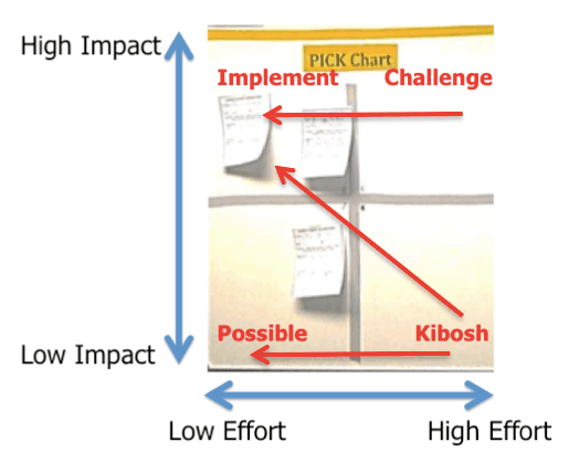
Our goal should be to creatively shift things from right to left, finding ideas that are easier to implement, as illustrated below:

In our collaborative discussions, we might find new ideas that are easier AND have a higher impact (the diagonal red line that goes up and to the left). This is something I talked about last week in the webinar that Dr. Greg Jacobson and I did for Gemba Academy on what to do when you get lots of employee ideas.
Why Are We Prioritizing?
There are a few thoughts behind the PICK chart.
One is that there's always an explicit cost/benefit ratio that can be determined. How do we gauge if an idea is worth the effort?
The second assumption is that we have to prioritize ideas — that we can only implement so many.
Why is that?
We often have a bottleneck in the improvement process. That bottleneck is often the manager or supervisor. That bottleneck might also be a key staff member. The bottleneck person is the one who “has to” be involved in every idea. That creates a burden and it does limit how much improvement can be done.
In an effective Kaizen system, we spend LESS time on prioritizing ideas because we have MORE people involved. When the workload is distributed within a team… let's say everybody can be working on or taking the lead on one idea, then we're less likely to have a bottleneck. Instead of spending time prioritizing, we can spend time talking about problem solving and implementation.
That's one reason why I've never included a PICK chart in the “To Do” column of the Visual Idea Boards that we write about in our Healthcare Kaizen books. It's just a column that says simply “To Do” and different ideas get assigned to different people. A similar conceptual idea holds true in our KaiNexus software — when opportunities for improvement are assigned to people in a distributed way, you can focus on moving forward, not just prioritizing in place.
Here is an example of a Visual Idea Board where somebody did incorporate a PICK chart in the To Do area. That's not how I would do it, but I won't criticize them for doing so. If that works for them… that Kaizen of the Kaizen board, then great. I would just encourage them to find ways to make the PICK chart analysis and prioritization to be less necessary.
Rethinking How We Use the PICK Chart
The PICK chart can be a helpful starting point for discussion–but it shouldn't be the end of the conversation. The real opportunity lies in how we engage with the ideas, especially those that seem difficult or lower in impact at first glance. When we treat every idea as a chance to understand a problem more deeply–and when leaders coach rather than just sort–we foster a culture of collaboration, creativity, and continuous improvement.
Rather than letting ideas languish in the “Kibosh” or “Challenge” quadrants, let's ask better questions, break down barriers, and work together to move ideas forward. That's how we make Kaizen a living, breathing part of the way we work–not just a tool we hang on the wall.
What's your next step to make improvement easier, more inclusive, and more impactful?
Please scroll down (or click) to post a comment. Connect with me on LinkedIn.
Let’s build a culture of continuous improvement and psychological safety—together. If you're a leader aiming for lasting change (not just more projects), I help organizations:
- Engage people at all levels in sustainable improvement
- Shift from fear of mistakes to learning from them
- Apply Lean thinking in practical, people-centered ways
Interested in coaching or a keynote talk? Let’s talk.
Join me for a Lean Healthcare Accelerator Trip to Japan! Learn More


Great points, Mark. I agree wholeheartedly with the idea that we should work to simplify apparently complex countermeasures, increase improvement capacity by removing bottlenecks/involving more people, and not making premature assumptions about what the cost/benefit of an idea might be.
While agreeing with all that, I’ve also used the PICK chart many, many times. Why? I think it’s because in facilitated, group-based improvement environments, such as kaizen events, we’re attempting to batch up a bunch of improvement work in a short period of time and need a quick, practical way to narrow down the list of countermeasures.
I realize this is not ideal. My preferred approach is more of a continuous improvement, kata-driven approach whereby we’re exploring and testing countermeasures on a frequent basis in small batches or ideally one at a time. But to obtain the benefits of a kaizen event (build excitement, show change is possible, harness wisdom of the team, etc.), we sometimes feel the need to compromise and go with a big-batch tool like the PICK chart.
It’s not ideal, but it’s useful in certain situations.
I agree, Michael. The PICK chart isn’t useless, nor should it be thrown away. I think we just have to be careful about traps and pitfalls, especially when PICK charts are being used in the context of daily Kaizen. Thanks for the comment!
I’ve never used the PICK chart before (with the quadrants labeled), though I’ve used the impact/ difficulty map quite a bit. I’m actually glad I never learned the labels, since the “kill” (or kibosh) labels strike me as expedient rather than thoughtful. I like how you suggest thinking about ways to shift ideas towards the top left area; I think this is a useful strategy.
I usually draw a widening band from the low impact/ low difficulty corner (small end) to the high impact/ high difficulty corner (large end), and have found most improvement projects to fit in this general space; projects can be assigned based on interest, availability and organizational need. To the top are easy/ low impact projects that are useful for jumpstarting campaigns or injecting energy during tough periods. Below the band are projects I enjoy thinking about during slow periods, and I’ve found that sometimes they either provide insight into other challenges, or turn out to be more impactful that initially thought. A lot of innovation occurs exactly because people work on relatively unimportant or tedious problems and end up with ideas and solutions never imagined.
Yes, I’ve seen and used those radial bands. The PICK chart methodology isn’t just about the quadrants. Thanks for pointing that out. Those bands often look like this, where you would work your way down from the top left toward the bottom right (bands are approximate):
Thanks for sharing your thoughts and approach, Sean.
I was introduced to this a few years ago. Now, as a manager I utilize this tool. I found the bottle neck was me. My staff are hospital clinical so it’s hard to find time for them to meet about pick ideas, much less see one through. I came up with the idea to copy our pick idea “cards” on to a piece of paper with lines to the side ;two to a page. I placed these in a binder in staff areas. Now when they have an idea they can quickly put it in writing in the binder. The charge nurse meets with the staff and I meet with the charge nurse after shift. I update the lines to the side of each idea to let staff know what progress is being made. I can quickly go through the binder and make calls or send emails about each idea. I change the PICK designation as I work them through. Before this, I would have to pick maybe five out of twenty or so and see them through before working on the others. I had 6 ideas out of 86 employees last month. After switching to the pick binder idea, I have 31 this month.
Here is an article from Harvard (Anita Tucker) that looks at prioritizing and analyzing, versus doing:
http://hbswk.hbs.edu/item/7046.html
and
and their conclusion:
Interesting….
We use PICK Charts in my organization, though admittedly, very little tends to fall in the Kill quadrant. One of the biggest challenges I’ve had is finding a good template that dynamically puts an item in the right quadrant based on how you rate it. I ended up creating my own and it works fairly well: http://www.hitdocs.com/pick-chart-xlsx/
Thanks for sharing that, Eric.
I did a webinar today where I talked a bit about the PICK chart and the need to coach people on the things that end up in Kill/Kibosh, trying to find things that aren’t as difficult to implement.
I proposed that the “K” should stand for “Keep talking.”
Great suggestion with “Keep Talking”! I might try that out and see how it goes.
Mark,
Thank you for sharing your thoughts about the PICK chart. Certainly the learning comes from your baseline discussion, but also the comments that follow. Hearing and reflecting on them deepens my understanding. When I use the PICK chart, the first thing that I like to do is get consensus on defining the criteria for each axis. For example, is Difficulty tied to time, technology, number of people or departments needed to collaborate, etc… Likewise Payoff can be viewed as Impact and that removes the shackles of thinking in sheer dollar terms.
Again, thanks for sharing your thoughts on this tool/topic.
Great point, Jon, about benefits needing to be more than monetary…
It’s my first time to be given an LSS project from our department in a banking institution and the challenge i have is on how to find a good strategy to know if my project will be feasible. Will this “PICK chart”(am not so familiar with this) technique be effective in achieving my project’s goal? Thanks
Dwainne – a PICK chart is often very subjective… one usually has to predict the difficulty and effectiveness of a solution (or a team does it).
A PICK chart won’t tell you definitively if a project is feasible.
If you’re new to LSS, I’d hope there is somebody there in your workplace (a black belt or master black belt) who is coaching you…
Good luck.
For the first time, I saw reference to a PICK Chart where K stands for “Keep Talking,” which is better than turning K into an idea graveyard, ala “Kill” or “Kibosh,”
[…] We always recommend parking those ideas and returning to them later (whether in 3, 6, 9 months or more), working continuously to find ways to make them possible. For a great article on the pros and cons of using PICK charts, and the importance of working to move ideas from “kill” to “implement,” see Mark Graban’s post. […]
[…] towards implementationWe need to prioritise what we are going to do in the implementation phase. A PICK chart might be helpful […]